Test Prints: Getting
the "A" Grade
Background
Whether you are an amateur,
professional, use color management, or couldn't care less about color
management, at some point you may end up printing some test prints in
order to evaluate color on a new printer or new type of paper.
There are some good test images floating around on the web that you can
use to make test prints on your printer. What are the pros and
cons of each of these test images and what should you be looking for
when you evaluate test prints?
Testing your
printer
Before we look at individual test images, let's first discuss their
purpose. While there are a few test images that allow you to test
your printer's resolution or the amount of fine detail visible in
prints, nearly all printer test images (sometimes referred to as
"targets") are designed to help you evaluate color and not resolution.
The reason for this is pretty simple and stems from the fact that your
printer has a well defined set of algorithms that determine the
resolution. Color on the other hand, can be more difficult to dial
in, especially if you are using third party paper.
Part of the problem with color
matching is the fact that the image you are printing can come from a
variety of equipment that uses different methods for encoding color.
Before printing any test images on your printer, first be sure you are
using software that is color managed. Most of the latest photo
editing packages are color management aware. In addition, some
high quality photographic printing software packages offer color
management as well. The latest version of my own
Qimage printing software,
for example, reduces the potential for user errors related to color
management mismatches by offering full color management support
including methods that allow the software and the printer to communicate
with each other to determine how best to handle color even when color
profiles are not being used. Before printing any test images, be
sure you are aware of the capabilities and limitations of the software
you are using to print and be sure you have that software set up
properly. You can refer to
other
articles I have written for this purpose.
What to look for
It is important to understand that printers have their limitations and
that some images are designed to test those limitations. As such,
you may notice problem areas in test images that you will never
encounter in "real" photographs. For example, many test images
have wide, sweeping color gradients where much of the colors in the
gradient are out of range for the printer. This forces the printer
(and software) to make compromises that can show up in the form of
posterization or "blockiness" of color where the test image looks smooth
on screen but a bit chunky or warped in print. One of the most
important things to realize when printing test images is to recognize
the fact that not all problems seen in printed tests will appear in real
photographs. How many times will you see a full rainbow of colors
that covers the entire visible spectrum at full saturation? In a
real photo, probably never. While these mathematical gradients
aren't a realistic test for photographs, they can show strengths and
weaknesses in color profiles and they can be a good indicator for the
possibility of problems should any of your photos enter the color
range represented in the trouble area of the test image. Such can
be the case in circumstances such as when printing sunsets or certain
skies that have broad areas of slowly changing color.
Many people make the mistake of discarding a setup that is really quite
good because they notice banding in one of the mathematically derived
gradients on a test image. Rather than looking for the extremes in
the test image, you should concentrate on overall color rendition,
accuracy, and then the gradients in that order. When judging
color, it is difficult to judge skin tones because more than likely you
do not know the person in the test photo, their actual skin color, what
time of year it is (how good their tan is), etc. The best you can
do for skin tones is to say that they look "good". Unfortunately
"good" is in the eye of the beholder and can vary widely from viewer to
viewer.
Since much of the test image may be
unknown and therefore hard to judge, it is always good to have a good
start: an accurate monitor profile. One of the most important
steps in judging good prints is to have an accurate monitor since that
is likely what you will end up using to judge your prints.
Fortunately, monitors often have less problems with color than printers
due to their more "linear" nature and monitor profiling tools that
include a colorimeter that attaches to the screen are relatively
inexpensive and do a nice job.
Here are some things to look for in
test prints:
-
Gray gradients: Look at the areas of
the test print that are supposed to be gray (neutral) to ensure that
they have no color cast. This can be difficult to judge due to
lighting and the fact that our eyes often adjust to the colors around
the gray area, but here we are looking for obvious color casts. Do
the gray areas look gray or to they look like they have a tint of green,
magenta, or some other color?
-
Skin tones: The next step after
evaluating (and possibly correcting) neutral tones in the print is to
judge skin tones. Skin tones are usually very lightly saturated so
they are the next batch of colors to evaluate after neutral tones.
Rather than judging skin tones against people you know or are familiar
with, just make sure the skin tones look natural and that they look
reasonable in that you would expect similar tones for a person with the
complexion type shown in the photo.
-
Known objects: Next up on the list
are the more saturated colors for objects that are clearly recognizable.
Blue sky, for example, can be a good test. Does the sky look blue,
or does it shift to purple (a common problem with many printers)?
Does a red rose look red or is it shifted toward magenta? Does
grass look green or too yellow? Objects such as these are usually
recognizable enough to determine if your printer is having significant
problems in those areas of color.
-
The extremes: Last, we look at
extremes such as black, white, and saturated colors. Is white
really white or can you see little dots in areas that should be pure
white? Is black truly black or does it look too dull, too green,
too red, etc. Can you see areas of shadow (dark colors) on screen
that are completely blocked with no detail in the print because they
printed too dark? Are color extremes like bright red, green, blue,
yellow, magenta, or cyan blocked or "blown out" in the print? For
example, does a bright red spool of thread show detail on screen but
look like one solid block of red in the print? These types of
problems are some things to look for at the extremes. Again, be
aware that test images are often designed to show the biggest problems
possible here, so things like highly saturated color gradients are often
the "acid test" for printers. Take them with a grain of salt
unless you notice real problems in the photographic parts of the test
image (as opposed to the mathematically derived color gradients or
rainbow swatches).
Some test images to
try
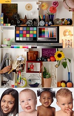
1: PhotoDisc Target
Links to above:
Page referencing the
PhotoDisc Target
Direct link to
PhotoDisc Target
This test image shows a variety of skin tones and colors and is often a
good test of printer color accuracy. This target is not heavy on
mathematical gradients or highly saturated colors but it does show some
recognizable objects in a well lit scene. This image uses the
Adobe RGB color space so be sure to use color managed software to print
this test image. Use the "ICM" option in your printer driver and
set your printing software to allow the printer/driver to manage color
if you do not have paper specific profiles that you are using.
Also note that since this test target has many small, detailed objects,
it is best to print this target about 10 inches tall if possible.
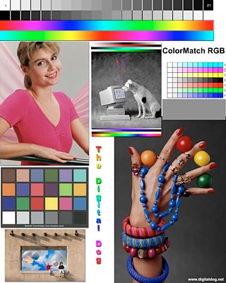
2: Printer Test File
Links to above:
Page referencing
the Printer Test File
Direct link to Printer Test File
Andrew Rodney's (Digital Dog) test image is another popular printer test
image on the web. It has good gradients for evaluating smoothness
of color and a good B/W photo and gray gradients for evaluating gray or
neutral colors. Unfortunately, unless you happen to have a
GretagMacbeth ColorChecker chart, this test image isn't exactly chock
full of recognizable photographic material. Still, it is one of
the better test images on the web as it doesn't tend to confuse the
viewer with slightly off-tone colors or overdone (read impossible to
render on the printer) gradients. This image uses the ColorMatch
RGB color space so be sure to use color managed software to print this
test image. Use the "ICM" option in your printer driver and set
your printing software to allow the printer/driver to manage color if
you do not have paper specific profiles that you are using.
3: Fuji Calibration Image
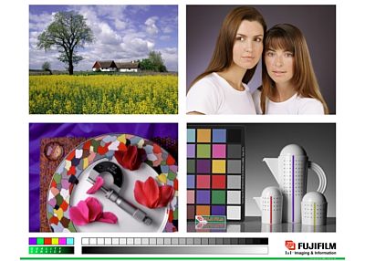
This is an older test image that has made its way around the web in one
form or another in the past. This test image (above) was
originally designed as a calibration image to help calibrate color on a
Fuji Frontier printer. While there are some "corrected" versions
and other incarnations of this image available on the web, I would not
recommend using this test image should you run across it in your search
for printer test images. This image, while it does have some
useful gray gradients, can be misleading in numerous ways. The
tablecloth behind the plate, for example, is really a purplish blue that
is likely out of gamut on your printer. Some people "want" to see
the tablecloth as blue while it really is supposed to be a shade toward
purple. Some of the color patches on the ColorChecker can also be
a bit erroneous in some versions of this test image as well. The
six colors displayed at the lower left of the test image also look like
they should be primary colors while they are not, again throwing off the
perception of what people expect versus what the image actually shows.
Last but certainly not least, the skin tones in this test image are a
bit washed out and not representative of your "average" skin tones.
I won't post a link to this test image because I don't recommend using
it and there are so many variations of it, it is hard to tell exactly
where it originated. I post this example just in case you run
across it in your travels on the web.
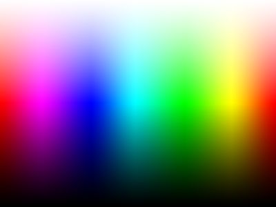
4: Granger Rainbow
Links to above:
Page referencing
the Granger Rainbow
Direct link to
Granger Rainbow
The Granger Rainbow is sometimes used by those who need to fine tune
color profiles. It works well for those who are trying to smooth
out colors at the extremes in a custom printer profile, but is of very
little use to the average user. Many of the colors in the above
rainbow are out of your printer's color range so compromises will have
to be made in the print. These compromises usually amount to
reduced overall saturation or color clipping which results in banding.
Even the best printer ICC profiles will have problems with this image
and it will almost never print as smooth as it displays on screen.
A print of the above image will always result in either desaturated
colors or banding/warping of the color spectrum. Again, this image
can be useful for fine tuning profiles using profile generation tools
but it is quite limited for general use as it focuses on problem areas
rather than actual photos.
Summary
While the above may give you some
ideas on generic test images to use for evaluating your printer, paper,
or settings, be aware that you are often the best judge of your own
work. Don't hesitate to print some of your own photos showing
subjects you are familiar with! You may have to print more than
one photo to be able to evaluate skin tones, bright colors of flowers,
greenery, and other objects, but you probably have enough of your own
material that spending an hour locating a few good examples of your own
work can be helpful after you've dialed in color using a generic test
such as one of the test images in this article.
Keep in mind that nearly every test print, especially those with
mathematically derived color gradients, will show some of the tradeoffs
that are inevitable with photographic printing. Since your printer
may not be able to reproduce all of the highly saturated colors in many
color gradients, don't get "stuck" trying to correct banding or other
problems if such problems only occur in the non-photographic areas of
your test prints. Always judge the big picture and how well your
settings, profiles, and other procedures work on the overall print
rather than focusing only on the areas that have trouble.
Mike Chaney


