|
4096
|
Technical Discussions / Articles / June 2007: Say "No" to Cracks!
|
on: May 27, 2009, 02:21:17 PM
|
Say "No" to Cracks!
Background
Cracked software costs
legitimate businesses billions every year, yet most people view this
form of theft as no big deal. Do you go searching for cracks or
patches before buying software just to see if you can get a copy for
free? You may be hurting more than just the wallets of big
businesses. You (and others like you) may end up driving companies
who work hard to bring you valuable products out of business. At a
minimum, you'll cost these companies resources as they spend time
fighting software piracy instead of bringing you the features you need.
Let's take a look at how piracy can be a double edged sword and how
piracy affects you beyond getting free software.
The cracker mentality
Many people wonder why hacks,
patches, cracks, and key generators exist to begin with. Hackers
don't get paid, do they? Well, sometimes they do, but the ones who
get paid usually get paid for hacking into systems to expose
vulnerabilities to companies that hire them to do so. The software
piracy cracker (as opposed to "hacker") usually cracks software for one
simple purpose: notoriety. Notoriety usually comes in the form of
just being able to prove that they are smarter than the "big wigs" who
create the software. Want to prove you are smarter than Bill
Gates? Just create a crack for Windows Vista before it is even
released. Want to get the best of Adobe? Just create a patch
for the latest version of PhotoShop. In reality, the cracker is
only proving something that the whole world already knows: nothing is
crack-proof! Being able to thwart copy protection only proves that
you can read low level code: something many thousands are capable of to
at least some degree. So while exploiting a hole in some copy
protection scheme doesn't make the cracker any smarter than the people
who wrote the scheme in the first place, it does gain them some
notoriety in the "elite" underground of cracking. Depending on the
type of cracking/hacking, the cracker/hacker can get exposure for
his/her name (always some made-up name like "Team XYZ") or even gain
them entry into specialized "Black Hat" type meetings. In any
case, hacking is not always a bad thing when it is used for good, but
often it is used for nothing more than chest beating when it comes to
software piracy as there us usually very little financial gain involved
with cracking software.
The risks
Perhaps one of the reasons for the
popularity of software piracy is the fact that there is little risk of
getting caught. Piracy is illegal in most countries, however, the
inability (or unwillingness) to crack down on the crackers and actually
enforce the law can be a problem. China and Russia are
usually seen as hotbeds for software piracy where piracy web sites are
allowed to remain online with little fear of prosecution. With the
risks being low for both the cracker and the people who use the cracks,
you must look at the big picture to see the real risks. First and
foremost, there is a real risk to your data and equipment when using
pirated software. If you don't know exactly what you are doing and
you don't know exactly where the crack came from, you are putting
yourself at risk for viruses and adware as a fair number of software
patches and key generators come with embedded viruses and adware!
Don't be surprised if your machine starts to act a bit "flaky" after you
steal software. That risk comes with the territory!
Remember, you are in cahoots with the very people who write viruses,
adware, and trojans, so by using pirated software, you may be opening
back doors to your system for even more serious crimes like data theft
or even identify theft!
Another real risk associated with
using pirated software is that the software you are using may only be
partially functional. To make piracy more difficult, some
companies insert "phantom" code that may randomly affect certain
functions when a crack is being used. These make it difficult for
the crackers to identify when they have a successful crack when problems
don't appear until certain functions are being utilized or after a
certain time period making your pirated software a bit of a "time bomb"
waiting to fail you when you need it most. The bottom line is that
by using pirated software, you never really know what you are getting
and to ensure that you get a 100% working copy, you should always buy
the software and obtain a legitimate copy from the company's web site!
There are other, less immediate risks
involved as well. Using pirated software usually means that
upgrading down the road will be a lot riskier. Many pirated
versions are disabled over time so upgrading may leave you at risk of
being exposed for your theft and/or being unable to upgrade without
searching for a new crack that works with the new version. Pirated
software also leaves you with little or no support for the software
since you don't have a legitimate copy. Again, each time you
download and use a crack, you make yourself vulnerable to more adware,
viruses, and phantom problems in the software you are using. By
contributing to the worldwide software piracy problem, you also
contribute to the dilution of the very software that you seek so hard to
steal as companies expend more resources fighting piracy instead of
improving the product. If you've ever stolen software via software
piracy, you have no right to complain about how complicated it is to
register or obtain a new version of a product as complex registration
schemes, product keys, and activation processes are simply a result of
the ongoing fight against software piracy. And if you don't
use pirated software, you may have the right to complain, but complain
to the right people: those who can make a difference as far as enforcing
the law and making the international community aware and responsible for
these crimes. It's really no different than rising insurance rates
that are due in part to people who have no insurance.
Price or upgrade policy
is no excuse
Many people seem to justify software
piracy with statements like "but it's too expensive" or "why should I
have to pay them for bug fixes". The fact is, software sales rely
on support from customers and bug fixes are just a reality of the
software business. People have no problem buying new tires when
the old ones wear out, yet we never claim that the fact that they wear
out is a "defect" in the tire. Or when a company introduces a new
tire that lasts twice as long as the old one, we don't run back to the
store and claim the old ones were defective. Bugs are an
inevitable consequence of using software and the fact remains that
people use software for months or even years before having to pay for an
upgrade and the upgrade almost always contains new features as well as
bug fixes for old features, so paying for new features shouldn't be a
stretch just as you wouldn't expect to walk into a car dealer and ask
for next year's model for free. My policy of free lifetime
upgrades for Qimage is,
in part, a plea to customers to register the product since the "pay
once" concept ensures that you never have to pay for things like bug
fixes or even new features. While this does reduce the tendency to
use pirated versions, companies shouldn't be forced to give away their
work to avoid piracy any more than they should have to use their
resources to prevent theft. Whether companies choose to raise
their prices, implement more aggressive anti-piracy procedures, or offer
free upgrades, piracy costs companies money and in the end, that costs
you by taking away some of the product's full potential.
Regardless of price or upgrade policy, if you find software useful
enough to go searching for a pirated version, do everyone a favor and
pay for what you are using. It has benefits all the way around and
will make your life a lot safer in the long run.
Summary
So did I change your mind? :-)
Probably not. This article is not designed to change the minds of
the many who steal software through software piracy. Those who
have made the decision one way or another will probably not change their
mind since the issue of piracy is a bit of a personal topic and people
are often creative in rationalizing software theft in their own personal
case. It's funny how human nature drives people to argue either
side of an issue when given sufficient motive to do so. In this
article, I hope to have exposed some of the risks involved with using
pirated software so that those who are contemplating going the route of
pirated software may change their mind when presented with the facts and
risks. If I can bring a few people who are on the fence back to my
side, the side where I must deal with piracy in my own software, maybe
we can spread the word and support the companies that bring us the
products that we use. Whether we are talking about big companies
that may be able to absorb more losses than others with respect to
software piracy, or the small company who works closer to the consumer
to bring the best products to the market, we all lose in the end when we
use pirated software.
Mike Chaney
|
|
|
|
|
4097
|
Technical Discussions / Articles / Re: May 2007: Sigma SD14: 14MP? 4.6MP?
|
on: May 27, 2009, 02:17:27 PM
|
Added (3/21/07): So where does
the SD14 rank among other dSLR's as far as resolution?
The 8 megapixel 20D is unable to resolve as much overall detail as the SD14.
Though they both resolve about the same amount of detail for B/W and green
colors, the SD14 takes the lead for all other colors tested.
From the data, we can infer that the overall resolving power of the SD14 lies
somewhere between the 20D and the 5D: that is, somewhere between 8 megapixels
and 12.7 megapixels. For overall resolving power, the SD14 appears to
compare to a typical (Bayer) 10 MP dSLR. Keep in mind here that my
findings that a Bayer based 10 MP dSLR resolves about 1700 LPI overall will be
lower than the resolution measured by other review sites that only consider
horizontal, vertical, and 45 degree detail from a single B/W chart because I
consider lines at many different angles and a range of colors other than just
B/W. Saying that the SD14 is approximately equivalent to a 10 MP Bayer
dSLR, however, is a bit like comparing apples and oranges. A typical 10 MP
dSLR may be able resolve detail as small as 1700 lines per inch, it does so a
bit differently than the SD14.
When I state that both the SD14 and a standard 10 MP dSLR can resolve about
1700 lines per inch, I must qualify that statement. To my eyes, the SD14
produces better photos than a typical 10 MP dSLR because it is able to carry
sharp detail all the way to the "falloff" point at 1700 LPI whereas contrast,
color detail, and sharpness begin to degrade long before the 1700 LPI limit on a
Bayer based 10 MP dSLR. Any Bayer dSLR will begin to lose significant
chroma (color) information when different colors are being captured near the
resolution limit. For example, tiny red spots on a white flower will begin
to lose saturation as the dots become small enough to approach the resolution
limits of the Bayer camera. In fact, the red dots will begin to start
losing saturation as far back as 1000 LPI on the 10 MP Bayer camera while the
SD14 will show a more accurate/vibrant red much further toward the 1700 LPI
resolution limit.
As a consequence of the varying levels of sharpness, contrast, and color
across different hues and spatial frequencies, many SD14 images look sharper and
appear to have more 3D effect or "presence" when compared to Bayer based 10 MP
photos. A necessary evil, however, to the fact that the SD14 can resolve
pixel level detail is the fact that aliasing can appear more prevalent in SD14
photos, especially when you look at detail at or beyond its 1700 LPI resolution
limit. To the observer, this can make SD14 photos appear jaggy in some
areas and areas of repeating fine detail at or near the 1700 LPI limit can
suffer from moiré. In some cases where
repeating fine detail is being recorded, the 10 MP Bayer camera may actually
produce less "distracting" photos as they tend to smooth over these artifacts.
Unfortunately, they also smooth over some detail as well so as stated
previously, the fight to balance aliasing and resolving power is a tradeoff.
I tend to prefer the pixel level detail of the SD14 over the antialiasing
methods of a standard dSLR however, because aliasing can be corrected via a
number of blurring algorithms for photos where this is an issue, but once the
data is "blurred" up front, there is no way to get the detail back.
The bottom line in the debate about where to place the SD14 among other
(Bayer based) cameras is that I believe the SD14 to be about equivalent to a 10
MP Bayer dSLR as far as pure (maximum) resolution. When taking into
account how the camera achieves that resolution, however, I would have to say
for image quality, the SD14 compares well to standard dSLR's a little closer to
12 MP, that is, more comparable to something like the Canon 5D. When
taking equivalent shots of "real" subjects and examining SD14 and 5D photos side
by side, SD14 photos compare nicely to photos from the 5D. I've done a
number of these tests and in scrolling around with my "pixel peeping" hat on, I
can always find some areas that I like better on the SD14 and other areas that I
like better from the 5D photos. For image quality alone, it's a toss-up
for me when comparing the SD14 and 5D. The SD14 seems to have a little
less consistent/controllable color than the 5D but the SD14 produces that 3D
presence that no other standard dSLR can match. In the race to get the
best image quality, I suspect some will like 5D photos better than SD14 photos
and vice versa. The mere fact that the SD14 compares so well to cameras
like the 5D is a testament to how good the SD14 really is!
Upsampling SD14 photos
Since words like "data", "quality" and "resolution" can become
intertwined, it is sometimes beneficial to take a look at the images at the same
size. What would the SD14 images look like if they were upsampled
(interpolated) to the same size as the 5D photos? At first glance, this
may seem like "cheating" but consider the following and you may realize how
valid the comparison really is!
Since the 5D is already interpolating (read guessing) two thirds of the color information in it's
photos, why not interpolate some of the resolution information in the SD14 for
comparison since it starts out with nothing being interpolated? Here's what the SD14 charts look like when interpolated to the
pixel count of the 5D using a good interpolation algorithm (I used the "Hybrid"
method in
Qimage).
 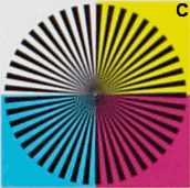
The above images are animated and should switch back and forth
between Sigma SD14 (S) and Canon 5D (C). You can see how the 5D has the
edge in some areas but not others. The 5D boasts final image resolution of 4368 x 2912
while the SD14 offers a final resolution of 2640 x 1760 which equates to 12.7 MP
for the 5D and 4.6 MP for the SD14. When comparing final image sizes, the
5D has 65% more pixels in both directions (horizontal and vertical), however, it
isn't surprising that the 5D can't capitalize on more than a fraction of that
65% in reality and falls short on detail for saturated colors. My findings
that the 5D slips ahead of the SD14 on B/W resolution while falling
behind (either via resolution or sharpness) in some saturated colors is expected, really.
The color interpolation algorithms used to reconstruct a full color image from a
single-color-per-pixel photograph are quite complex and between antialiasing
filters and the logic needed to guess two thirds of the information at each
pixel, there is understandably some resolution loss in the process before the 5D
spits out that final photo. I believe that the star sector resolution test
is a much more accurate method of determining real world resolution since in
real photographs, we have more than just horizontal and vertical lines.
Determining resolution by looking at a B/W chart with mostly horizontal and
vertical lines is really of little merit when comparing different technologies
such as Bayer versus full color capture because it does not adequately expose
the weaknesses of the Bayer design and those are weaknesses that definitely show
up in real photographs.
Revised (3/17/07): What about "real photos"
Wouldn't it be nice if the inconsistencies in resolving power of
the Bayer sensor design were limited to only red and black mathematically
derived resolution targets! One of the first criticisms to any scientific
test seems to be, "but that problem will never appear in real photos".
Sadly, this is not the case for the Bayer sensor as the issues of edge blurring
and inconsistent resolving power across subjects of varied color are present in
many "natural" shots that contain saturated colors. The issue is
particularly noticeable in bright colored flowers and also fabrics where texture
such as thread weave brings the inevitable blurring of the Bayer sensor design
to the surface. In real shots, I'm finding upsampled SD14 photos to be
every bit as detailed as the 5D across the board and better for certain problem
colors like deep reds and blues. Below are some 1:1 crops from a shot of
the same flowers taken in raw mode on both cameras and developed without any
tweaking of the images:
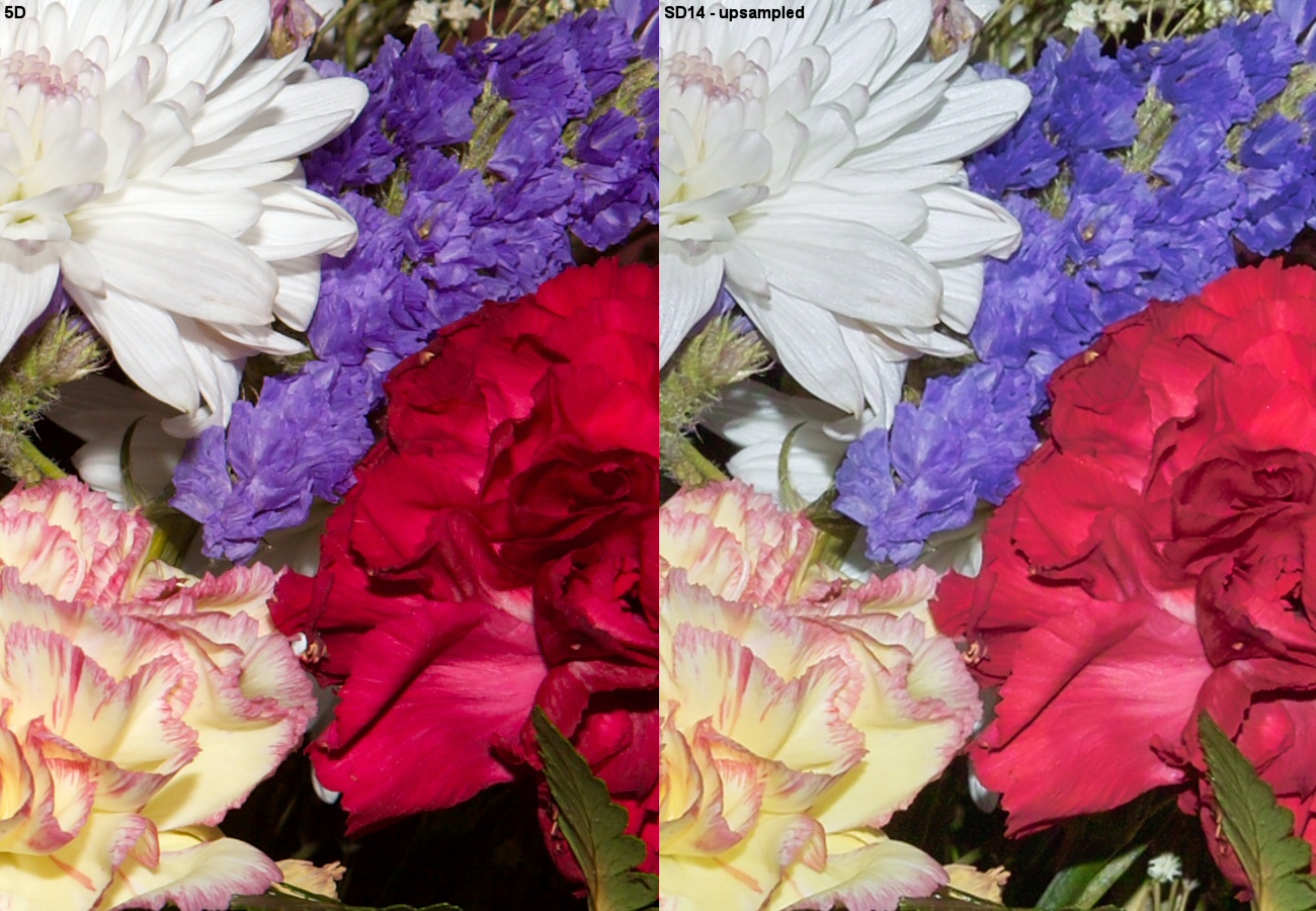
On the surface, it may seem unlikely that a 4.6 megapixel image
upsampled to 12.7 MP can look as good or better than one that started as 12.7 MP
but the proof is in the shooting! Even though the SD14 photo on the right
above started as a much smaller image, when upsampled to match the resolution of
the 5D, it holds up very well, easily matching the 5D in most areas while
surpassing it in others. Where the SD14 holds consistent sharpness across
the frame, the 5D has smudged over a bit of detail in areas notoriously
problematic for Bayer sensors such as the red carnation and even the white
flower where edge detail is being lost to the AA filter. Looking at the 5D
shot, you'd be tempted to believe that the red flower is just a little out of
focus because it's in front of (or behind) the other flower due to it not
looking as sharp. In reality, all the flowers in the above crop are in the
same plane relative to the lens. In addition, the shot was taken from a
distance at f/11 so much of the depth of field is quite forgiving as well.
To be fair, the 5D did a little better overall with respect to
color accuracy as the true purple tones of the flowers at the top/middle show
more accurately in the 5D shot. The reds are actually somewhere between
those depicted in the 5D shot and the SD14 shot as neither got the reds the
perfect shade. Since I used Bibble 4.9 to process the 5D shots versus
Sigma Photo Pro 3.0 for the SD14, I suspect much of the difference in color
accuracy is due to the raw converter being used. I look forward to more
raw conversion tools eventually supporting the SD14 in a truly color managed
workflow.
Bottom Line
The bottom line here is that the SD14 appears to compare
favorably to high end cameras having final images with significantly higher
pixel counts. Is the SD14 equivalent to a standard 14 MP camera? As
you can see from the above, that would depend on the circumstances and what you
are shooting. I've upsampled a number of SD14 shots to 5D resolution and
in most areas of near gray or only lightly saturated colors, there is actually
very little visible difference between the SD14 and 5D shots as far as detail or
resolving power. Throw in some saturated colors, however, and the detail
and 3D appearance of the SD14 might just edge out the 5D! The consistency of sharpness and detail
throughout the entire photo, no matter what color your subject, cannot be
explained without being seen on the SD14. To some, the Canon name might be more
important than the Foveon/Sigma innovation but I think the
SD14 web site asks a
relevant question with respect to brand loyalty by pointing out that technology
that is fundamentally better may be worth more than an extra feature or two, or
a metal body that can survive a 10 foot drop to concrete. At least until
you drop your camera from 10 feet onto concrete. ;-) Different
people will always have different needs and that's why there are so many cameras
out there. So far, it looks like the SD14 lined up at the starting line
and may well be jumping ahead of the rest of the pack at least as far as image
quality. From what I can see by my initial look at this camera, image
quality has pushed the SD14 ahead of competitors costing twice as much.
Whether it can stay in front will depend on many factors not the least of which
are reliability, usability from a real photographer's standpoint, and how it is
received by the public. Speaking of public perception, one of my reasons
for doing this article is to point out to potential buyers that the SD14 really
is fundamentally better technology. Even though it's final images are 4.6
MP, it really is comparable to standard cameras that deliver final images 2-3
times larger in final resolution. For those who would be tempted to look
at those 4368 x 2912 5D photos, comparing them to the 2640 x 1760 SD14 photos
and say, "But what if I want to print a 24 x 36 inch print", don't be fooled by
the Bayer resolution myth! The SD14 looks at a scene and records 14
million pieces of information in a balanced manner, sampling both color and
resolution at the highest quality. Other ~14 MP cameras record the same
amount of data, but give you a false sense of security by "stealing" two thirds
of the color information from each pixel and attempting to use it for
"resolution". Make no mistake, whether you want to call the SD14 a 4.6 MP
camera or a 14 MP camera, it's in the running with the best on the market today
and in my own personal opinion, beats most of them for total image quality!
Update (4/18/07): My SD14
develops major problems!
The above testing was done mostly in the confines of my small
office and most shots were taken from a distance of about 6 ft to 8 ft.
The SD14 focused normally in that range but once I started shooting macros and
telephoto shots I noticed that I kept getting out-of-focus shots. After
much testing, I found that the camera focuses in front of the subject in macro
mode and well behind the subject when shooting a subject at the telephoto end of
the lens (18-50 f/2.8 lens) when the subject is more than about 10 feet from the
camera. This is repeatable time after time with only the center focus
point being used. The camera only focuses properly when the subject is
between about 4 and 8 feet from the lens and my other lens (15-30) behaves
identically so I know it is the camera and not the lens. With firmware
1.00, I was also experiencing major problems with lockups, reboots, failure of
the shutter to release, etc. so I sent the camera back outlining both problems
in detail. I was surprised that I had to send the camera in and pay for
the shipping (to Sigma service) myself when both Nikon and Canon have provided
prepaid UPS boxes for the same service in the past but I just shrugged my
shoulders and sent the camera to NY for service. Unfortunately after 10
days, I received the same camera back from Sigma with nothing but new firmware
(focus issue not addressed) so I now need to ship the camera back to Sigma again
and await a replacement. Hopefully the replacement will do better as I'm
beginning to wonder if the Sigma body/firmware are worthy of the Foveon sensor.
I'll be sure to update this page once I have the replacement camera.
Update (4/21/07): My replacement
SD14
After the initial mixup where Sigma service sent my defective
SD14 back to me, they turned it around very quickly the second time around and
sent me a replacement. The new SD14 is working much better than the old
one as far as focus is concerned. The new SD14 came loaded with v1.01
firmware yet it still has an occasional lockup that can sometimes even interrupt
shooting. In addition, firmware 1.01 only fixes one of the three problems
associated with shooting Adobe RGB JPEG's so JPEG shooting with Adobe RGB is
still unreliable at best. The new camera with 1.01 firmware only locks up
occasionally such as when shooting buffered shots quickly so it is certainly not
as bad as the initial 1.00 firmware. Sigma appears to be going in the
right direction. I'm hoping firmware v1.02 will cure the few remaining
lockup problems and the remaining issues with Adobe RGB color space when
shooting JPEG's.
Mike Chaney
|
|
|
|
|
4098
|
Technical Discussions / Articles / May 2007: Sigma SD14: 14MP? 4.6MP?
|
on: May 27, 2009, 02:16:37 PM
|
Sigma SD14 Resolution: 14 MP? 4.6 MP?
Background
It's not often that I get excited enough about a new camera to
take a look at some technical aspect of the camera, but whenever there is a
fundamental change that could affect the future of digital photography, I like
to discover just what the impact is and how it could affect future products.
Being the owner of Digital Domain Inc. and the author of
Qimage and
Profile
Prism, I don't have the time to do in depth camera reviews, take sample
photographs, critique the camera body and controls, and so forth. What I
can do is delve into the heart of what makes a new camera stand out from the
pack. Since Sigma introduced the SD9 as the first prosumer full color
capture camera, I've been hoping that the full color capture technology would take
hold and we'd soon see the end of cameras using single color capture (Bayer
mosaic) sensors. The RGBG sensors used in nearly all dSLR's today can only
capture one of three primary colors at each pixel: red, green, or blue.
The Foveon sensor used in the Sigma SD9/SD10 of yesteryear and the newly released
SD14 can capture all three primary colors at each pixel site on the sensor.
While all other consumer/prosumer dSLR's capture only 1/3 of the
color information for each pixel when compared to the SD14, what does this
really mean as far as image quality? Is the SD14 really comparable to 14
megapixel cameras? How could it be when the SD14 produces a 4.6 megapixel
final image? Sigma markets the SD14 as a 14 "megapixel" camera because it
records 14 million pieces of information for each image. By comparison, a
standard 14 MP dSLR also records 14 million pieces of information but it spreads
the color information thin in order to gain resolution. Few people can in
their own mind equate this to overall image quality to know what effect "full
color capture" has on actual photos.
The "Bayer Blur "
Having spent years developing color interpolation algorithms
that try to take one color per pixel and reconstruct the missing 2/3 of the
information, I can tell you I have never been a big fan of the Bayer RGBG sensor
design. In my opinion, it's simply a bad idea that has been implemented
with enough finesse to make it quite effective given the obvious limitations.
It's similar to the internal combustion engine which is also a very dated and
relatively simple
design that has been refined to the point that it actually works quite well.
Capturing one color per
pixel has inherent problems such as the fact that an antialiasing (basically
blurring) filter must be used to spread light over a larger (than one pixel)
area because at any pixel on the sensor, it takes a minimum of 9 pixels to
capture all three primary colors! The fact that so many (adjacent) pixels
are needed in order to estimate the color of any given pixel in the final image also means
that edge detail and sharpness can suffer significantly when shooting subjects
that only stimulate one or two of the primary colors. A deep red or blue
subject suffers the most since the red and blue sensors only account for 1/4 of
the pixels on the sensor. A red rose, for example, may be noticeably less
sharp and the veins in the petals may be far less detailed on a standard dSLR
because only the red pixels on the sensor are gathering any useful data.
At that point, your 12.7 megapixel Canon 5D has just turned into a 3.2 MP
camera. Fortunately, there are very few subjects that are the exact shade
of red needed to only stimulate the red pixels on the sensor. Even a red
rose will likely excite the green and/or blue sensors to some extent and even a
little bit helps as that information (in the blue/green sensors) can still be
used to resolve detail. Still, with the standard Bayer one-color-per-pixel
design, resolving power will drop off at least to
some degree whenever you are shooting a subject that is not black and white.
Both theoretically and in practice, a standard camera's resolving power will begin to drop whenever a
non-neutral color appears in the frame.
A brief look at the SD1
The SD14 is the newest entry using Foveon's full color capture sensor design in a
Sigma camera. Full color capture means that all three colors (red, green,
and blue) are captured at each
pixel location on the sensor. Capturing full color eliminates the need for
the "Bayer Blur", antialiasing, and the "finagling" of color around edges that
can make some areas look unsharp on a standard camera. While the SD9/SD10
used similar technology, those cameras were more limiting in that they had no
in-camera JPEG shooting mode, a necessity for some journalistic type work, and color was often a bit inconsistent under
different lighting necessitating more color tweaking than would normally be
necessary. Still, the 3D effect or "presence" of images from the SD9/SD10
was unrivaled. Until now! The SD14 has improvements in color
accuracy, noise, and resolution that make it a solid contender that can compete
with the best dSLR's on the market today.
To be honest, I never quite got the hang of my Canon 5D. It
often underexposed even under relatively controlled conditions where my previous
300D, 10D, and 20D never had a problem, and I never quite got used to the full
frame light falloff that can darken the corners of some shots near the wide end
of the zoom range. Worse, I just could never get a shot from the 5D that I
felt lived up to my expectations as far as sharpness and detail. This
could be more a result of my lack of photographic skills than anything else
since I don't proclaim to be a professional photographer, but it's odd that I
never had trouble with my older 10D or 300D just as examples. To be honest, many of
my 5D photos actually look gorgeous printed up to 13x20 and even beyond, but
being on the software and engineering side of things, I'm a pixel peeper and I
often expect to see excellent detail when viewing the image on screen at 1:1
(100% zoom) and it just wasn't there. Sure, the 5D has so many pixels that
the amount of detail at 1:1 viewing on screen is of little consequence when
printing, but it
just might be a hint that all those extra pixels aren't quite adding up to what
they should mathematically and that's why I'm so excited about what I'm seeing
from the SD14 so far.
While
I haven't taken enough shots with the SD14 to know if the
color consistency problems that I had with the SD10 have been solved
and if the
camera does exactly what I need it to, it sure is producing shots that
I'm
personally much happier with right out of the box than the 5D has been
able to
give me in over a year working with it! Again, I'm not trying to
"put down" the 5D
because we all know that a photographer must pick his/her tools and
without a doubt
the 5D would be a better fit than the SD14 for others who are reading
this,
particularly if you happen to have a large investment in Canon
lenses.
For me, just after taking my first few dozen shots, I'm getting photos
from the
SD14 that are simply in a different league from (better than) what I
was getting
from the 5D. Is that just me? Am I just too lame to use the
5D
properly. ;-) Maybe. Time will tell once the more
photographically inclined reviewers start doing their real reviews of
the SD14.
For now, I'm beyond impressed with the SD14 and the few issues I've
found with
its operation appear minor and should be fixable with firmware
updates! There is a bug in the v1.00 firmware that causes the
"color space" selection of Adobe RGB to not stick as it should and the
setting
reverts to sRGB once the camera is powered down and back up.
Actually, it
only partly reverts because some indicators show Adobe RGB while others
show sRGB so
you really don't know what to think if you want to set the color space
to Adobe
RGB and keep it there. If you have firmware v1.00, I'd suggest
choosing
sRGB in the menu and leaving it there, as there appear to be multiple
bugs
related to choosing Adobe RGB. I'm sure a firmware fix could
easily address that
problem and it only affects JPEG shooting and not raw anyway which is
where I
spend most of my time. The jury is still out on battery life
since after
fully charging the battery, I only got about 15 shots before the
battery
indicator was at the half depleted mark on the display. From what
I
understand from others, the indicator seems to drop to halfway sooner
than it
should and I have shot another 30 or so shots since then with the
indicator
still sitting on the halfway mark so the indicator itself may be a bit
liberal
in its estimation of usage. One little oddity popped up when
playing back
images on the LCD in that I got some strange flashing/banding on the
display.
A power off/on fixed it and it was an LCD display issue only as the
images were
fine. It'll be interesting to see if that little glitch will pop
up again.
Other than these few things making me feel that firmware v1.00 might be
a little
glitchy, when you see the photos that this camera takes, the little
things just
don't matter any more!
Hit me with your first shot
After charging the battery, the first thing I did was to pop up
the flash and fire off a shot. At this point, my intent was to do nothing
more than make sure the camera was working, that I could download and process the
files, etc. I turned 90 degrees to my left where Jake was sitting in the
window and fired off this shot which shot in raw (because
that's the camera's default) and I developed as-is with no tweaks/changes.
This was my first shot from the camera, and the WOW factor had already hit me
like a freight train! With this first shot, I had already gone beyond the
level of sharpness and detail I thought possible with a camera. I had been
struggling for so long to get a shot with decent detail and sharpness with the
5D and I take one with the SD14 that blows me away just by "accident". From there,
things just got better and better! Since I've always had to "fight" my 5D
to get the proper exposure without tweaking the photos after the fact, I thought
maybe my first shot was just a fluke. My second shot,
however, had perfect exposure too, as have all 40-50 shots so far!
Resolution/detail: comparing the SD14 with the big boys
I have revised the resolution shots
to include six primary colors (red, green, blue, yellow, magenta, and cyan).
Red seems to be the worst case scenario for Bayer sensors so I wanted to get a
more balanced measurement using various colors. As a result, much of this
page from here forward has been revised.
Added 03/21/07: Added 20D resolution tests.
My
findings with respect to the SD14's resolving power are about what I
expected. Visually, the detail and 3D presence of SD14 photos are
amazing,
but I wanted to see if I could quantify this a bit. I already
knew that as
far as resolving power, the 5D would have the edge for black and white
detail
like that of a resolution chart, but what about the details in colorful
subjects? Would things start to fall apart when photographing
subjects
close to primary colors like red or blue? Instead of looking at
horizontal
and vertical lines on a typical resolution chart, I chose to use star
sector charts as they should be better suited for identifying the point
at which both the 5D and SD14 are no
longer able to resolve detail reliably. The charts below all
start at 500 LPI (lines per inch) at the outer most point where the
lines are the thickest.
By measuring the distance from the outer edge to the point at which the
lines
start to blur together, we can calculate maximum resolution.
While I
confirmed that, as expected, the SD14 was able to resolve the same
amount of
detail regardless of color, Bayer cameras like the 5D will have more or
less
resolving power depending on the color being sampled.
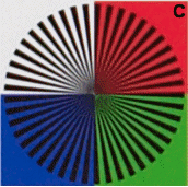
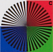
Here are the resolution crops just as they came out of the cameras with no
resizing or tweaks other than a click on white to fine tune white balance. If you are wondering about
the reds, the SD14 appeared a bit weak on the reds while the 5D had a little too
much punch in the reds. The actual red was somewhere between the two. Neither camera was perfect with
respect to color accuracy under my mixed lighting but it was of little consequence for
this test. Images from the 5D are labeled "C" for "Canon" and images from
the SD14 are marked "S" for Sigma. Here, the SD14 images will obviously
appear smaller because the SD14 produced final photos that are about 4.6 megapixels compared to the 5D's 12.7 megapixels.
Notes on the setup:
- Canon 5D using 24-70 f/2.8 L lens at mid zoom
- Sigma SD14 using 18-50 f/2.8 lens at mid zoom
- Both cameras set to f/5.6 aperture
- Resolution chart framed the same way and covering the same area of the
image in both cameras
- Both cameras shot raw: processed in SPP 3.0 (SD14) and
Bibble 4.9* (5D)
- In-camera JPEG's produced nearly identical results (not shown) for both
cameras
* Also tried Canon's DPP 2.0 for 5D and several other converters but Bibble
produced the best resolution.
| Canon EOS 5D |
Canon EOS 5D |
Canon 20D |
Canon 20D |
Sigma SD14 |
Sigma SD14 |
 |
 |
 |
 |
 |
 |
Measured Resolution
| |
Canon EOS 5D |
Canon 20D |
Sigma SD14 |
| B/W |
2100 |
1700 |
1700 |
| Red |
1630 |
1400 |
1700 |
| Green |
2000 |
1680 |
1700 |
| Blue |
1750 |
1480 |
1700 |
| Yellow |
1950 |
1600 |
1700 |
| Magenta |
1800 |
1500 |
1700 |
| Cyan |
2000 |
1700 |
1700 |
| Average |
1890 |
1580 |
1700 |
The resolution values listed above represent the point at which the lines
begin to blur/distort at any point around the arc of the circle. Imagine
placing the pin of a protractor at the center of the chart and drawing
concentric circles with the pencil starting at the outside edge of the chart and
moving in. As you move in, the first point where your pencil-circle meets
any lines in the graph that are blurred/smudged together, stop and the
resolution can be measured at that point. Of course, since these are
photos, we do this by using a photo editor and drawing circles digitally to see
where the blurring/smudging starts. Since there are some heavy handed
interpolation algorithms involved in reconstructing full color images from Bayer
cameras like the 5D, it's a good idea to look at the resolving power at many
angles and not just the horizontal, vertical, and 45 degree angles you see in
the typical ISO-12223 resolution charts posted on digital camera review sites.
As expected, the 5D takes the lead on resolving power for B/W, but it also
steps ahead on green, yellow, and cyan detail. The 5D's lead starts at
about 24% for B/W detail but that advantage drops to about 18% when capturing
green, yellow, and cyan colors. Due to the lack of a green component, the
5D's lead drops to only a 6% advantage for magenta, less than a 3% advantage for
blue, and actually falls behind to a 4% deficit when capturing red colors
which seem to be the worst case scenario for Bayer sensors. Why?
While red and blue sensors are spaced identically on the sensor and one would
expect the same resolving power for red and blue, blues fair a bit better simply
because they often carry a weak green component, meaning that it is easier to
find reds with no green component than blues with no green component.
While on average, the 5D does seem to have a 10% to 15% advantage in
resolving power, by the numbers (megapixels in the final images), you'd expect a
65% advantage in all directions. The use of antialiasing filters and the
complex color reconstruction algorithms are the primary reason that the 5D
cannot realize the full 65% advantage. It is also important to note that
while in some cases, the 5D pulled better max resolution than the SD14, the
detail at that cutoff point was often very soft due to the amount of
interpolation going on. In contrast, the SD14 was able to carry sharp
detail all the way to its max resolving power, however, as a result of the lack
of "smoothing" being done, the SD14's tradeoff was an increase in aliasing at or
beyond max resolution. A tradeoff for sure. The worst part of the
test for the 5D is that with resolving power varying by as much as 25% for some
colors, the eye can pick up on the fact that some detail in the photo just isn't
as sharp as it should be when the photo consists of subjects with widely varying
color. The SD14's consistent resolving power give photos a more 3D
appearance. It is important to preserve the relationship between detail,
sharpness, and depth-of-field throughout the photograph and this is where Bayer
cameras fall behind by not being able to reproduce the same realism as a full
capture sensor under many shooting conditions. This effect is quite
noticeable on the tests above as well as in real shots. If you look at the
RGB chart for the 5D versus the SD14, the 5D makes the red and blue swatches
look as if they are disconnected from (either in front or behind) the rest of
the chart due to the obvious inconsistency in sharpness. The SD14 shows
consistent sharpness all the way around as it should, and you can tell that all
colors are on the same piece of paper.
|
|
|
|
|
4099
|
Technical Discussions / Articles / April 2007: Delicate Balance: WB and your Camera
|
on: May 27, 2009, 02:04:35 PM
|
Delicate Balance: WB
and Your Camera
Background
White balance can have a
dramatic effect on your photos and the effect can be good or bad
depending on how accurate the white balance was for a given shot.
Let's take a quick look at this important but often ignored aspect of
digital photography.
What is white balance?
Different types of light cast a
different overall color onto objects. Incandescent (standard)
light bulbs produce a warm, reddish light while fluorescent light tends
to produce a cooler green-blue color. The "color" of the light
source is often referred to as the "color temperature" with red being on
the warm end of the spectrum and blue being on the cool end of the
spectrum. Our eyes easily adjust to this difference so that a
white piece of paper looks white under any color light, but cameras are
a bit different. If the "raw" image data is viewed without
compensating for the color of the light source itself, a white piece of
paper will look red under warm lighting and blue under cool lighting.
We compensate for light sources with
different color temperatures in photographic images by balancing the
red-blue shift. If a sheet of paper appears in the photo, for
example, and we know the sheet of paper is white, we can apply a
red-blue bias to force the paper to be white and in doing so, the
remaining colors in the photo will fall into place nicely. White
balance basically amounts to adding/subtracting red or blue in the image
until the red, green, and blue channels are equalized for neutral (gray
or white) objects.
The balancing act
At this point, it may sound simple to
just pick a neutral object in the photo and just rebalance based on
that. Some photo editing software offers a "click to balance"
option where a dropper is used to click on a neutral object. My
own Qimage software
offers this ability in the batch filter, for example. By clicking
the dropper in the "White Balance" section and then clicking on a
gray/white object in the photo, the entire image is rebalanced to remove
color casts caused by improper white balance. A white shirt with
RGB 200,225,245 will have a strong aqua/blue cast indicating a white
balance error. Clicking on the shirt to rebalance will bring the
shirt to RGB 225,225,225, making the shirt look white instead of blue by
increasing the red channel to match the green channel and decreasing the
blue channel to match the green channel. Why is the green channel
not altered and only the red/blue channels changed? Because the
green channel is generally considered the luminance or "brightness"
channel. While technically the green channel is certainly not
strictly brightness, it doesn't tend to shift like red and blue due to
differing color temperatures.
After-the-fact balancing
By now, you may be thinking that this
whole balancing act is no big deal. Just set the camera to
automatic white balance (AWB) and hope it gets it right. If not,
just click on a neutral object later and rebalance it or use curves to
adjust manually. While that will correct color casts caused by the
white balance error and will restore neutrality, there are problems with
readjusting WB after the fact. If you are shooting in JPEG capture
mode, your photos are being developed inside the camera. That
means the camera has already decided how to process color based on the
information available when the shot was taken. This color
processing takes white balance into account and creates colors as they
would appear assuming WB is correct. If you shift WB later, you
can no longer benefit from the camera's complex color processing that
must be done based on a correct WB reading and as a result, there may be
some unwanted (but usually subtle) color shifts such as reds looking too
orange, blues looking purple (or vice versa) and so on. If you are
shooting in raw capture mode, this is less of a concern because WB can
generally be corrected in the raw developing software, allowing the
photo to be re(color)processed based on the change in WB. With
already-processed JPEG's, it is impossible to remove the original color
assumptions that were made based on an inaccurate white balance.
Getting it right from the
get-go
By far the best way to minimize
unsightly colors is to make sure that white balance is set properly on
the camera so that the camera knows the color temperature of the light
source(s). We do this by either setting a custom white balance or
setting a manual WB setting on the camera. No matter what camera
you are using, you will find (lighting) situations where the camera is
easily fooled and you'll end up with horrible color casts.
Shooting under mixed indoor lighting often fools cameras as do shots of
subjects that are biased toward only one or two colors such as green
grass or red leaves where there is no white reference in the frame for
the camera to "lock" onto. When shooting fall leaves in sunlight,
for example, it is best to set your camera's WB to "sunlight" manually.
Most cameras assume a "gray world" when trying to calculate white
balance automatically and scenes that are predominantly one color or
have no neutral/white references in the frame easily fool these AWB
algorithms.
There is no substitute for getting WB
correct at shooting time and the most accurate method of setting WB is
to use the "custom" WB setting provided your camera offers that option.
Using custom WB amounts to shooting a white object as a reference and
then shooting remaining shots normally. It helps to carry a white
piece of paper, white card, or gray card, but other objects can be used
as well such as white shirts, a white door, concrete driveway,
chrome/silver objects, etc. Normally you are only required to have
the white/gray object cover the center metering circle in the camera's
viewfinder so the white/gray object need not cover the entire frame.
While this may sound impractical, you may be surprised how much of an
improvement it can make to your photos. As long as your lighting
isn't varying as you shoot, you can pick any object that happens to be
under the same lighting as your intended subjects, take a custom WB
shot, and then shoot the rest of your shots with peace of mind that WB
adjustments will not be necessary later.
Since some objects can often be
misinterpreted as true white, be careful about picking objects that
might have a slight color cast and may throw off your WB a bit. If
using paper to set custom WB, use a plain sheet of copy paper as many
high quality photographic papers tend to have brighteners that actually
color the paper slightly blue. An idea that may make custom WB
easier is to take a heavy weight sheet of white paper and cut a circle
to the size of the inside of your lens cap for your camera. Place
it inside the lens cap and in a pinch, you can remove the lens cap and
hold it a foot or so in front of the camera, then take a shot of the
paper in the cap to acquire the custom WB. Check your manual, but
remember that most cameras only require that the white reference cover
the center metering circle in the viewfinder, making the round paper in
the lens cap work nicely for this situation.
Summary
It is true that some photographers
don't mind "tweaking" photos to get each one just right, but no one
likes guesswork and unless you happen to know exactly what light source
was being used, guesswork is what you'll be faced with trying to fix WB
after the fact. Take the extra few seconds before you shoot to set
your white balance appropriately in-camera. Take a few seconds to
shoot a white object and set a custom white balance if you have a known
white or gray object as a reference and it could save you a lot of
frustration trying to fix color problems later. If you shoot in
JPEG mode as opposed to raw, getting white balance right up front is
even more important as subtle color errors can occur if the JPEG images
are developed with the wrong assumption for white balance.
Automatic white balance can do a decent job but it is easily fooled by
complex lighting conditions or certain subject material and even small
errors in WB can cause a significant change to the overall look and feel
of a photo. White balance is one shooting parameter that is worth
getting right before you shoot!
Mike Chaney
|
|
|
|
|
4100
|
Technical Discussions / Articles / March 2007: High Def Talk Part II: Content
|
on: May 27, 2009, 02:02:34 PM
|
High Def Talk Part II:
Content
Background
Last month we talked about
high definition TV monitors and how to get started by choosing the right
HDTV equipment. This month in part 2 of 2, let's take a quick look
at high definition content to see what is available as far as getting
high definition signals to your new HD home theater.
Through the airwaves
Perhaps the most accessible way to
get HD content is to subscribe to a satellite provider that offers HD
content. Unless you live in an apartment (and sometimes even if
you do), you're likely to be able to get satellite TV because satellite
TV is available to almost anyone provided you are not surrounded by tall
trees that block the satellite signal based on where on your house (or
in your yard) you can install the receiving dish. Since satellite
TV depends on "line of sight" transmission, it doesn't depend on other
services (like cables) being installed to your house. While
federal law grants you the right to install up to an 18 inch dish even
if you are in a subdivision with covenants/bylaws, there may be some
local restrictions, so check with the provider you are considering to
see if the satellite TV service can be installed in your location.
Of course, if you already have one of these services, just call or visit
their web site to inquire about getting upgraded equipment and
subscription plans for HD content. Below are the two major
satellite TV providers:
-
Dish Network: Dish Network offers one
of the most comprehensive high definition packages on the market as of
this writing as they (relatively) recently took over VOOM satellites
which are dedicated to HD content. If you are looking for the most
HD channels, Dish may be your best bet at this time regardless of what
other services may be available to you. To see what Dish Network
has to offer in the way of HD content, click
this link. You can contact Dish Network from their web site to
find out if you can receive Dish Network programming from your location.
A visit to your home may be required to determine if the satellite
dish(es) can be located/aimed from your home/property. You may
also wish to inquire as to whether or not Dish Network carries your
local TV channels in high definition and if they don't, whether it is
possible to receive these channels OTA (over the air) via an antenna at
your location in addition to the satellite dish(es). While
visiting the web site, you can check plans/pricing as well.
-
DirecTV: DirecTV has fewer HD
channels than Dish, but they do plan to add more and even launch more
satellites to carry more content at some point. Details on timing
are sketchy/speculative at best. To see what DirecTV has to offer
in the way of HD content, click
this link. You can contact DirecTV from their web site to find
out if you can receive their service from your location. A visit
to your home may be required to determine if the satellite dish(es) can
be located/aimed from your home/property. You may also wish to
inquire as to whether or not DirecTV carries your local TV channels in
high definition and if they don't, whether it is possible to receive
these channels OTA (over the air) via an antenna at your location in
addition to the satellite dish(es). While visiting the web site,
you can check plans/pricing as well.
In addition to satellite TV
providers, most areas that have access to broadcast TV via the old
"rabbit ears" also now have digital broadcast TV. OTA (over the
air) channels will be limited to what you can receive as far as the
major networks from local stations (ABC, CBS, NBC, Fox, PBS, etc.).
See
last month's article for information on receiving HD over the air
and to find out whether or not there are digital channels in your area.
While over the air choices/channels are limited, once you buy the HD
tuner box (if your TV doesn't already have one), you can receive content
for free. Believe it or not, over the air HD signals are some of
the highest quality you'll experience because they are typically less
"processed" than HD content that goes up to a satellite or to a
cable/fiber provider and is re-encoded for viewing. Don't think
noise and snow when you think about over the air high definition
broadcasts as they are just as "digital" and often even cleaner than
other providers.
Wired/fiber HD content
If you live in an apartment or other
location where satellite dishes are not an option, the next logical
option is a cable/fiber service that delivers HD content via a physical
cable to your residence. Most cable companies offer high
definition packages, but be aware that many cable providers only offer a
handful of channels so check their web site or call them to be sure
exactly what channels are offered in HD. Also be aware that with
cable, some of your (non HD) channels may be "analog", meaning they are
not digital and can be susceptible to noise/snow just like an old TV
with rabbit ears. "Digital Cable" often means that only a portion
of the channels are digital and noise-free while many are still the old
analog format. If you want to know which channels are digital
versus analog, just check with the cable company or their web site.
One of the most promising "cable"
services is Verizon
FIOS. FIOS is Verizon's fiber optic answer to local cable
providers. They offer a very good selection of HD channels and
also offer (extremely) high speed internet that beats just about
anything else available for residential customers. Unfortunately,
if you are reading this article any time close to when it was written
(March 2007), there is more than a 90% chance that you cannot get
Verizon FIOS where you live as its availability is very sparse right now
due to the necessity to install fiber optic cables to every location
where it is being offered. You can enter your phone number on the
web site above to find out whether or not you can get FIOS. Note
that FIOS TV and internet are actually separate services but if you can
get FIOS, it is likely you'll be able to get both: high speed internet
and TV.
Hardware for
satellite/cable HD content
These days any company who offers HD
content via satellite or cable also offers equipment that allows you to
receive the HD content and send it to your TV (monitor). The most
common setup is an HD DVR (digital video recorder). For those
familiar with Tivo, you'll know what these are. They are simply a
decoder box with a hard drive inside that allows you to record HD
content for later playback. Many offer nice features like passes
where you can record all episodes of a certain show automatically, even
if the times change, etc. An HD DVR is the best way to enjoy
broadcast HD content as you can pick the shows/movies you want and you
get to pick the time you watch them. Be aware that most services
offer to rent the DVR for a small fee assessed on your monthly bill so
many times you don't have to pay a lot for the equipment.
Other hardware: HD
DVD and Blu-Ray
HD DVD and Blu-Ray are the next
generation digital media format. Both the size of a standard DVD,
they hold as much as 10x or more data and therefore support HD content.
Unfortunately, the "format war" is still ongoing and there is no clear
winner amongst these two competing HD disc formats. That's part of
the reason why not all newly released movies are available in HD DVD or
Blu-Ray even though most of the mail rental services do allow you to
rent the ones that are available at no extra charge over what you pay
for renting standard DVD's. At the moment, HD DVD players are
about $500 and Blu-Ray disc players are about double at $1000. If
you buy a player that only supports one of the two formats, you'll only
be able to watch movies released in that format and some movies are only
released in one of the two formats. This is especially true for
HD-DVD since Sony owns Blu-Ray and will therefore not allow movies from
Sony Pictures to be released on HD DVD.
There is finally one "hybrid" player
at about $1100 that can play both HD-DVD and Blu-Ray discs but from what
I understand, this first hybrid player is really a Blu-Ray player with
HD-DVD support added almost as an afterthought. Apparently it
doesn't support the full HD-DVD spec as far as being able to use all the
menus/features of HD-DVD. Unless you have deep pockets and just
want to play with a new toy, the word here is still... wait and see.
Good hybrid players with less problems and faster boot up times should
be available within the next year so it still probably isn't the best
time to get into HD-DVD or Blu-Ray.
Do all HD channels
carry HD content?
Well, yes and no. All HD
channels carry true HD content from time to time, but that doesn't mean
that the channel continuously broadcasts nothing but HD content!
Take the major networks for example. Nearly all prime time (that
would be 8:00pm or later here on the east coast) shows on major networks
are now broadcast in high definition including dramas like CSI Miami,
Jericho, etc. and even half hour sitcoms. The exceptions are
reality shows like Survivor or The Apprentice or news/documentary shows
like Dateline or 20/20 where footage is shot with non HD cameras as the
shooting environment is less controlled out in the field. It is
worth mentioning then, that just because you are watching an HD channel
does not necessarily mean that you'll be watching HD content 24/7.
In fact, while many football games are broadcast in HD during football
season, you'll occasionally find some broadcast in SD (standard
definition). Of course, major sporting events like the Super Bowl
and the Daytona 500 are broadcast in HD and the best part is, if you
have an OTA (over the air) tuner, you can receive these broadcasts in
all their glory for free with just a table top or rooftop antenna
provided you are close enough to a TV station/tower.
Summary
In this short article, we've taken a
look at the major players involved in getting the high definition
content you need delivered to your home. A big part of enjoying
your new high definition home theater is being able to get actual high
definition content on your system. More and more HD content is
becoming available and it is certainly no longer true that having a high
definition TV doesn't make sense because there isn't any good HD
material. The material is there for the taking and it's getting
better all the time!
Mike Chaney
|
|
|
|
|
4101
|
Technical Discussions / Articles / February 2007: High Def Talk Part I: HD Displays
|
on: May 27, 2009, 01:59:58 PM
|
High Def Talk Part I:
HD Displays
Background
Let's take a break from
cameras, computers, and printing for a bit and take a look at high
definition television and home theater. After all, those of us who
are interested in the best photographs, camera equipment, computer
equipment, and printers are often interested in getting the best picture
when it comes to home entertainment as well. I find it interesting
when I meet photographers who have some of the most expensive
photographic equipment, claim to be home theater or AV (audio-video)
fans, yet are still watching a 54 inch big screen TV from the late 80's
or early 90's. I've even heard the phrase: "My DVD's look great.
How much better can it be?" I'll try to answer that question in
this article that is geared toward those of you who have not yet made
the leap to HDTV and might be wondering if it is time. If you are
an "HD nut" who frequents
avsforum,
you'll likely get very little out of this article as you are already
ahead of the curve.
SD versus HD
What is "high definition" and how
does it compare to "standard definition"? Broadcast TV, based on a
display format that was conceived in the 1930's in black-and-white and
later modified to carry color video in the 1950's, offers a resolution
of about 330 x 245 pixels. SD or "standard definition" is a
relatively new term that refers to a digital video format
of approximately 640 x 480 pixels interlaced (480i). While this is
better than the old broadcast standard (and is the reason why standard
DVD's look better than TV), 640 x 480 is not nearly enough resolving
power for the larger (36 inch+) sets used in home theaters. Just
walk up to anyone who is digital photography savvy and tell them that
you are thinking about printing a 36 x 24 inch print from a 640 x 480
shot taken with a cell phone. When they're finished laughing and
finally get up off the floor, realize that you're doing almost the same
thing by watching that 640 x 480 DVD on your old 54 inch TV!
If you live in an area where you are
able to get local TV stations on a television with a "rabbit ear"
antenna, chances are you already have high definition signals coming
through the airwaves to your home. You simply cannot watch them
because you don't have a high definition set. High definition
comes in two basic formats: 720p and 1080i. 720p is 1280 x 720
resolution and pixels are displayed progressively so that all 920,000
pixels are displayed in each frame. 1080i is 1920 x 1080
resolution but it is interlaced, meaning that only the odd or even lines
are displayed with each frame. A newer format, 1080p, is now being
supported in many displays but as of this writing, there is very little
content that is actually available in the 1080p format so most of the
1080p sets just take a 1080i signal and deinterlace it. Still,
1920 x 1080 is 2 million pixels of resolution. Compare that to the
640 x 480 (300,000 pixels) available on a standard DVD. The best
high definition material is over 6 times the resolution of a standard
DVD.
In the eye of the
beholder
It's difficult to describe how much
better HD is when compared to SD. You simply have to see it for
yourself. Many compare HD to the feeling of looking through a
window at the actual scene. The clarity, texture, and dynamic
range are amazing. So much so that once you get used to HD, it is
difficult to watch SD! I'm so used to HD now that whenever a
football game is broadcast in SD, I literally cringe. SD looks so
out of focus and so devoid of detail that it almost gives me a headache
when I watch something with a lot of action like a sporting event in SD.
Of course, these don't look nearly as good as a DVD due to compression
artifacts and the re-processing involved with broadcast SD signals on
satellite or digital cable. Upsampled DVD on an HD monitor can
actually look nearly as good as high definition even though, technically
it is not high definition: most likely 480p (640 x 480 or 720 x
480 progressive). When asked to describe HD versus SD, you'll
likely get a different answer from everyone you ask but there's nothing
like the first time you see true HD material on a true HD set.
It's something you'll never forget!
"Fake" HD
As we know, "high definition" refers
to a video format that consists of either 1280 x 720 pixels or 1920 x
1080 pixels. If you walk into a store and they are piping video
from a standard DVD player through their sets, you'll know immediately
that you are not looking at anything high definition because DVD's are
480p (640 x 480 resolution) and are therefore not considered high
definition. Technically, 480p is considered EDTV (enhanced
definition TV). EDTV is actually a major advance over SDTV, but it
still falls short of high definition. Be aware of sets that are
marked EDTV. If it is marked EDTV, it is not a high definition
set. Some smaller plasma TV's are EDTV as are some sets marked
"high definition compatible". High definition compatible is often
used to indicate that the set can decode an HDTV signal, not that the
set itself is HD! Suffice it to say that if you are in the market
for an HDTV, make sure the store where you are evaluating the sets is
piping a true HD signal to the sets and that the set itself is truly HD.
Display types
Different types of displays (LCD's,
plasmas, DLP's) have their advantages and disadvantages. Any true
HD set you buy today will certainly look many times better than a
standard TV, but what type of set is right for you? Let's take a
quick look at a few of the most popular display types and look at their
advantages and disadvantages.
Plasma: Plasma televisions are
actually not that dissimilar from older tube sets. They use
phosphor just like the old tube sets. The difference is in how the
phosphor is excited (lit). In a CRT (tube television), a beam of
electrons scans the phosphor, lighting "pixels" in sequence. In a
plasma TV, the phosphor is lit with individual electrodes under each
pixel. The obvious advantage is size. Since plasma TV's
don't need any projection, they are made as flat panels that are very
thin and can be hung on walls or used in cramped spaces. Plasma
TV's are some of the most vibrant sets with excellent dynamic range
(rich blacks and bright whites) and are currently the best technology on
the market for viewing at an angle, as plasma televisions don't fade
when viewed off-center. Almost all consumer plasma sets as of this
writing use the 720p HD format. That is, they have a resolution of
about 1280 x 720 pixels for plasma sets 46 inches and larger. Due
to limitations in the plasma technology, 1080p (1920 x 1080 resolution)
plasma sets are just now being introduced to the marker in sizes under
60 inches, so if you are looking for a plasma set that is 60 inches or
smaller, you'll be getting a 720p set unless you want to pay $10,000 or
more. Burn-in, where static images can be "burnt" into the screen
permanently, is not much of an issue on the latest plasmas but you
should avoid static images as much as possible during the first ~100
hours of operation. In addition, if you plan to do a lot of video
gaming, an LCD may be a better choice because static images like radars,
scores, and health meters can eventually be burned in if left on a
plasma screen for extended periods of time.
LCD: For years, LCD (liquid
crystal display) televisions have struggled to compare to plasma TV's.
The most recent LCD models have all but caught plasma TV's on every
front except off-angle viewing. Today's LCD's offer less fade when
viewing from an angle, are brighter, have better blacks (better dynamic
range) and have better response times, meaning that they don't "blur"
fast moving objects like older LCD sets. In addition, it's easier
to manufacture smaller LCD screens (under 60 inches) with a higher pixel
count compared to plasma TV's, so there are a fair number of 1080p (1920
x 1080 resolution) LCD sets available at the 55 inch and smaller sizes,
making them boast higher resolution than plasma sets. There is
still some color and contrast fade when moving to off-angle viewing, but
the very latest models show a lot of promise here, with very little
noticeable fade when viewing from an angle. Things tend to change
quickly as far as display technology, but as of this writing, some of
the latest 1080p 50 to 55 inch LCD sets top the list as the highest
quality HD sets available with the least number of drawbacks (such as
uneven lighting, ghosting, "hot spots", seen with many projection type
TV's)! Like plasma displays, LCD's are flat panels that can be
hung on a wall and they are often even lighter/thinner than plasmas.
Screen burn-in is not an issue with LCD displays, making them the
display of choice for gamers.
DLP: DLP (digital light
processor) televisions have been around for about a decade. They
are a form of rear projection television that uses tiny mirrors to throw
light on the front screen. These sets are not flat panels and are
therefore a bit bulkier than plasma or LCD TV's, but they can be very
cost effective. They tend to be cheaper than plasma or LCD sets of
comparable size and they do offer an excellent picture. I'm not a
big fan of projection televisions as they tend to produce a less evenly
lit picture and my eyes are quite sensitive to blooming, color
inconsistencies, fade, and the "rainbow effect" that you can sometimes
see on DLP sets. Any projection set will tend to be a bit less
sharp than a flat panel set due to the fact that light is being "thrown"
at a distance rather than being created at specific points on a static
(non moving) panel. As with LCD panels, screen burn-in is
generally not an issue with DLP displays.
SXRD: SXRD, short for Silicon
X-tal Reflective Display, is a Sony acronym for a technology known as
LCOS (liquid crystal on silicon). It is similar to DLP in that it
uses a reflective surface but instead of using mechanical mirrors,
liquid crystals are used to reflect the light from the projector onto
the front screen. Again, this is a projection TV so it is not a
flat panel and will take up more space than a plasma or LCD TV.
Sony SXRD sets typically have a better picture than DLP sets and some
people believe they have a "film" or "movie theater" look unrivaled by
any other display type. As I mentioned under DLP, I'm not a fan of
projection TV's just because I'm sensitive to the contrast and color
fade that occurs when viewing projection TV's at an angle. I also
miss the silky smooth uniformity of plasma and LCD sets when I have to
move (walk) in front of a projection set as I can always detect the
bright spot from the projection lamp(s) moving across the screen with me.
Others may prefer SXRD technology over plasma and LCD due to the
film-like look appearing less like "pixels". Here again, beauty is
in the eye of the beholder. Since SXRD displays are basically LCD
on silicon, they generally do not suffer from burn-in.
Bottom line: The bottom line
on choosing a display is to first determine whether or not the display
is truly high definition. To be high definition, the display must
have 1280 x 720 pixels or more and should have an "HD" logo. Stick
to models marked HDTV and shy away from models marked EDTV. When
you have limited your search to HD displays, let your eyes be the judge.
Different people look for different things in a display. Some pay
more attention to contrast and saturation while others are more critical
of resolution, pixels, and sharpness. The real bottom line is that
you should pick the set that looks best to you! Keep in mind that
different display types work better in different environments with
plasma and LCD displays generally being better in rooms with bright
lighting (sunlight entering a window for example). Once you've
picked your favorite set in your price range, it wouldn't hurt to leave
the store and do a little research. Try Googling the model number
or even the model number and the word "problem" to see if other users
are experiencing any common issues with that set. Sometimes you'll
find complaints of color blooming, ghosting, banding, or other issues
and that may give you some things to double check before you buy.
Any common problems are usually described or displayed with enough
detail that you'll be able to look for the problem in the set you picked
to see if it is an issue for you.
HD Content
Before buying an HD display for your
home theater, it would be wise to be aware of the HD content that is
actually available to you. Broadcast HD is accessible in most
locations in the form of digital cable, satellite, or fiber services.
If you have cable TV, chances are your cable provider offers "digital
cable" that includes at least a few HD channels. Note that the
fact that a channel is "digital" does not necessarily mean that it is HD
(it could be SD just broadcast in digital format), so be sure to ask
your cable provider how many/what channels are offered in true HD and/or
check out their web site. If you are interested in cable HD, some
displays offer a cable card feature, so you might want to check
compatibility of the TV with your cable service, although that is not a
necessity since your cable provider can provide you with an (external)
cable box.
Verizon FIOS is a promising fiber TV
and internet service that has a lot of promise, but it isn't likely to
be available in your area as coverage right now is extremely limited.
To find out if FIOS is available in your area,
check here.
If you live in the boonies and don't
have cable or FIOS service and/or you don't like the selections offered
by those services, there's always satellite TV. Right now,
Dish Network has the greatest
selection and number of true HD channels available in any service
offering high definition content since Dish has taken over the Voom HD
satellite service. DirecTV
also offers HD channels and while they plan to offer many new HD
channels in the next year, their selection of true HD channels is more
limited as of this writing. If you already have one of these
services but you don't get high definition channels right now, you may
need new equipment and you may be required to pay an install fee and a
small monthly fee to access the HD channels. Check the web sites
of the service in question for more info. All services that offer
HD content also offer DVR's that can record HD content as well.
When choosing a satellite provider, find out whether or not they offer
your local (ABC, CBS, NBC, Fox) channels in high definition via
satellite. If not, you may be required to get these OTA (over the
air) with an antenna connected to the satellite receiver.
If you live within say 30 miles of a
city that has local TV channels, chances are you can get some HD content
for free (or at least with no monthly charges). If your display
didn't come with a built in tuner that can handle "over the
air" TV broadcasts, you'll need to buy a tuner that is capable of
receiving high definition broadcasts. What you're looking for is a
tuner that is labeled as an ATSC tuner. In most cases, a good indoor antenna is sufficient to
receive these channels but if you need an antenna, check to see whether
you need a VHF or UHF antenna as HD can be used on both frequency
ranges. To see how far you are from various TV stations and what
type of antenna you need, try visiting
antennaweb. You can simply
enter your ZIP code and click "Submit" to see the TV stations near you
and the antenna type/size needed. Note that channels with a
sub-channel (2.1, 11.1, etc.) are "DT" or digital television.
Those are the channels that are broadcast in digital format and are
likely to offer high definition content although the DT designation does
not guarantee that the channel broadcasts HD.
After broadcast HD comes HD content
on other media such as HD-DVD and Blu-Ray. Movies are starting to
be released in the HD-DVD and Blu-Ray formats now and most online rental
services offer the formats at no additional charge over standard DVD's,
but selections are limited and the two formats are still competing with
no clear winner in the format war. In addition, current HD-DVD and
Blu-Ray players can be expensive (about $500 for HD-DVD players and
$1000 for Blu-Ray players) and are relatively slow to start up.
There's also talk of players in the future that may be able to play both
formats, but no "hybrid" players exist as of this writing. Simply
put, it may be best to wait a year to see where these technologies are
going unless you have deep pockets and just want some HD to show off
because you are limited as far as HD content. A good upsampling
(standard) DVD player may be a more cost effective investment until the
HD media markets settle a bit.
Summary
While this article focused on high
definition displays to be used in home theater applications, there is
certainly a lot left untouched. If you are left wondering about
which connections to use, HDMI versus component, audio options, HD-DVD
versus Blu-Ray, backlighting, or other aspects of home theater, those
aspects will have to be covered in a future article. And again,
this article is aimed at those of you who have been wondering if it
might be time to make the leap to HD and some things to look for at the
starting line. Just be warned that if you are easily obsessed,
home theater and "high definition" can be quite expensive. While
my own setup is quite modest, I've seen people spend $85,000 or more on
true home theaters! On the other end of the
spectrum, it is possible to set up a good HD theater for $3,000 with
$1,500 being about the bottom entry point, so there's something for
everyone. To start, try to pick a store that has a home theater
section with a large selection of displays and knowledgeable/helpful
staff. Let them help you but don't let them push this week's sale
on you. Take your time, use the information from this article, and
make the decision that is best for you and I believe you'll find that HD
will quickly become a necessity in your home theater. If you're
reading this article soon after release, you may still have time to get
that HD set for the big game! :-)
Mike Chaney
|
|
|
|
|
4102
|
Technical Discussions / Articles / January 2007: Profiling a Camera with an IT8 Target
|
on: May 27, 2009, 01:57:17 PM
|
Profiling a Camera with
an IT8 Target
Background
I am often asked about
camera profiling in one context or another, and even challenged by other
professionals as to whether or not it is even possible to develop ICC
profiles for digital cameras. As I often say, the answer can be
complex and may depend on many factors, but let's break it down into a few
key points that are relatively easy to understand.
What is a camera profile?
I've done numerous articles in the past about color management and color
profiling, so if you need a refresher on the subject of color management
and ICC profiles, please check out my articles from
August 2004 and
February 2005.
First, it is important to realize
that the only time a custom or "home made" camera profile is needed is
when the camera or raw developing software needs a little help to get
more accurate color. Due to differences in lighting and viewing
conditions, the term color "accuracy" is a subject of some debate since
you are unlikely to be able to reproduce the exact lighting (color
temperature) and exact colors from the original scene. To those
who will be viewing your photos on screen or in print, color "accuracy"
can best be defined as the reproduction looking as much like the
original scene as possible to eyes of the observer. Sometimes cameras add a
little "pop" by increasing contrast and saturation a bit, and that is
normally not objectionable unless it is extreme. What most viewers
object to are noticeable hue shifts: color shifts that make a blue
sweater look purple, a red flower look orange, green grass look yellow,
and so forth.
When hue shifts are significant
enough, viewers may remark that the subject is the "wrong color".
In my 5+ years of developing
Profile Prism, software that can discover the color characteristics
of almost any device to produce ICC profiles, I have developed methods
that allow for accurate profiling of digital cameras, with some caveats
(under some conditions). These profiles can be used to improve
color "accuracy" and reduce or eliminate complaints about color problems
when your raw conversion software falls a bit short. I mention
"raw" because it is nearly impossible to create a usable profile
that works under a variety of shooting conditions when
shooting in JPEG/TIFF mode with your camera. When the camera
stores a JPEG/TIFF, the image has already been "profiled" (in a sense)
by the camera and producing a profile that second-guesses the camera is
usually of little use due to the fact that results/colors are often
inconsistent when shooting in JPEG/TIFF mode under different lighting
and exposures.
Profiling a camera: the
process
In the early days of digital cameras,
it was possible to produce a profile for cameras shooting in JPEG/TIFF
mode mainly due to the fact that some cameras produced gross errors that
could benefit from correction, even if the result wasn't completely
"accurate". Now, most cameras comply reasonably well with the sRGB
color space and many more advanced cameras even offer an option of sRGB
or Adobe RGB as the color space used by the camera. When we have a
relatively recent camera model and/or a color space selection, it is
rarely beneficial to try to develop ICC profiles for the camera shooting
in JPEG/TIFF mode because it is difficult to impossible to produce corrections
that result in any consistent improvement. If we shoot in raw
mode, however, most raw conversion tools offer an option to turn off
color management so that custom ICC profiles can be created/used. With
color management turned off, the raw data offers a much more consistent
starting point, and profiling becomes not only possible, but often quite
beneficial.
The process, at least conceptually,
is very simple. Take a shot of a color target in raw mode, develop
the raw image with color management turned off in the developing
software, and use a profiling tool to create a profile from the image of
the target. The profile can then be activated in the raw
developing tool. That said, the actual process itself can get a bit
complex if we want to ensure a quality profile. You need to get a
good shot of the target under good lighting, and you need to use a
profiling tool like Profile
Prism that was designed with camera profiling in mind as camera
profiling requires specialized options like the ability to normalize
tone curves and let the device dictate white balance. There are
other high-end (read expensive) tools that allow you to develop camera
profiles. These tools offer specialized targets and software, but
I find that with some care, it is possible to match or even exceed the
performance of these "high dollar" tools with Profile Prism and a
standard IT8 target!
The problem, the
solution
Before we start with the details, it
is appropriate to inject a bit of reality here. Many raw
developing tools, while they are designed to produce the best color
possible, just weren't built using any real "scientific" means for color
accuracy. Some use a simple color matrix to tweak color so that it
looks acceptable and many don't employ reasonable tone curves to ensure
good shadow detail. In layman's terms, this is the reason that it
is often possible to develop ICC profiles for raw images that result in
better color reproduction than the raw tools offer out-of-the-box.
If we can develop a profile that
improves color over the "default" color reproduction of the raw
developing tool, we can say we have a successful/useful profile.
Some may question whether or not it is possible to develop a single
profile that works under all lighting conditions, or whether it is
imperative to develop one profile for each lighting condition: sunlight,
fluorescent, incandescent, mercury vapor, etc.. Again, the true
scientific answer here can get complex, but I've found that when
profiling the true raw data, a "generic" profile can be developed using
direct sunlight. As lighting conditions (color temperature) shift
from direct sunlight to warmer lighting such as incandescent lighting,
the profile will become less accurate but the shift is not normally so
extreme as to cause gross errors. This is, in part, because the
color filters used on the image sensor aren't changing under different
lighting. Their overall response is the same under different
lighting and color temperature only affects the proportions of red,
green, and blue recorded by the sensor. A good profiling tool can
discover the overall color characteristics of the sensor which tend to
be valid over a wide range of lighting conditions. Here, the closer you can
get to the actual raw data the better, because up-front color
corrections only tend to multiply color shifts, so a raw tool that
offers the ability to process the raw data without injecting color
corrections will work best.
While some may choose to develop
different profiles for different lighting, and that's certainly optimal,
a generic profile for sunlight should work under a variety of
conditions. Shooting the IT8 target in direct sunlight helps to
reduce any metamerism of colors on the target and ensures a good match
to the data file that tells the profiling software what the color on the
target should look like. Shooting in direct sunlight also offers
the ability to eliminate glare as the IT8 target is a glossy target
that, when not shot under the proper conditions, can certainly produce
glare which will make the profile useless.
Shooting with the light hitting the target at an angle is imperative to
eliminate glare/reflections and due to the fact that our light source
(the sun) is so far from the target, we don't have to worry about the
light being brighter on the side of the target closest to the sun as we
would with angled studio lighting!
Here's how to shoot an IT8 with no reflections or glare:
-
Of course, a lot depends on your
location and the time of year, but in general, the best time to shoot
the target is either 1-2 hours before mid-day or 1-2 hours after
mid-day. Try to shoot on a day with minimal clouds so the sun
isn't changing intensity/color as you shoot.
-
It is helpful to attach your IT8
target to a piece of thick cardboard using small tacks or pins at the
corners or even tape at the corners as an IT8 will tend to curl and bend
when it heats up in sunlight.
-
Try to find a room where light is
entering a window/door at a sharp angle and hitting a wall adjacent to
the window. If you can open the window to reduce lighting
variations caused by the glass, all the better! Here in the
northern hemisphere, a south facing window often works well in the
afternoon. If the sun doesn't hit a wall, a palette, chair, or
other object may be used to place your cardboard w/IT8 in the sun.
-
Make sure the room is as dark as
possible and that the only light entering the room is coming from the
window. Also try to avoid the direct sunlight hitting bright
colored (non-neutral) surfaces such as red walls, blue floor tiles, etc.
as these reflections can cause color shifts on the target.
-
Place your target in the sunlight so
that the sun is hitting the target at an angle and you can sit in the
shadows while taking the shot. The following is a typical setup
for shooting an IT8 target in direct sunlight. Notice how the sun
hits the target at a sharp angle so that the camera can sit in the
shadows, thereby eliminating glare on the target:
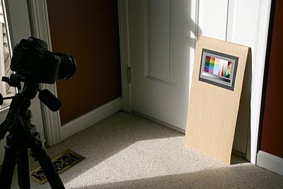
-
If your camera has a custom white
balance feature, using a white/gray card or a white sheet of copy paper
(don't use photo paper with brighteners), place the card at about the
same location as the IT8 and make sure it is in the sunlight. Use
the custom white balance on your camera to white balance on the card.
-
Take several shots of the target in
raw mode. Take one "normal" shot and then increase exposure
incrementally, taking several more shots with brighter exposures making
sure to stop just before the exposure gets "blown out" in the
highlights. Camera settings like aperture usually have little
influence, but smaller apertures often produce more even lighting across
the frame. Note that camera lens and ISO speed can make a slight
difference in profiling, so be sure your ISO speed is set appropriately
and you are using your most-often-used lens. If you and/or the camera are sitting in the shadows of
the room, you can take the photo straight-on at the target and you
should get no glare or reflections. When taking the photos, fill
only about 3/4 of the frame with the target. Don't zoom in so far
that the target covers the entire frame because light falloff from the
edges of the lens can be a factor here.
Once you have the shots of the
target, turn off color management in your raw developing tool and
develop the photos. Depending on the raw tool you are using,
turning off color management may entail selecting a color management tab
and selecting "Embed camera profile", or selecting "None" in the "color
management" dropdown. Whatever you do, the important thing to
remember is that you need to be able to turn off color management to
develop the profile. Then, once you are done creating the profile,
the profile can be activated in the raw tool by selecting the ICC
profile that you created. Of course, this assumes that the raw
tool you are using allows selection of custom profiles. Not all
tools allow use/application of custom profiles so be sure the tool you
are using has this feature. The more popular third party tools
like Bibble,
Capture One, and (the now discontinued) RawShooter allow the use of
custom profiles. When developing the images, develop to TIFF (you
can use 8 or 16 bit/channel TIFF format).
In Profile Prism, click "File",
"Open" and open one of the developed images of the IT8 target.
Next, make the following selections on the Profile Prism main window
(description and file name are just an example):
| Parameter |
Set to |
| Type of device to profile |
Camera/scanner |
| Reference target |
Choose the file for your IT8 target |
| Profile description |
Something like "Canon 5D Generic" |
| Printer target |
N/A |
| File name |
Choose a name like canon-5d.icm |
| Profile for |
Highest Accuracy |
| White balance |
Device dictates WB |
| Tone reprod. curves |
Normalize |
| All other options |
"Normal" or zero (0) |
The above parameters are appropriate
for profiling a camera. Once you have set all the parameters, mark
the 4 corners of the target on the image of the IT8 target. The step by step
procedures for profiling a camera or scanner in the Profile Prism help
will show you how and where to place the crop markers on the IT8 target.
Once placed, there should be a white punch-out in each of the color
squares on the IT8 including the gray scale at the bottom. If the
punch-outs don't align inside each color square on the target, the
corner markers have not been placed properly. Finally, click
"Create Profile" at the bottom left and Profile Prism will create your
camera profile. You can then test the profile by selecting the
profile in your raw developing tool using the file name you used in the
table above. Once the new custom profile has been set, simply
redevelop the photos and evaluate them for color accuracy/appearance.
Since some raw tools like Capture One
and RawShooter apply some "pre-curves", it isn't possible to profile
based on truly raw data. As such, you may have to create a profile
for each of the exposures (the one normal exposure and several brighter
ones) and then pick the profile that has the tone curve (shadow and
highlight detail) that you prefer. Usually, the best result occurs
when the curves displayed in Profile Prism (after clicking "Create
Profile") end as close as possible to the upper/right corner of the
graph. If the curves end on the top edge or the right edge of the
graph, you may need to try a different/better exposure. Note that
it is best to pick a different shot with a different exposure as opposed
to tweaking the exposure of a single shot in the raw developing tool!
With a little practice, the above process can produce excellent profiles
for any camera shooting in raw mode. The above are the procedures
we used to develop
our own
camera profiles for numerous raw tools. These profiles have
gotten many positive reviews and are often compared to profiles produced
with much more expensive equipment/targets from other sources.
Summary
This article can be described as a
"secrets revealed" on how to create IT8 based ICC profiles for digital
cameras shooting in raw mode using my inexpensive but highly effective
Profile Prism software.
With the right tools and a little experience, it is possible to develop excellent ICC profiles for
digital camera raw photos using a standard IT8 target. It is possible to
rival or even beat results of software/targets costing 10 to 20 times as
much as Profile Prism. Although there are thousands of satisfied
Profile Prism users out there who have created excellent scanner and
printer/paper profiles, some users may have been reluctant to try
Profile Prism for profiling their cameras in raw capture mode. I hope that this article will be helpful in
getting people started who wish to create custom camera profiles for raw
developing tools. While this article has been tailored to my own
Profile Prism software, the techniques can certainly be used by anyone
using any software capable of creating camera profiles. Regardless
of the profiling tool you use, the saying "it can't hurt to try" applies
here. Just remember that the whole point of creating a profile is
to improve color in the developed images, so always evaluate your
results against the "default" color produced by the raw developing tool.
You want to make sure you aren't going backwards, which is a possibility
when developing camera profiles!
Since the initial release of Profile
Prism in 2001, it has been shipped with two targets: a glossy IT8 and a matte target.
We will be dropping the matte target soon and will be shipping
Profile Prism with only the IT8 target as we have found the IT8 to be the
most accurate under all conditions and with the tips in this article,
the matte target should no longer be necessary for camera profiling.
We use some of the most accurate IT8 targets in the industry and I feel
that with a little care, the IT8 can and should be used to profile all
devices: cameras, scanners, and printers. With the proper setup, a
matte surface is not necessary to eliminate glare. While you may
hear words of disbelief regarding the ability to profile a camera,
especially using a standard IT8, just follow the steps outlined in this
article and you may be surprised at the results. Many times,
camera profiling difficulties come from using a tool that doesn't offer
the features (like "device dictates WB" and normalization of tone
curves) needed for camera profiling. We've proven with our own
custom raw profiles that with the right tools and the right setup,
camera profiling can be beneficial and cost effective.
Mike Chaney
|
|
|
|
|
4103
|
Technical Discussions / Articles / December 2006: Hype or Hero Take 2: 16 Bit Printers
|
on: May 27, 2009, 01:52:34 PM
|
Hype or Hero Take 2: 16
Bit Printers
Background
The digital photography
market seems to be heating up with products that boast
"groundbreaking" features not found on previous models. Are these
groundbreaking products all they are cracked up to be, or are they just
hype to get you to buy a new product? Last month we took a look
at the potential of full color capture offered by the Sigma SD14 slated
for release within the month. This month we take a look at 16 bit
printing and the new printers that offer specialized 16 bit print
plug-ins. Do they really offer improved color and/or control?
What are the benefits and drawbacks? If you wanted to print 16
bits/channel, would you know how to do it in order to get the best
results? Let's take a look. Like most things, the answer
isn't simple. In the digital world, it can take a little hype to make
a hero... or vice versa!
8 versus 16 bits
The most common image format is a format that offers 8 bits per channel.
For the typical RGB encoded image, that would mean 8 bits to store the
brightness for red, green, and blue for each pixel in an image.
Given 8 bits per channel, you get values from 0 to 255 to record the
darkest to lightest intensities. Since values of 0 to 255 can be
recorded for all three color primaries (red, green, and blue) separately, the total
number of colors that can be recorded is 256 * 256 * 256 or about 16.8
million colors. Images that contain 8 bits of information per
channel are often referred to as 24 bit images.
A less popular format, but one that
is gaining recognition, is the 48 bit image format. This format is
similar to the 8 bit/channel format, except 16 bits are used to divide
the intensities from dark to light. With this format, you get
values from 0 to 65,535 to record the brightness of the primary red,
green, and blue colors for each pixel. That equates to 65536 *
65536 * 65536 or approximately 280 trillion colors!
All this at a cost of only doubling your storage requirements for each
image. Is it worth it? It certainly can be, but let's dig a
little deeper and try to discover whether or not printers really need
this capability.
The benefits of 16
bits per channel
By far the greatest benefit to 16
bit/channel images and 16 bit/channel processing comes from the initial
image capture, particularly when working with digital cameras that must
conform to a variety of lighting conditions. Having more
"quantization" points in the capture range (65536 versus only 256)
allows for finer gradations between each color and allows the photographer to adjust for capture issues like underexposure
and even overexposure. Ability to adjust for exposure and still
end up with a usable image is very limited when capturing only 8
bits/channel.
Once the initial image capture is
done and exposure, white balance, and other factors have been corrected,
the performance gap between 8 bit and 16 bit imaging decreases
dramatically. Once any initial exposure and white balance issues
have been corrected and the image has been developed (from raw format),
8 bits/channel is almost always enough to get you from the developed
image to print (or to screen) with no ill effects. I refer to raw processing here
because if you record in any other format in-camera: JPEG or TIFF,
you'll only be getting 8 bits/channel from the capture image to start
with and at that point, the benefits of printing your 8 bit images to a
16 bit printer are almost nil. Obviously the best advice is
to shoot in raw capture mode and keep your developed
images in 16 bits/channel if you intend to make the most of your 16 bit printer!
That's not to say that 16 bit printer drivers can't offer any benefits
when printing 8 bit images, but the utility of the 16 bit printer is all
but lost if you intend to send it 8 bit/channel images.
16 bits at print
time
So the big question is whether or not 16 bits/channel is really needed
at print time. All drivers in all Windows operating systems are 8
bits/channel as 16 bits/channel is "foreign" to the Windows operating
system. That means that you will always require a special plugin
to be able to print 16 bits/channel to your 16 bit printer and the
normal "File", "Print" command that you use from your standard photo
editor or printing tool will not be able to utilize the 16 bit
functionality of the printer.
It is worth pointing out that your
monitor will still be running at 8 bits/channel, and you've likely never
had any problems with displaying images on your monitor so why worry
about the printer? The push behind the new 16 bit printers is the
fact that your printer is likely capable of printing some
colors outside the range of your monitor's capabilities and due to this
extended color gamut, you may need more gradations (bits) to render
colors without banding or color posterization.
In reality, there are colors that
your monitor can reproduce that are not reproducible by your printer as
well. It is generally believed that the human eye can recognize
about 10 to 11 million colors. So shouldn't 8 bits be enough since
that gives us 16.8 million colors? Like most things, it is a lot
more complicated than that, as the 16.8 million colors in 8 bit/channel
images are not optimized to match the 10 to 11 million that our eyes
see.
Comparing gamuts
"Gamut" simply refers to the range of
colors that can be reproduced. Your PC monitor loosely conforms to
a color gamut called sRGB. sRGB is a relatively small gamut and
due to its size, 8 bits/channel is enough to represent all colors in the
sRGB gamut without any noticeable banding between colors. While
sRGB is good enough to capture almost all colors that can be rendered by
your monitor, your printer can likely reproduce colors outside the sRGB
gamut: colors that we can see and the printer can reproduce, but will be
"clipped" by the sRGB gamut. If you capture your images
in sRGB color space or develop your raw photos into sRGB color space,
that means you won't be able to print all possible colors that your
printer can reproduce.
Adobe RGB is probably the most
popular gamut being used by professionals. It is a larger gamut
and can therefore capture a wider range of colors, and it is still small
enough that 8 bits/channel is enough bit depth to render smooth color
throughout the gamut. Adobe RGB is
easily large enough to accommodate your monitor, but your printer will
still be able to reproduce some colors that are beyond even Adobe RGB.
When you go beyond Adobe RGB and
start using color spaces with very large gamuts (such as ProPhoto RGB or
Wide Gamut RGB), the gamut is so large that 8 bits/channel may not be
enough and you may start to see banding in smooth but gradually changing
colors such as a blue sky just before sunset. Here, 16 bits can
help because you have more gradations to work with. To put it
simply, spreading 16.8 million colors across a large color gamut may be
spreading things too thin and you may end up with noticeable difference
between "adjacent" colors and that, in a nutshell, is what causes color
banding in areas that should be smooth.
How bad is the problem to start with
though? Is Adobe RGB really inadequate to reproduce your photos on
your printer? The answer to that question depends on many factors
including the colors in the image being printed and the printer you are
using. Generally printers with more ink colors produce larger
gamuts, so printers like the Canon i9900 and Epson R1800 have larger
gamuts just because they have a wider range of ink (colors). Let's
take a look at the color gamut of the i9900 on Canon's Photo Paper Pro
compared to Adobe RGB:

As you can see, there are many colors
in Adobe RGB (represented by the wire frame above) that the i9900
printer (represented by the solid shape) cannot reproduce, but there are
some "slivers" of color that the printer can reproduce that Adobe RGB
will clip. These problem areas where the color space isn't large
enough to hold the color reproducible by the printer are represented by
the small sections of solid surface that poke through the wire frame
above. The biggest problem area is the swatch of
mid-brightness cyan/green on the bottom left above. As you can see
by the area of cyan/green that pokes through the Adobe RGB wire frame,
there are some cyans and greens that cannot be printed using Adobe RGB.
Whether or not this is a problem in your photographs depends on how many
photographs you print that happen to have that shade of super-saturated
mid-brightness cyan and/or green. But wait. It gets even
more complicated. Can your camera even record that information to
begin with? We'll get to that in a minute.
Matching gamuts
The biggest selling point for 16 bit
printers/drivers is that you need more bits to support the larger gamut
of the printers.
Given that the color gamut of the new 16 bit printers isn't really any
larger than current 8 bit 8+ ink printers, it doesn't follow that 16 bits
would be required to support the full gamut of the printer. In the
end, it comes down to selecting a color space that has a gamut big
enough to support all printed colors but not so large that it requires
16 bits/channel to cover the gamut "smoothly". Yes, if you shoot
in raw mode, convert to the super-large ProPhoto RGB, and keep all your
developed images in 16 bits/channel all the way to print, the 16 bit
printer/driver may help. Part of the reason it helps, however, is
that there's a lot of overkill in that workflow.
At first it might appear that you are
losing a good chunk of highly saturated cyan/green colors if you decide to use Adobe RGB for the
color space of your developed images, along with a small sliver of
magenta and yellow. When we dig a little deeper,
however, we find that the color gamut of the camera's image sensor is
even more limiting than Adobe RGB on the cyan/green edge. This is
the color gamut of a Canon 5D Professional dSLR camera. The color
gamut that the camera is capable of recording is the wire frame and the
color gamut of the i9900 printer is the solid shape.
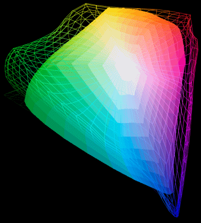
Due to the way CMOS and CCD sensors
are constructed and the light filters that they use, other cameras like
Nikon Professional dSLR cameras have the same limitation on the
cyan/blue edge of the gamut, meaning that you gain almost nothing from
developing your photos into a super large color space like ProPhoto RGB
because your camera cannot capture much more data than Adobe RGB anyway,
at least where it is needed!
What all this boils down to is the
fact that you need to compare the color capabilities of the camera
combined with the reproduction capabilities of the printer itself and
when you do that, Adobe RGB is an excellent match and using anything
larger is really just overkill. For the purist who is worried
about losing a tiny sliver of highly saturated yellow or magenta that
will likely go unnoticed in the few photos that actually contain those
colors, I have developed a color space slightly larger than Adobe RGB
that is designed to cover the entire gamut of today's printers without
being excessively large and requiring the jump to 16 bits/channel.
This printer-optimized color space,
called pRGB (for "Printer RGB") automatically installs in the Qimage
program folder (usually \program files\qimage) when you install Qimage,
so give the Qimage demo
a try as it may help you with color managed printing anyway, and as a
benefit, you automatically get the printer-optimized color space that
works well with any 8 bit printer. If you want to use it for your
other work (like using it in your raw conversion tool or your photo
editor), simply right click on the pRGB.icm file in your Qimage install
folder and select "Install". At that point, you can use that color
space in any Windows application and you can use it the same way you
would any other color space like Adobe RGB, ProPhoto RGB, etc..
Given the fact that 8 bits/channel
is enough for finished/developed Adobe RGB images and enough to
reproduce almost the entire color range that can be captured by your
camera and later reproduced by the printer, I'm going to have to call 16 bit printers/drivers mostly
hype at this time, at least given the current state of printing and
display technology. Shooting in raw capture mode, correcting
exposure/color issues there, developing into 8 bit Adobe RGB or pRGB
images, and printing to an 8 bit driver is all anyone, even the most
critical professional should need.
What about the
reviews of 16 bit printers?
I've seen a handful of reviews on the
new 16 bit capable printers and some reviewers do claim to see some
differences in the 16 bit versus 8 bit output of the new printers.
I've seen some claims of "more vibrant" or "smoother" colors for
example. I'm quite skeptical at this point at the notion that these
differences are really the result of 16 bit/channel capability! I
believe there are a lot of potholes in trying to review these printers.
As an example, I asked one professional photographer to send me prints
from his Canon iPF5000, one done in 16 bit mode and one in 8 bit mode
because he claimed he could see benefits to the 16 bit mode in several
more demanding shots. I did
see that the 16 bit version looked a little smoother in a few places so
I asked him how he printed the two versions. He told me that he
started from a raw image, converted to ProPhoto RGB, and then printed.
Knowing that ProPhoto RGB can show some banding for 8 bit images, I
asked him to go back and convert the original raw image to Adobe RGB and
reprint the 8 bit version. The banding was gone. This was
simply a case of needing to know how to best utilize both technologies
(8 bit and 16 bit) and how to make the most of the 8 bit technology.
I wonder if some reviewers may have fallen into the same pothole and
come to the same (misleading) conclusion.
I will have to say that the 8 and 16
bit versions still looked a bit "different" with respect to slight color
casts and certain colors, but one really didn't look "better" than the
other to me. I attribute the minor differences in look/feel to the
fact that the 8 bit and 16 bit drivers are two completely different
drivers and may handle color just a bit differently. I also have
to wonder if slightly different optimizations in the 16/8 bit drivers alone lead to some reviewers giving the 16 bit
specialized driver the nod over 8 bits. As a matter of interest,
the same raw file when developed into Adobe RGB in 8 bits/channel and
then printed to an older Canon i9900 (which is
not capable of 16 bit printing) produced a print every bit as
good as the iPF5000 print in either 8 or 16 bit mode. While these
tests are hardly definitive, at this
point, logic has to step in and you have to wonder how we've been using
8 bit/channel printers for decades, profiling them in raw (no color
adjustment) mode, using different papers, etc. and have never had a
problem. Yes, sometimes it's hard to realize what you were missing
until you see the new technology, but I'm not seeing any real benefit to
16 bit printing at the moment. As technology on both ends (camera
to printer) improves over time, I may have to revise my outlook in a
future article. :-)
I do think 16 bit printers can make
workflows easier if you choose to go the overkill route all the way (raw
to ProPhoto RGB color space, keeping the 16 bit/channel image format all
the way) because you don't really have to worry
about being careful. That does have some appeal, but as long as
you shoot in raw, do any "heavy handed" manipulation like large changes
to exposure and/or white balance at the raw stage before
you develop, you can still develop to Adobe RGB, print to the standard 8 bit
driver, and get results that are as good as the 16 bit driver plugin on
the same printer. One final thought to keep in mind is that storing
developed images at 16 bits/channel doesn't just fill up your hard drive
faster. It creates added burden at the processing stage as well by
doubling the amount of memory needed to process (interpolate, sharpen,
spool, etc.) and that can result in problems when doing things like
printing very high resolution scans or photo montages or printing large prints. I
think that 16 bit printers are new enough that the jury is still out as
far as the total benefits offered by 16 bit printing. I would
simply caution that changing your entire workflow to 16 bits at this
point simply because you own a 16 bit printer may be a bit premature and
may lead to unnecessary side effects.
Summary
Certainly, we live in a "more is
better" world. Just look at how manufacturers are still able to
sell consumer level cameras with more pixels and pixel counts continue
to increase every year despite increased image noise and a general
decline in overall image quality. Right now, with the current
state of technology considering cameras, monitors, and printers, I
really don't see any real benefit to 16 bit printing over 8 bit printing
when 8 bit printing is done properly. That said, it
can be easier to foul up 8 bit printing and end up with artifacts like
banding and color posterization if heavy editing like exposure
correction or white balance is done at the wrong stage or one tries to
use a super large color space like ProPhoto RGB in 8 bit mode.
The bottom line is that I believe
there will be little or no difference between 8 bit and 16 bit printing
provided you follow an acceptable workflow for both. If you've
been thinking of shelling out a few thousand dollars on a new printer
because it is touting 16 bit printing, my advice is to hold on to your
money for a little while longer. As with anything in the digital
imaging industry, a general consensus will emerge in the next 6 to 12
months about how useful the 16 bit printing really is, and certainly
these new printers (which I'm sure you have noticed will go unnamed in
this article just to be "politically correct") have benefits above and
beyond just being able to print at 16 bits/channel so as more and more
people use them, the benefits and costs will become clear over time.
The handful of 16 bit capable printers offered at the time of this
writing are excellent printers, just don't buy them solely for their 16
bit print capabilities. In closing, I do believe 16 bit printing
capability is a good feature and wouldn't mind seeing it on all
printers, but it certainly should be low on the priority list when
evaluating what you need in a photographic printer as the real world
benefits are quite limited.
Mike Chaney
|
|
|
|
|
4104
|
Technical Discussions / Articles / November 2006: Full Color Capture: Hype or Hero?
|
on: May 27, 2009, 01:49:33 PM
|
Full Color Capture:
Hype or Hero?
Background
You may have heard about
the upcoming Sigma SD14 that offers full color capture, but do you know
what full capture is and what it can do for your photos? Will the
full color capture SD14 set a new standard for digital cameras or will
it be a mere curiosity like it's older siblings the SD9 and SD10 which
developed a loyal following but never quite turned the tables on sensor
design as originally hoped. As of this writing, the Sigma SD14 is
not yet out, but the technology is already in place so let's take a look
at the technical details of full color capture versus single color
capture.
Single Color
Capture
The vast majority of digital cameras including high end professional
dSLR's use an image capture sensor that can record only one color per
pixel. Most sensors use what is often referred to as a "Bayer
mosaic" pattern where the sensor only records one of the three primary
colors (red, green, or blue) at each photo site (pixel). A six
megapixel dSLR, for example, may have a sensor with 3000 x 2000
resolution. One thing that is often overlooked is the fact that
each of those "pixels" on the sensor only records a single color: red,
green, or blue. To make matters even more complicated, single
color capture sensors do not divide their pixels evenly, recording 1/3
red, 1/3 green, and 1/3 blue. Instead, half of the pixels on the
sensor are green while only 1/4 are red and 1/4 are blue. More
green sensors are used because having greater sensitivity/resolution in
green mimics how the human eye captures color. The RGBG layout of
a standard digital camera sensor looks something like this:
Since a 3000 x 2000 (six megapixel)
dSLR returns a full color image with all three colors present at each
pixel, the most obvious question at this point is how we can end up with
a full color image when only one color was recorded for each pixel on
the sensor! The answer lies in interpolation. Digital
cameras and raw processing software use sophisticated algorithms to
predict the missing two colors at each photo site (pixel). As an
example, take a look at a blue photo site somewhere in the middle of the
above graphic. Notice that at every blue photo site, there are
four red photo sites adjacent (diagonally) to the blue photo site.
If all four of those adjacent red photo sites have high red brightness,
it can be "assumed" that the blue pixel will also have high red
brightness. This is a simple example but similar prediction-based
algorithms are used at all other pixels to recover the two missing
primary colors for each pixel until each pixel has all three colors (one
actual, and two predicted). Obviously the algorithms get much more
complicated when surrounding photo sites are not the same brightness,
but the general idea is to "guess" the missing two primary colors at any
given pixel by looking at the color of surrounding pixels. Once
both of the missing primaries have been interpolated for each pixel, the
final full color image has been reconstructed.
Problems with
single color capture
The above single capture Bayer Mosaic sensor is used in nearly all
digital cameras as of this writing. If you are familiar with
interpolation, you probably already know that interpolation comes with
certain drawbacks. Because a single color capture sensor only
captures one of the three needed colors at each photo site, two thirds
of the information in your photos is being "guessed" while only one
third is "real" data! By the numbers, you'd have to wonder how
this even works at all! The answer lies in the fact that our eyes
are more sensitive to changes in detail, edges, and brightness than
changes in color. In addition, the interpolation algorithms used
to reconstruct the missing colors at each pixel have become so advanced
that they actually do a very good job at predicting the missing colors
under most circumstances.
The real issue with single color
capture sensors arises when you have subjects that have colors close to
the primary red, green, and blue colors used for the photo sites on the
sensor. For areas of detail that are black/white, all photo sites
on the sensor will be reacting similarly (will have similar brightness).
This makes it easier for the interpolation algorithm to reconstruct the
image because each photo site will be recording near the same values.
This is why, when reviewers shoot resolution charts, the cameras return
resolution numbers comparable to what you'd expect if the sensor were
actually a full color capture sensor recording all three primary colors
at each photo site.
When the balance of color starts to
shift however, particularly toward red or blue, things start to go
downhill. When shooting a bright red flower with dark red veins
that only "excites" the red photo sites on the sensor for example, you
can see by the graphic above that your resolving power quickly drops to
near 1/4 resolution. This is because the green and blue sensors simply
offer no data (they are black) and only the red sensors contribute data.
The same would be true of a bright blue sweater or blue fabric.
While black/white subjects may be resolved at near full resolution, some
red/blue subjects may fall to near 1/4 resolution and other colors like
yellow, green, orange, etc. fall somewhere in between. Of course,
you don't see this difference as missing pixels: only a loss of
detail/sharpness. The result is that you end up with an
inconsistency in sharpness in photos that makes some colors less
sharp/detailed than other colors, and the visual result is a bit
"flatter" look that some would see as less three dimensional.
The only saving grace for the single
color capture sensor is the fact that it is often difficult to find a
subject that has a color so closely matched to the red, green, or blue
filters on the sensor that the other two primaries receive no data
whatsoever. As an example, the red photo sites on the sensor will
certainly be affected more than the green and blue sites, but most
shades of red will still invoke some type of response from
the green and blue sensors. It is rare to find a shade that
matches so well that the sensor records no information whatsoever at the
green/blue sites. Granted, the lower the brightness recorded on
the green/blue photo sites, the lower detail you'll have to work with
for that red subject and (potentially) the higher the image noise
levels.
For more information on "sharpness
equalization" as a means for correcting loss of sharpness/detail in
single capture sensors, please read my
article at Digital Outback Photo or try the "sharpness equalizer" in
my Qimage software.
Full color capture
and what it can do for us
Released in 2003, the Sigma SD9 was the first camera to offer full color
capture. The sensor, manufactured by Foveon, was touted to be the
next generation in digital camera sensors. Using three sensor
"layers", the SD9 (and soon-to-follow SD10) offered the ability to
capture all three primary colors (red, green, and blue) at each photo
site on the sensor. Since no interpolation was necessary, the
typical problem with sharpness/detail consistency across different
colors was solved and to most people, the result was a more 3D feel to
images. The new technology didn't come without problems though...
The first problem faced in mass
marketing this new technology was that, while the SD9 and SD10 were
marketed as 10 megapixel cameras, the final images were "only" a little
over 3 megapixels. The Sigmas were competing with 6 megapixel
dSLRs that, to the "unwashed" appeared to have twice the resolution even
though the full color capture Sigma was actually capturing more data,
and doing it in a more sensible fashion. Because many reviewers
base resolving power on test shots of a black/white resolution target,
the Sigma performed poorly compared to the single color capture 6
megapixel dSLR competition because black/white detail is handled nicely
on standard cameras. Had those resolution test shots been black/red or
black/blue instead of black/white, it would have been a different story.
It didn't help matters that you can't
stop the age-old rule of thumb that you need 300 PPI of detail to get a
good print. The die hard 300 PPI camp would argue that they could
print bigger prints using a standard single color 6 megapixel dSLR
because the final image was 6 megapixels compared to the 3.4 megapixels
recorded by the full color capture SD9/SD10. It also didn't help
that the SD9/SD10 could only shoot in raw format and pictures had to be
developed after-the-fact and that the camera body wasn't the best on the
market at the time and being a Sigma body, it needed Sigma lenses which
gave Nikon and Canon followers pause.
The final tether that kept full color
capture from reaching escape velocity in the SD9/SD10 is the fact that
it did have some problems recording consistent, noise free color.
People familiar with the camera and raw developing software could
produce some gorgeous photos but it did, on average, take a little more
work than standard single color capture dSLRs. It turns out that
the layers used in the Foveon full capture sensor made it more difficult
to get consistent/accurate color fidelity compared to the arguably
simpler design of the single color capture sensor. The result was
that the full color capture Foveon based SD9/SD10 were a little harder
to keep under control with respect to color accuracy and they suffered
from a bit of metamerism (colors shifting under different light sources)
that was not accounted for by the hardware/software.
Looking for a
bottom line: is full color the future?
Right now, the SD14 appears to be the
new contender in the next attempt to get full color capture into the
mainstream of digital photography. The camera has not yet been
released, but you can find information about it
here. At first glance,
the SD14 seems to step into the ring with some of the same handicaps
that held back its older siblings. While it will be advertised as
14 megapixels because it records three colors at each photo site, it
will return final (non-interpolated) images that are under 5 megapixels,
less than half the final resolution being returned by the single color
capture competition.
It remains to be seen if Foveon has
improved color fidelity of the full color capture chip and if Sigma have
made improvements to the body, but at least the SD14 is capable of
returning developed (JPEG for example) photos and doesn't require raw
developing tools. While I always shoot in raw mode by choice, some
jobs actually require shooting finished images for the sake of time and
I'm sure the ability to shoot in a "finished form" will improve sales.
Final price still has not been set to my knowledge, so I'm sure that
will be a factor as well.
Technically, the SD14 is an
interesting camera and I applaud Sigma/Foveon for keeping the concept
alive! It really has potential as it does correct some image
quality flaws inherent to single color capture devices. In this
respect, the SD14 is an important entry in the world of dSLR cameras!
Mathematically speaking, the SD14 will record 40% more "real" data than
a 10 megapixel dSLR even though the final images will have half the
pixels. It sounds confusing at first, until you realize that the
SD14 is investing the data in color capture rather than added pixels.
Whether or not the "masses" will recognize that extra data as a benefit
or a detriment remains to be seen, but if it didn't happen the first
time (with the SD9/SD10), I have my doubts this time around.
Summary: The future
of full capture
Full color capture resolves a number
of issues related to today's single color capture sensors. Single
color capture has been around for decades, however, and the sensors and
the interpolation algorithms that make them work have been refined over
time. Many of the pitfalls of single color capture can be
addressed with advanced color interpolation algorithms. As a
result, to really get noticed, I believe full color capture has to take
a leap forward that would make it a clear winner in the eyes of the
consumer. In my opinion, to do that, the final image resolution
needs to be comparable to today's dSLRs. Regardless of how good
you are with math, some will see the SD14 as a 4.6 megapixel camera
competing in a 10+ megapixel market. Even if you grant that the
SD14 actually records 1.4 times the amount of data compared to a typical
10 megapixel dSLR, 12-14 megapixel dSLRs are on the horizon that will
match the amount of data recorded by the SD14. Anyone familiar
with digital sampling and integration will realize that if you make the
pixels small enough and abundant enough, it won't matter that you can't
record all colors at once. Case in point: inkjet printers, audio
CD's, DVD's, etc. At some point, when the pixels get small enough,
it won't matter whether they are on top of each other or not!
Due to the consumer perception of
"more pixels = better camera", it is my belief that had Sigma released
an SD30 that returned 10 megapixel non-interpolated final full color
images, it may have made a big dent in the digital camera market and may
have turned the tide provided the technology worked as advertised.
As is, it may end up being nothing more than another curiosity.
Personally, I wish Sigma/Foveon had made a big leap forward like an
SD30, but I also have to realize that true technical marvels take time
and often come in small steps. Either way, for me, the SD14 will
be an interesting camera that I hope, if nothing else, will help move us
forward in the arena of full color capture!
Mike Chaney
|
|
|
|
|
4105
|
Technical Discussions / Articles / October 2006: In-Camera Color Spaces
|
on: May 27, 2009, 01:46:39 PM
|
In-Camera Color Spaces
Background
So you've been fumbling
through the custom menu settings on your new dSLR or high end camera and
you've found a setting called "Color Space" or something similar, with
choices like "Adobe RGB" and "sRGB". What do these settings mean,
and when are they used? Let's take a look and try to make some
sense of this, because it can alter your images and frankly, can really
foul things up if you don't know how to set this option and how to
properly view/print the photos taken with the selected color space.
What is a color
space
While I've covered color spaces and profiles in previous articles, a
brief description of the term "color space" is
probably worth summarizing here, if only briefly. A "color space" is
like a language that describes what the red, green, and blue values in
your images really mean. You might be tempted to think that
knowing the RGB value of a pixel gives you it's exact composite color.
Such is not the case, however, as different shades of red, green, and
blue can be used as primaries which means that a particular RGB value
can indicate an entirely different color on two different devices (or
images). Tweaking the red, green, and blue
primaries gives the ability to store images in a color space that better
matches the device(s) that will reproduce the photos later. A
monitor, for example, is capable of reproducing a different range of
colors than a printer, so using a different color space for the monitor
and printer will allow both of those devices to achieve closer to their
full potential.
Visually, you can think of a color space as a container that holds all
RGB values possible in an image from 0,0,0 to 255,255,255 including all
combinations of vibrant, saturated colors in between. The larger the container, the more
colors that can be reproduced but the further apart the RGB values become
since they are spread across the entire container. The trick
becomes trying to match the size/shape of the container that holds the
image to the size/shape of the container that is used by the
monitor/printer. This matching of containers (color spaces) is
what color management is all about.
sRGB versus Adobe
RGB
High end consumer cameras and dSLR cameras usually offer two choices for
color space: sRGB and Adobe RGB. sRGB is what most PC's and
monitors use and it will display reasonably well on emails and web
pages without the need for any color management software (web browsers
and the like do not offer color management). While sRGB is generally well matched for your average PC
monitor, the "container" is rather small with this color space: it
doesn't cover some of the more vibrant and saturated shades that might
possible to capture with the camera and reproduce on your printer. That brings us to Adobe RGB.
Adobe RGB is a larger color space than sRGB, meaning that the container
is large enough to hold colors that would be "clipped" in sRGB space due
to those colors being too bright/saturated to be reproduced in the
smaller sRGB container. Shooting/storing images in the Adobe RGB
color space will allow you to capture and therefore later reproduce
vibrant, saturated colors like deep yellows, cyans, and magenta colors
found in subjects like flowers, some clothing dyes, and other subjects
with very deep and saturated color.
sRGB and Adobe RGB
in practical use
By now, you're probably thinking, why even bother with sRGB if Adobe RGB
can record a wider range of colors? Good question! The
simple answer is that, unfortunately, the whole world is not yet ICC
(color management) aware. By that I mean, sRGB is a good middle
ground if you are placing images in a public venue such as the web or
email, not knowing whether or not the recipient can "decode" the more
specialized Adobe RGB color space. If he/she doesn't have color
managed software, the Adobe RGB image will probably look washed out
because it's "container" is not as well matched as sRGB to a standard
monitor. Simply put, the use of Adobe RGB color space requires
specialized software to view/print the resulting images accurately.
When using fully ICC aware software such as
Qimage or
PhotoShop, the
software will know how to take the colors from the larger container
(Adobe RGB) and
map them properly into the smaller containers used by your monitor/printer.
Since your monitor covers certain colors that your printer cannot print
and vice versa, using a larger color space up front and then converting
doesn't "penalize" either device and makes the most of your images.
If you have/use ICC aware software,
there is a strong argument for using Adobe RGB in that it is a larger
color space and can store a wider range of color. You can't get
back what you didn't record in the first place! After all, if you
are familiar with ICC aware software, you can easily convert from Adobe
RGB to sRGB should you need to email someone some photos or upload
photos to a web site, so using Adobe RGB doesn't mean that you can never
use those photos for web/email display! In addition, when printing
photos, your ICC aware software will know how to translate the wider
range of colors that Adobe RGB color space offers so that they can be
reproduced in print (provided you have an ICC profile for your printer
and the paper you are using).
When using Adobe
RGB, be aware...
Be aware that the sRGB/Adobe RGB
selection on your camera applies to in-camera JPEG/TIFF images only.
If you are shooting in raw mode, your raw images will not be altered or
stored in any color space so the color space selection will not be a
limiting factor: you'll choose the "converted" color space in whatever
raw decoder you use to develop the raw images. Shooting in raw
format really offers the widest gamut (color coverage) because raw
images record data straight from the image sensor and that data covers
an even wider gamut than the larger Adobe RGB color space! For
frequent shooting of subjects with very vibrant and saturated colors,
this can be important because there are likely some areas of color that
your printer can reproduce that not even Adobe RGB can record. For
example, most inkjet printers can reproduce some shades of yellow and
cyan that are beyond the Adobe RGB color gamut. This is not
normally an issue with "general" shooting, but can become a factor when
shooting subjects that fill the frame with vibrant colors such as might
be the case if you are shooting sunflowers in bright sunlight.
Also be aware that not all so-called
ICC aware software can discern when your camera JPEG's have been stored
with the Adobe RGB color space selection. The above mentioned
Qimage and PhotoShop can automatically decode the color space properly,
but many other photo editing and printing tools will not. The
bottom line here is: make sure you check the software you are using to
ensure that it is picking up the fact that your images are stored in
Adobe RGB color space. If the software you are using opens the images in
sRGB color space, you'll know that the software isn't properly decoding
the embedded color space tag(s) in the images. In that case, you
may need to manually assign the Adobe RGB color space to tell the
software that the images are in that space. Unfortunately,
camera manufacturers still aren't embedding the actual profile in the
images even though doing so would only add about 500 bytes to the size
of the file. What we are left with are a handful of programs that
are smart enough to decode the proprietary embedded tags used by the
manufacturers, so be careful when shooting in Adobe RGB color space that
your software actually recognizes the photos as Adobe RGB photos!
Summary
The short story here is that I
recommend using the Adobe RGB color space when shooting JPEG's or TIFF's with your
camera if your camera offers the option AND you are familiar with color
management and ICC profiles. Because the sRGB color space is
smaller and cannot record as many colors in the vibrant and saturated
range, it should be used only on more
limited platforms such as specialized applications that do not (or
cannot) make use of color management. For example, you may be
forced to use sRGB color space if you must
rely on super-fast or super-simple output that requires printing directly from the memory card using a printer that can
print without a computer attached. In this case, the printer will
likely not recognize Adobe RGB photos and will probably assume the
photos are in sRGB color space. The result will be dull and inaccurate color
if the standalone printer assumes sRGB color space but is "fed" Adobe
RGB photos. So if you
have the time, the software, and the know-how, Adobe RGB is the way to
go unless you are shooting in raw mode, which gives you even more
flexibility as the color space decision can be made later, when you
develop the photos.
Mike Chaney
|
|
|
|
|
4106
|
Technical Discussions / Articles / September 2006: Working With Aspect Ratios
|
on: May 27, 2009, 01:44:25 PM
|
Working with Aspect
Ratios
Background
This month we tackle the
simple but often misunderstood topic of aspect ratios and how to handle
cases where the aspect ratio of the image doesn't match the aspect ratio
of the print.
Aspect ratio: the
simple definition
Aspect ratio is nothing more than width divided by height. The
higher the aspect ratio, the wider the image (or screen). For
example, standard televisions have an aspect ratio of 1.33. That
is because the screen is 1.33 times as wide as it is tall. This
1.33 aspect ratio can be written as 1.33, 1.33:1, or 4:3. HDTV
sets have an aspect ratio of 1.78, sometimes displayed as 1.78:1 or
16:9. The higher number (1.78 versus 1.33) indicates that the HDTV
set has a wider, more rectangular screen than the more "square" standard
set.
|
Standard TV 4:3
1.33:1 |
HDTV 16:9
1.78:1 |
This same concept applies to digital
photographs. Most consumer digital cameras capture a picture that
is about the same aspect ratio as a standard television: 4:3 or 1.33:1
while professional dSLR cameras often use the 3:2 or 1.5:1 standard that
matches the typical 35mm negative, slide, and 4x6 photograph. As
you can see below, a dSLR produces a picture that is a little more
rectangular (wider) than the more square photo from the consumer camera.
|
Consumer Camera 4:3
1.33:1 |
Pro dSLR Camera 3:2
1.5:1 |
Matching aspect ratios
Now that we know the definition of an
aspect ratio, it becomes clear that we have a problem. First
consider aspect ratios that match. For example, the 3:2 photo from
a pro dSLR camera (displayed above right) can be printed at the popular
4x6 photo size because the aspect ratio of the image (3:2) matches that
of the print which is also a 3:2 ratio. That means that the entire
photograph from the pro dSLR camera can be printed as a 4x6 print with
no cropping and the final print will be exactly 4x6. Here, we have
no problem because we have a match between the aspect ratio of the image
and the print size we have chosen.
The problem occurs when we have a
mismatch. For example, if we have a consumer camera that produces
4:3 photos, we cannot print a 4x6 photo without either distorting the
image (making the subjects look wider than normal) or cropping some of
the image. Let's consider three methods for obtaining a 4x6
photograph from a consumer camera that records a 4:3 "mismatched" image.
Method 1: Fit in frame
With method 1 above, we fit the
entire 4:3 photo inside a 4x6 frame. Using this method, the actual
photograph is 4 inches tall but only 5.3 inches wide. The white
bars on the left/right fill out the rest of the 4x6 photo and would show
if mounted in a 4x6 photo frame. This method is often not
desirable when placing photos in a frame because the white bars show
inside the 4x6 frame. The advantage to using this method is the
fact that the entire photo can be printed with no cropping.
Method 2: Crop to Size
With method 2, we crop out a portion
of the center of the photo using a 3:2 crop. Using this method, we
lose a little off the top and bottom (notice the flags are missing on
the bottom) but we lose nothing on the left/right. This method is
often the preferred method since the photograph will be exactly 4x6
inches and will fit in a 4x6 frame with no borders. The
compromise, of course, is that we must lose a bit of the image on the
top and/or bottom.
Method 3: Distort (stretch)
The third and least preferred method
is to "stretch" the image from left to right so that the entire image
fits in the 4x6 photo. Since this method distorts the image, it
should not be used with photographs. The distortion is not as
obvious in the above photo as it would be with people as subjects.
We can see that the tall/skinny building near the right/center of the
photo looks "fatter" in the distorted image. This effect is more
noticeable with people/faces than with buildings for which we have no
internal reference in our mind.
Dealing with the
differences
While any photo editor will allow you
to achieve any of the above aspect-ratio-matching methods, the best way
to deal with this issue is to use software specifically designed for
photo printing. Most photo printing software will allow you to
easily switch between methods 1 and 2. Method 3 is not offered in
most photo printing applications as it is considered an "error" since it
distorts the photo.
As an example, in my own
Qimage photo printing
software, you can easily switch back and forth between "fit in frame"
and "crop to fit" by simply selecting photos on the page and clicking
the crop button (scissors icon on the main window). With the
button in the up position, photographs will print via method 1 above.
With the button down, method 2 is used. When using method 2, the
default cropped area is the exact center of the photo (equal portions of
the top/bottom are cropped in the above example) but the area that gets
cropped can easily be changed.
When using method 2, it is desirable
to have a quick and easy way of adjusting the part of the photo that is
cropped. For example, if the flags are important, you may want to
drag the crop down a bit so that the flags are included in the photo,
losing a little more of the tops of the buildings. If the flags
are not important or are considered a distraction, you need to be able
to drag the cropped area up so that the flags disappear and you get more
of the tops of the buildings. In Qimage, this task can be
performed simply by clicking the "Full page editor" button under the
preview page on the main window and then dragging the small image on the
"Cropping" tab on the right side of the page editor window.
Other photo printing software may
offer similar methods of fitting/cropping and adjusting but most
multiple-photo-printing programs do offer the option at some point in
the user interface.
Summary
While this entire topic may be
trivial to the advanced amateur or pro, I'm still surprised by how many
inquiries I get on a daily basis regarding how to effectively deal with
this issue. I often get the same question, for example, asking how
to print a 4:3 photo at exactly 4x6 inches without cropping. After
reading this article, hopefully the answer is clear: the only way to do
this is by distorting the image. Other than distorting the image,
your only other options are to adjust the size (to 4 x 5.33) or crop
some of the image (on the top and/or bottom). Obviously, this
article focused on one example but similar situations exist when
printing other sizes. For example, we have the same problem when
trying to print a 3:2 photo from a dSLR at a size of 8x10 or 5x7.
Also note that depending on the orientation of the image
(portrait/landscape) and the image-versus-print aspect ratios, sometimes
the cropping method will require cropping from the top/bottom rather
than the left/right. I hope this article will help in the basic
understanding of aspect ratios and the handling of "mismatched" aspect
ratios.
Mike Chaney
|
|
|
|
|
4107
|
Technical Discussions / Articles / August 2006: Enable Advanced Printing Features
|
on: May 27, 2009, 01:41:09 PM
|
Enable Advanced
Printing Features
Background
If you right click on your
favorite printer in Windows "Printers and Faxes", you will find a little
check box labeled "Enable Advanced Printing Features" on the "Advanced"
tab. Of all the printing features found in your print driver and
printer properties, this is perhaps the most mysterious. Having a
check in that box when printing photographs (particularly large prints)
can cause a multitude of problems from error messages to missing pieces
of photos or blank pages. Remove the check and you may start to
experience other issues such as longer print processing times or failure
of the print driver to "release" the printing application in a timely
fashion after it is finished processing. In this article, we'll
take a quick look at this mysterious printing feature, try to give it
some meaning, and we'll look at how my recently released
Qimage
2007 photo printing software can make working with this feature a
bit easier.
Two printing modes:
raw and EMF
When working on the "Advanced" tab of your printer properties in the
Windows "Printers and Faxes" dialog, unless you check "Print directly to
printer" (which is normally not recommended), Windows will spool data to
your printer. Since most printers accept data much slower than the
printing application can process it, "spooling" can make life easier by
capturing the data going to your print driver, putting it in a holding
area (temp files on your hard drive), and then spooling it in the
background later, at a transfer rate that the printer can handle.
In a sense, the spooler is the middleman between your printing
application and the printer and it sits in the background "feeding" the
printer as fast as it can take the data.
Windows employs two methods of
feeding the printer via the print spooler: raw and EMF (enhanced
meta-file). Let's take a look at both spooling methods.
EMF: "Enable Advanced
Printing Features" ON
If there is a check in "Enable
Advanced Printing Features", you have turned EMF printing on and have
told Windows that it can defer some of the print processing until later.
Data is saved and the spooler later feeds each page to the print driver
for further processing by the driver before it is finally sent to the
printer. With "Enable Advanced Printing Features" checked, your
printing application will likely finish it's processing job faster and
control will be returned to the application faster. This is
because the data being sent to the spooler is simply "stored" as a
meta-file that is not fully processed (actually sent to the driver)
until later, when the spooler begins sending data to the printer in the
background. Sounds like a win-win, right? Well, almost.
One major drawback to the EMF
printing mode is that, while the printing application will be able to
finish processing data faster, a (sometimes much) larger spool file will
be created because there is simply more overhead in the EMF spool file
format in most cases. These larger spool files can cause problems
if you are running low on hard drive space or you are printing to a
network printer.
In addition, since EMF printing
involves the spooler "talking to" the print driver at a later time to
finalize data, a lot depends on the print driver being used as to how
much additional space will be required for the EMF format, or even
whether the EMF format will work with the printer. While most
printers can handle EMF printing, some more specialized printers may not
come with standard Windows drivers and if they don't, chances are they
will not work in EMF mode because, well, there is nothing for the
spooler to "talk to" later. In such cases, "Enable Advanced
Printing Features" must remain unchecked.
EMF: "Enable Advanced
Printing Features" OFF
If "Enable Advanced Printing
Features" is turned off (unchecked), Windows will create a spool file in
the raw format. That is, the driver is invoked up front (as your
printing application is processing the data/pages) and the raw data that
is ready for the printer to receive is spooled into file(s) on the hard
drive. Due mostly to halftoning and the fact that most inkjet
printers don't offer continuous color for each printed "dot", these raw
files are usually smaller and therefore create smaller spool files on
the hard drive. This is often helpful when printing to network
printers or when running low on drive space. When printing in the
raw mode with "Enable Advanced Printing Features" turned off, your
printing application will likely pause at the end of every printed page
while the print driver is invoked to decode the raw data that needs to
go to the printer. These pauses can sometimes be lengthy (up to 30
seconds or more on larger pages) and can really add to the amount of
processing time needed by the application you are using to print.
Sound like a bad idea to print in this mode? Well, not really.
Simply put, raw printing with "Enable
Advanced Printing Features" turned off is more reliable. While the
initial processing may be slower, normally less disk space will be
required and that can result in more reliable printing on drives that
are low on disk space. In addition, some older operating systems
and/or older print drivers may have a limit on the amount of data that
can be read by the spooler in EMF mode, meaning that printing in raw
mode may allow you to print more data or larger prints than the EMF
mode. Since EMF printed data is only partially processed, large
EMF print jobs sometimes fail due to the inability of the spooler/driver
to finish processing data when dealing with large jobs. Raw
printing, on the other hand, can be more reliable simply due to the fact
that the spooler doesn't have to continue to communicate with the print
driver to finish processing the data: the raw data is already ready for
output.
What's best in
practice?
I've printed 44 x 96 inch prints and
larger at 720 PPI without incident with "Enable Advanced Printing
Features" turned on. Because having this option checked can make
life easier by allowing your printing software to finish processing
faster, I'd recommend leaving "Enable Advanced Printing Features"
checked unless you have problems. If you uncheck it, you will
start to notice things like pauses after each printed page and a
(potentially substantial) delay between when your printing software
finishes printing and when Windows returns control to that application.
In addition, turning off (unchecking) "Enable Advanced Printing
Features" will disable the print preview function on Canon printers, so
if you are wondering why "Preview" is grayed out in your Canon print
driver, it might simply be because you don't have "Enable Advanced
Printing Features" checked.
By far, the most common symptom of
problems related to checking the "Enable Advanced Printing Features"
option is missing print data. If this option is checked and you
start to get prints that are only partially printed, pages that are
missing, hard drive space errors, or other issues that can't be tracked
down to other areas, you may wish to uncheck "Enable Advanced Printing
Features". If the problem disappears, you'll know to leave that
box unchecked in your printer properties.
Again, on most systems, checking
"Enable Advanced Printing Features" will result in faster processing.
While that won't speed up your printer, it will definitely result in
your printing software being able to process the job faster and that
means returning control to you faster so that you can do more work while
the printer is printing. If you don't want to get into the details
of changing these settings in Windows or you are having trouble
remembering which option has which benefits, I've designed my recently
released Qimage 2007 photo
printing software to be able to print either way. Simply use
"Edit", "Preferences", "Printing Options" and you can set the spool type
to either the default "EMF - Faster printing" or "Raw - Large prints".
Qimage will make sure that other corresponding options such as the spool
data type are set optimally and that "Enable Advanced Printing Features"
is checked/unchecked in your printer's properties based on your
selection.
Mike Chaney
|
|
|
|
|
4108
|
Technical Discussions / Articles / July 2006: A Raw Lifestyle
|
on: May 27, 2009, 01:38:48 PM
|
A Raw Lifestyle
Background
In my
April 2005 article, I discussed
the ups and downs of working with 48 bit (16 bits/channel) images.
In this month's article, we take a bit of a vacation from the technical
to talk about workflows and lifestyles related to shooting in raw
capture mode. Even if you have a digital camera and happily shoot
JPEG's all day long, this article may be worth a read because some day
you may decide to make the jump from "cooked" to "raw". This
article, of course, assumes you have a camera that allows you the choice
of shooting either JPEG or raw format images.
Raw mentality, raw
lifestyle
In a sense, shooting raw images can be described as a lifestyle change
as it affects nearly every aspect of how you capture your life and the
lives of others through your photography. At the heart of the
matter is the fact that capturing raw images means that when you are
finished shooting, you'll end up with a flash card containing digital
"negatives" that must be developed before they can be viewed or printed.
In contrast, when you shoot in JPEG capture mode, the camera applies
processing before the developed image is saved on the flash card.
Capturing raw images offers a number of benefits but at the same time
imposes a bit of a lifestyle change in that an extra step is introduced
into your workflow: raw image development. Let's take a little
closer look at the process of raw shooting and development.
Raw benefits
Perhaps the most obvious benefit to
shooting in raw capture mode is the fact that you are truly storing a
digital "original" just as the scene was captured by the camera.
In comparison to JPEG shooting where the data is massaged and
manipulated prior to saving, raw capture mode stores the data as it was
digitized straight off the image sensor. This allows higher bit
depth, greater dynamic range, and much greater ability to correct issues
such as underexposure or even overexposure. The only thing better
than capturing the data directly off the sensor would be actually going
back to the scene and taking the shot again. To put things into
perspective, in JPEG capture mode, your camera is able to capture 256
gradations at each pixel site on the sensor. In a well exposed
shot that doesn't need white balance corrections or other tweaks, 256
gradations for each color is enough. It can begin to fall short,
however, when an image is underexposed, overexposed, or shot under the
wrong white balance. Raw images have the ability to store 4096
gradations of color at each pixel site (12 bits/channel) or even higher
on some cameras. This extra depth allows for greater accuracy and
reduces banding/posterization when making color or exposure corrections.
Raw workflow
Currently, the biggest problem with
shooting raw images is the fact that each manufacturer has its own raw
file format and that format can (and usually does) differ even between
different camera models from the same manufacturer.
This keeps third party software developers scrambling to keep up with
the latest undocumented incarnation of NEF, CRW, RAF, and so on, and is
the reason that I discontinued development for new raw formats in my own
Qimage photo printing
software years ago. The fact that most manufacturers do not
document raw image formats so that they can be decoded by third party
applications has prompted many software developers to stop supporting
raw formats or only provide "skeleton" support for the formats, leaving
the quality developing stage to the dedicated raw developing tools.
To the photographer, this means that you can't simply open the image,
print the image, or send the image to someone else without first
developing the raw image. To me, this is where the lifestyle
change takes place. If you shoot raw images, you need to be
comfortable with the fact that your images must be developed using a
professional raw developing tool. In the same way it isn't
sensible to pull undeveloped film out of a roll fresh from the camera
and expect to view it without developing it, it isn't sensible to expect
to pull raw images from a flash card, pop them onto your desktop, and be
able to get good quality views/prints from those raw files.
The fact that manufacturers all seem
content blazing their own trails with their proprietary undocumented
formats has given rise to the Open Raw concept. The
Open Raw website is dedicated to
the concept that manufacturers should document their raw formats in
order to make them, well, less "raw". It offers a platform to
third party software developers like myself to lobby manufacturers to
stop going in different directions and coming up with new undocumented
raw formats for each new model camera. I'd actually like to see
this concept taken a step further by lobbying the manufacturers to get
together and come up with one internationally accepted raw file format
to be used in all future cameras: a sort of raw TIFF format. While
Adobe likes to boast their own DNG format for this purpose, it really
cannot work until the cameras themselves start storing data in this
format on the actual flash card. Until then, it's just another
file storage format that you have to deal with and one where you'll
still need an initial developing cycle to get the data from proprietary
to this other "standard".
Raw tools
Where does this leave us?
Basically it leaves us with files on our camera's flash card that we
hope to develop to make photos, and that prompts us to start looking for
raw developing tools. While many utility type programs like
thumbnailing or image management programs can "read" raw files, these
types of multi-purpose programs generally produce poor quality developed
photos. Most of them are not color managed, produce inaccurate
color, and just don't produce very "clean" results as they are prone to
artifacts like zipper edges, moire, aliasing, and poor resolving power.
If you use a general utility type tool to develop or print your raw
files, you'd probably get better results in most cases just shooting in
JPEG capture mode! Developing raw photos is a tough job that in my
opinion should be left to dedicated raw development software.
Most cameras come with raw software
that can do a good job developing raw images but manufacturer software
can have limited functionality and while it does come from the
manufacturer, it still rarely offers the highest possible quality.
In this day of corporate buyouts (I won't mention any names), it can be
hard to tell which raw tools will be around for the long haul and which
ones might give you a rather short ride for your money. One of my
long lived favorites is Bibble,
an advanced, hyper-featured but still easy to use raw tool that has been
around since the first consumer level camera started supporting raw
captures (the Nikon D1). Where the generic image utility programs
struggle to just let you "see" what is in your raw files, Bibble
actually has the horsepower to process them to actually bring out the
benefits of the raw format. So if you find yourself wondering why
you have to work so hard to get your raw images to look as good as the
JPEG's from the camera, find yourself always having to correct color
problems, or just find yourself standing on the street corner with your
existing raw tool riding off on another bus all by itself, it may be
time to give Bibble a try.
I'm a firm believer that the use of
specialized raw developing software is an absolute necessity when
developing raw images. You really need to shoot those raw images,
process them in a professional raw developing tool, and then use the
processed results in your favorite photo editor and photo printing
program if you want to reap the benefits and really see what raw can do
for you with respect to quality. If you shoot in raw mode and then
just take whatever your thumbnailing, printing, or image management
software gives you, you still benefit from having a copy of your digital
negatives but in many cases you probably won't get any better quality
than you would just shooting JPEG's. In fact, you're liable to end
up with something that looks worse than a camera JPEG
because most generic utility type programs know nothing about your model
camera and can do little more than give you a "half baked" rendition of
the raw image. Bottom line: use a quality, dedicated, professional
raw development tool to process your raw images and you'll enjoy all the
benefits that raw has to offer. A good rule of thumb is: if the
tool you are using to process, view, or print your raw images is
designed to do more than just develop the raw images, it probably isn't
going to give you stellar results.
Summary
Hopefully this article has helped
those who are thinking about trying out raw capture mode on their
camera. In the "old days" of film, most people wouldn't throw away
their negatives once the 4x6 photos were processed. Similarly,
there are advantages to shooting raw and keeping your digital negatives.
Keep in mind that for many casual shooters, JPEG is just fine. If
you are good with the camera and can get consistent and accurate white
balance and exposure, the quality benefits of raw shooting can be
marginal. When the one good shot of the bride and groom cutting
the cake turns out underexposed though or the white cake is blown out
with no detail, raw can be the difference between the recycle bin and a
beautiful framed 13x20! If you do decide to give raw a try, stick
with the professional standalone raw developing tools that are
specifically designed and dedicated to developing raw photos. They
do the best job by far and generally offer the only way to capitalize on
all the benefits of shooting raw.
Mike Chaney
|
|
|
|
|
4109
|
Technical Discussions / Articles / June 2006: My Camera, My Color Space
|
on: May 27, 2009, 01:36:15 PM
|
My Camera, My Color
Space
Background
We've covered a lot of
ground in previous articles with respect to color management, profiles,
and color spaces, but one area that continues to confuse many people is
the origin of color management: the color space used by your digital
camera. If you have any interest in color management, that is
preserving accurate color from the capture device to the monitor and
printer, you probably understand that you need a printer profile to
describe how to reproduce color with your printer, paper, and ink and a
monitor profile so that you can see accurate color on your monitor.
Too often, however, we forget that the origin of color is just as
important as the destination! If you don't know what color space
your camera is using and your camera isn't embedding a color space
profile, you can end up with color problems on screen and in print.
Let's take a look at how your digital camera records color and try to
get some answers.
The origin of color
Cameras make taking photos so easy that few people realize how complex
the image capture process really is. Unlike scanners, which have
their own consistent light source, a camera must be able to record the
scene under a variety of lighting conditions. Since the lighting
conditions that existed when the photo was taken are likely quite
different than the lighting conditions where you'll be viewing the
reproduced photo, white point adaption must be performed (white balance)
so that our eyes perceive the scene as it was when photographed even
though the lighting is now different.
Suffice it to say the camera is doing
some number crunching before saving the finished JPEG on the flash card.
For this article, we'll limit our discussion to the JPEG/TIFF shooting
mode and won't go into raw processing since most raw processing software
both handles the color conversion and stores the proper color space as
part of the processed image, thus eliminating the uncertainty of which
color space to use for the processed images. With cameras shooting
in JPEG or TIFF capture mode, however, it can be difficult to tell
exactly what the camera is using as the color space for the photos.
The camera has "done its thing" and processed the photo, but do you know
whether the saved JPEG/TIFF images are in sRGB color space, Adobe RGB
color space, or some other color space, and do you know whether or not
the data is really accurate for that color space? If you are not
sure, using a super accurate monitor and printer profile won't help you
because for the monitor/printer profile to work, you also have to know
the color space (which can be specified as a profile as well) for the
image itself!
What is color
accuracy?
When I talk about "accuracy" for the
purpose of this article, I'm using the term a bit loosely.
Technically, accurate color would be color that is identical to the
original scene including the light source that illuminated the scene.
Unfortunately, if you reproduced the original scene with this type of
colorimetric accuracy, it may look quite odd both on screen and on
paper, because the light source in the room where you are viewing the
photos is unlikely to be identical to that of the original scene, the
white point of the paper is not likely to match the original scene, etc.
When we talk about accuracy in on-screen or printed photos, we must talk
about a subjective type of accuracy in that our eyes perceive the photo
to be true in color to the original scene.
If you are looking at a photo of
someone you know was wearing a bright red shirt and the shirt looks
orange in the photo, or you were looking at a blue sky that printed
purple, you would say the color reproduction is "inaccurate". In
general, most complaints about color accuracy will come from hue shifts
(colors shifted toward another/different color), saturation problems
(colors being too vibrant or too dull) or luminance problems (too bright
or too dark) in that order. Fortunately, color management knows how we
see and can adapt to different illuminants so that photos still look
accurate on our monitor and printer. Once again though, to do
this, we must have an accurate image profile (color space for the camera
images), an accurate monitor profile, and an accurate profile for our
printer, paper, and ink.
What color space
does my camera use?
As discussed above, some color space
(profile) must be assumed for the images created by your camera.
If you are using a monitor and/or printer profile, some color space is
being assumed for your images (out of the camera) whether you realize it
or not! Let's make sure we know the assumptions being made by our
camera and our imaging software.
Both the JPEG and TIFF image file
specification include an option for embedding a profile that describes
the color space for the images. Unfortunately, and for reasons
still unclear to me, I don't know of any camera manufacturer who chooses
to utilize this feature, so there are almost no cameras that will
specifically identify the color space of the image by embedding the
profile for that color space even though it would require only about 500
bytes in the file header to do so. Instead, most manufacturers
include the EXIF "color space" tag in the file header, meaning that the
color space is "tagged" but not "embedded".
The EXIF data in your photos includes
information such as the shutter speed, aperture, flash status, and other
shooting parameters, so it is logical to identify the color space via
the EXIF information. Sadly, the EXIF color space tag can only
identify the color space if the color space being used is sRGB.
There are only two valid settings for the EXIF color space tag and those
are sRGB (a standard color space for PC's and the web) and "uncalibrated".
Basically this means that if your camera is storing images in the sRGB
color space, you should be fine since the EXIF color space tag will
specify sRGB and your photo software should be able to identify sRGB as
the color space of your images. If your camera is not storing
images in the sRGB color space, you really cannot tell what color space
is being used by looking at the EXIF information since "uncalibrated" is
all the information that will be provided.
Where does this
leave us?
Fortunately, if you use a consumer
camera that doesn't give you any menu option to change the color space,
it is very likely using sRGB as the color space and this will be
recorded in the EXIF header of the image. These images will open
in most photo editors and other imaging software with the proper sRGB
color space recognized automatically.
Things can get a bit more
complicated, however, if you are using a dSLR or other camera that
allows you to switch your color space from sRGB to Adobe RGB.
Shooting in Adobe RGB mode allows you to capture a wider range of colors
so those who use high end cameras like dSLR's often change the color
space so that the camera uses Adobe RGB. Once you do this, the
EXIF information is changed so that the color space is listed as "uncalibrated".
At this point, some photo editors and other photo related software may
start telling you that there is no embedded profile/color space and may
ask you what color space to assume when you open the image(s).
Since the vast majority of cameras
only offer two options for color space, sRGB or Adobe RGB, if the
software you are using tells you that there is no embedded color space
and asks you what to use, chances are the answer is Adobe RGB since if
the images were in sRGB color space, sRGB would have been explicitly
identified in the image file. I have programmed my own
Qimage software with
logic that can automatically determine the proper color space to use,
but if you are using other photo related software and you are asked
about the color space or profile to use when the image is opened, follow
these general guidelines:
-
If you are using an older camera that
may not support the latest EXIF data and/or your camera does not offer
the ability to change the color space (say from sRGB to Adobe RGB), it
is safe to assume sRGB as the color space for your photos.
-
If you are using a camera that allows
you to select sRGB or Adobe RGB as the color space in a setup menu and
you are using ICC aware software, you should not be asked about which
color space to use if sRGB is selected in the camera and you may or may
not be asked if Adobe RGB is selected as this depends on the capability
of the software you are using. If you are asked, you have probably
set your camera to Adobe RGB mode, so select Adobe RGB.
-
If you are not using fully
ICC aware (color managed) software, you may never be asked about color
space because the software ignores that information, or you may be asked
every time if the software is unable to read the EXIF header to
determine color space. In cases like these, use your best
judgment. Again, if you haven't taken any action to specifically
change your camera to Adobe RGB color space, it should be safe to assume
sRGB is the proper color space to use for your images.
I know now what my
camera says. Is it accurate?
Here we open up a whole new can of
worms. If we've read the above and we know which color space our
camera is using for images it stores on the flash card (most likely
either sRGB or Adobe RGB), is color really going to be "accurate" if we
assume that color space for our photos? This is a much more
difficult question to answer and the answer depends on many factors such
as lighting, white balance accuracy, exposure, and even the lens being
used if the camera has interchangeable lenses. Next comes the fact
that the most accurate photos may not be the most pleasing
photos to many people.
In reality, many consumer grade
cameras offer a simple color shaping matrix that is designed to return
pleasing color that results in few complaints from consumers. Most
consumers, for example, prefer a little extra sharpness and pop
(contrast) in photos. They also like green grass to look really
green even when in reality it might be a little yellow/brown. As
you begin to move up to high end or dSLR cameras, we see more of a shift
toward color accuracy and less of that extra "pop", but there is often
still a balance between accuracy and that "wow" factor of a photo that
really leaps off the paper.
In the end, if you know what color
space was intended for the images, the resulting photos should look good
when that color space is used. Some people often notice small
errors like some detail being lost in shadows as darkening shadows is a
common technique used to increase contrast and hide image noise/grain.
People often ask whether they should try to create a custom ICC profile
for their camera using their favorite profiling package. Most
often, the answer is no. While some older cameras in the 1-3
megapixel era could benefit from custom profiles just because
manufacturers weren't as good at color in those days, you'll most likely
only make things worse trying to create a profile for a modern camera
shooting in JPEG/TIFF mode. Custom profiles can be a big help for
raw shooting, however, since the profile can be applied in the raw
software at a more stable point in the conversion process. The
trouble with trying to create an ICC profile for your camera in
JPEG/TIFF shooting mode is that there are far too many adjustments
taking place before the profile is applied and you end up shooting at a
moving target.
Summary
The bottom line when dealing with
photos from your digital camera is that you must be aware of the color
space used for those images since this is the first step in color
management and your monitor/printer profiles will not be accurate unless
you are assuming the correct input (image) color space. Unless you
have specifically changed a setup menu to specify a color space like
Adobe RGB in your camera's options, the camera is most likely storing
photos in sRGB color space. If your camera has a color space
option and allows you to change the color space from sRGB to Adobe RGB
and you are unsure about the mode used for some of your shots, try using
Qimage to determine the
color space of your images. It has built in logic that can
determine the proper color space for your camera's photos. Simply
hold your mouse pointer over the thumbnail for an image in question, and
Qimage will display the color space assignment on the status bar at the
bottom of the main window. Ensuring the proper color space for
your images will enable accurate color rendition from your monitor and
printer by virtue of the fact that we have the right starting point.
Mike Chaney
|
|
|
|
|
4110
|
Technical Discussions / Articles / May 2006: Test Prints: Getting the "A" Grade
|
on: May 27, 2009, 01:33:52 PM
|
Test Prints: Getting
the "A" Grade
Background
Whether you are an amateur,
professional, use color management, or couldn't care less about color
management, at some point you may end up printing some test prints in
order to evaluate color on a new printer or new type of paper.
There are some good test images floating around on the web that you can
use to make test prints on your printer. What are the pros and
cons of each of these test images and what should you be looking for
when you evaluate test prints?
Testing your
printer
Before we look at individual test images, let's first discuss their
purpose. While there are a few test images that allow you to test
your printer's resolution or the amount of fine detail visible in
prints, nearly all printer test images (sometimes referred to as
"targets") are designed to help you evaluate color and not resolution.
The reason for this is pretty simple and stems from the fact that your
printer has a well defined set of algorithms that determine the
resolution. Color on the other hand, can be more difficult to dial
in, especially if you are using third party paper.
Part of the problem with color
matching is the fact that the image you are printing can come from a
variety of equipment that uses different methods for encoding color.
Before printing any test images on your printer, first be sure you are
using software that is color managed. Most of the latest photo
editing packages are color management aware. In addition, some
high quality photographic printing software packages offer color
management as well. The latest version of my own
Qimage printing software,
for example, reduces the potential for user errors related to color
management mismatches by offering full color management support
including methods that allow the software and the printer to communicate
with each other to determine how best to handle color even when color
profiles are not being used. Before printing any test images, be
sure you are aware of the capabilities and limitations of the software
you are using to print and be sure you have that software set up
properly. You can refer to
other
articles I have written for this purpose.
What to look for
It is important to understand that printers have their limitations and
that some images are designed to test those limitations. As such,
you may notice problem areas in test images that you will never
encounter in "real" photographs. For example, many test images
have wide, sweeping color gradients where much of the colors in the
gradient are out of range for the printer. This forces the printer
(and software) to make compromises that can show up in the form of
posterization or "blockiness" of color where the test image looks smooth
on screen but a bit chunky or warped in print. One of the most
important things to realize when printing test images is to recognize
the fact that not all problems seen in printed tests will appear in real
photographs. How many times will you see a full rainbow of colors
that covers the entire visible spectrum at full saturation? In a
real photo, probably never. While these mathematical gradients
aren't a realistic test for photographs, they can show strengths and
weaknesses in color profiles and they can be a good indicator for the
possibility of problems should any of your photos enter the color
range represented in the trouble area of the test image. Such can
be the case in circumstances such as when printing sunsets or certain
skies that have broad areas of slowly changing color.
Many people make the mistake of discarding a setup that is really quite
good because they notice banding in one of the mathematically derived
gradients on a test image. Rather than looking for the extremes in
the test image, you should concentrate on overall color rendition,
accuracy, and then the gradients in that order. When judging
color, it is difficult to judge skin tones because more than likely you
do not know the person in the test photo, their actual skin color, what
time of year it is (how good their tan is), etc. The best you can
do for skin tones is to say that they look "good". Unfortunately
"good" is in the eye of the beholder and can vary widely from viewer to
viewer.
Since much of the test image may be
unknown and therefore hard to judge, it is always good to have a good
start: an accurate monitor profile. One of the most important
steps in judging good prints is to have an accurate monitor since that
is likely what you will end up using to judge your prints.
Fortunately, monitors often have less problems with color than printers
due to their more "linear" nature and monitor profiling tools that
include a colorimeter that attaches to the screen are relatively
inexpensive and do a nice job.
Here are some things to look for in
test prints:
-
Gray gradients: Look at the areas of
the test print that are supposed to be gray (neutral) to ensure that
they have no color cast. This can be difficult to judge due to
lighting and the fact that our eyes often adjust to the colors around
the gray area, but here we are looking for obvious color casts. Do
the gray areas look gray or to they look like they have a tint of green,
magenta, or some other color?
-
Skin tones: The next step after
evaluating (and possibly correcting) neutral tones in the print is to
judge skin tones. Skin tones are usually very lightly saturated so
they are the next batch of colors to evaluate after neutral tones.
Rather than judging skin tones against people you know or are familiar
with, just make sure the skin tones look natural and that they look
reasonable in that you would expect similar tones for a person with the
complexion type shown in the photo.
-
Known objects: Next up on the list
are the more saturated colors for objects that are clearly recognizable.
Blue sky, for example, can be a good test. Does the sky look blue,
or does it shift to purple (a common problem with many printers)?
Does a red rose look red or is it shifted toward magenta? Does
grass look green or too yellow? Objects such as these are usually
recognizable enough to determine if your printer is having significant
problems in those areas of color.
-
The extremes: Last, we look at
extremes such as black, white, and saturated colors. Is white
really white or can you see little dots in areas that should be pure
white? Is black truly black or does it look too dull, too green,
too red, etc. Can you see areas of shadow (dark colors) on screen
that are completely blocked with no detail in the print because they
printed too dark? Are color extremes like bright red, green, blue,
yellow, magenta, or cyan blocked or "blown out" in the print? For
example, does a bright red spool of thread show detail on screen but
look like one solid block of red in the print? These types of
problems are some things to look for at the extremes. Again, be
aware that test images are often designed to show the biggest problems
possible here, so things like highly saturated color gradients are often
the "acid test" for printers. Take them with a grain of salt
unless you notice real problems in the photographic parts of the test
image (as opposed to the mathematically derived color gradients or
rainbow swatches).
Some test images to
try
1: PhotoDisc Target
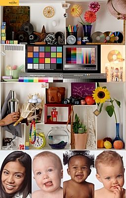
Links to above:
Page referencing the
PhotoDisc Target
Direct link to
PhotoDisc Target
This test image shows a variety of skin tones and colors and is often a
good test of printer color accuracy. This target is not heavy on
mathematical gradients or highly saturated colors but it does show some
recognizable objects in a well lit scene. This image uses the
Adobe RGB color space so be sure to use color managed software to print
this test image. Use the "ICM" option in your printer driver and
set your printing software to allow the printer/driver to manage color
if you do not have paper specific profiles that you are using.
Also note that since this test target has many small, detailed objects,
it is best to print this target about 10 inches tall if possible.
2: Printer Test File
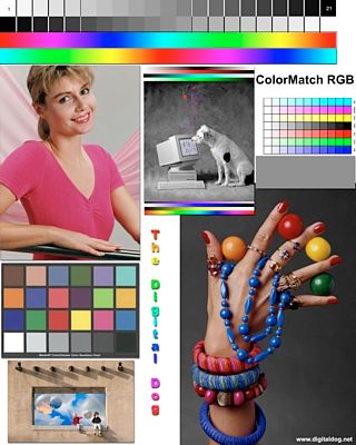
Links to above:
Page referencing
the Printer Test File
Direct link to Printer Test File
Andrew Rodney's (Digital Dog) test image is another popular printer test
image on the web. It has good gradients for evaluating smoothness
of color and a good B/W photo and gray gradients for evaluating gray or
neutral colors. Unfortunately, unless you happen to have a
GretagMacbeth ColorChecker chart, this test image isn't exactly chock
full of recognizable photographic material. Still, it is one of
the better test images on the web as it doesn't tend to confuse the
viewer with slightly off-tone colors or overdone (read impossible to
render on the printer) gradients. This image uses the ColorMatch
RGB color space so be sure to use color managed software to print this
test image. Use the "ICM" option in your printer driver and set
your printing software to allow the printer/driver to manage color if
you do not have paper specific profiles that you are using.
3: Fuji Calibration Image
This is an older test image that has made its way around the web in one
form or another in the past. This test image (above) was
originally designed as a calibration image to help calibrate color on a
Fuji Frontier printer. While there are some "corrected" versions
and other incarnations of this image available on the web, I would not
recommend using this test image should you run across it in your search
for printer test images. This image, while it does have some
useful gray gradients, can be misleading in numerous ways. The
tablecloth behind the plate, for example, is really a purplish blue that
is likely out of gamut on your printer. Some people "want" to see
the tablecloth as blue while it really is supposed to be a shade toward
purple. Some of the color patches on the ColorChecker can also be
a bit erroneous in some versions of this test image as well. The
six colors displayed at the lower left of the test image also look like
they should be primary colors while they are not, again throwing off the
perception of what people expect versus what the image actually shows.
Last but certainly not least, the skin tones in this test image are a
bit washed out and not representative of your "average" skin tones.
I won't post a link to this test image because I don't recommend using
it and there are so many variations of it, it is hard to tell exactly
where it originated. I post this example just in case you run
across it in your travels on the web.
4: Granger Rainbow
Links to above:
Page referencing
the Granger Rainbow
Direct link to
Granger Rainbow
The Granger Rainbow is sometimes used by those who need to fine tune
color profiles. It works well for those who are trying to smooth
out colors at the extremes in a custom printer profile, but is of very
little use to the average user. Many of the colors in the above
rainbow are out of your printer's color range so compromises will have
to be made in the print. These compromises usually amount to
reduced overall saturation or color clipping which results in banding.
Even the best printer ICC profiles will have problems with this image
and it will almost never print as smooth as it displays on screen.
A print of the above image will always result in either desaturated
colors or banding/warping of the color spectrum. Again, this image
can be useful for fine tuning profiles using profile generation tools
but it is quite limited for general use as it focuses on problem areas
rather than actual photos.
Summary
While the above may give you some
ideas on generic test images to use for evaluating your printer, paper,
or settings, be aware that you are often the best judge of your own
work. Don't hesitate to print some of your own photos showing
subjects you are familiar with! You may have to print more than
one photo to be able to evaluate skin tones, bright colors of flowers,
greenery, and other objects, but you probably have enough of your own
material that spending an hour locating a few good examples of your own
work can be helpful after you've dialed in color using a generic test
such as one of the test images in this article.
Keep in mind that nearly every test print, especially those with
mathematically derived color gradients, will show some of the tradeoffs
that are inevitable with photographic printing. Since your printer
may not be able to reproduce all of the highly saturated colors in many
color gradients, don't get "stuck" trying to correct banding or other
problems if such problems only occur in the non-photographic areas of
your test prints. Always judge the big picture and how well your
settings, profiles, and other procedures work on the overall print
rather than focusing only on the areas that have trouble.
Mike Chaney
|
|
|
|
|


