 Show Posts Show Posts
|
|
Pages: 1 ... 274 275 [276]
|
|
4126
|
Technical Discussions / Articles / January 2005: Coming to Terms with DPI, PPI, and Size
|
on: May 27, 2009, 03:29:54 AM
|
Coming
to Terms with DPI, PPI and Size
Background
I get a lot of questions about DPI,
PPI and image size, enough to indicate that a lot of
people are having trouble grasping some of these concepts
when applied to their images. In this article, we'll try
to make the terms and concepts of DPI, PPI, and physical
size a little less of a mystery while at the same time
offering some simpler methods of dealing with image/file
size and resolution.
Understanding the terms
DPI or "dots per inch"
is a term that normally describes the resolution of a
printer since printers produce colors by placing colored
dots on a piece of paper. A printer that has a resolution
or DPI rating of 2400 can place 2400 individual dots of
color within a one inch span on the page. If the printer
is listed as a 2400 x 1200 printer, the printer can place
2400 dots in an inch across the page and 1200 dots in an
inch down the page. A 2400 x 1200 printer can therefore
place about 3 million dots in a 1 inch x 1 inch square on
the paper. Resolutions of 2400 x 1200 DPI, 5760 x 1440
DPI, etc. are typical for inkjet printers.
Dye sub printers are usually
between 300 and 500 DPI. Why the difference? Dye sub
printers can produce continuous tone color, meaning that
every dot on the page can be an arbitrary color of up to
16.7 million possibilities. With an inkjet printer, the
printer can only "spit" a few different colors
(up to maybe 32 in some cases) for each dot, so much
smaller dots are used in combination to simulate
continuous color. A dye sub printer might place a single
dot of gray on the page for example, while an inkjet
printer might lay down 32 intermingled dots (16 black and
16 empty/white) in the same area in an 8x4 pattern to
"simulate" gray by using half black dots and
half white dots. Let's not get too caught up in printer
technology, however, and just remember that DPI refers to
a printer's capability to place individual dots on the
page.
PPI or "pixels per inch"
is a term that most often indicates the resolution of an
image file (a JPEG, TIFF, etc.) when that image file is
displayed/printed at a certain size. For example, if you
take a photo with your 6 megapixel camera that produces a
3000 x 2000 pixel image, that 3000 x 2000 pixel image
will be 300 PPI only if displayed/printed at a
size of 10 x 6.67 inches, 150 PPI if displayed/printed at
a size of 20 x 13.33 inches, and so forth. The bigger you
display/print that 3000 x 2000 image, the less PPI you
have to work with because the same number of pixels (6
million) is being spread over a larger area. As you can
see, PPI (resolution) and image size are directly related.
With respect to resolution (PPI) and image size,
increasing one will always decrease the other, and vice
versa because there are always 6 million pixels in your
3000 x 2000 images from your camera and the number of
captured pixels does not change.
One Size Fits All
When you look at an image that was
captured using your 6 megapixel (MP) camera, it will most
likely be stamped with an arbitrary resolution such as
300 PPI. A 3000 x 2000 pixel image from a Canon 10D
camera for example has 300 PPI recorded in the image file
as its "resolution". With 3000 x 2000 pixels in
the image, 300 PPI only equates to one size: 10 x 6.67
inches. When you open this image in your photo editor, it
will tell you that the image is 3000 x 2000 pixels, 300
PPI, and its size is 10 x 6.67 inches. Does that mean
that you should print all images from that camera at 10 x
6.67 inches? Does it mean that 10 x 6.67 is the maximum
size you can print?
Of course, stamping an image file
that came from a camera with a physical size is
completely arbitrary and an almost "backward"
way of thinking because the scene that you photographed
with the camera most likely wasn't 10 x 6.67 inches nor
is it likely that you will always print all your photos
at 10 x 6.67 inches. So why put information in the image
file that gives it a physical size of 10 x 6.67 inches?
The answer is that 300 PPI is just a general guideline
often used in the industry for "minimum resolution
for true photo quality". In reality, it is possible
to print excellent quality photos far above and below the
300 PPI "photo quality" threshold, so the
resolution/size that you see in an image when you open
that image in a photo editor is rather arbitrary and
should not be considered a magic number.
For most workflows involving
editing and printing images, an image should not have a
physical size until that image is displayed or printed on
a device and you shouldn't need to worry about size or
resolution until print time. You can't change the number
of captured pixels in the image anyway, so resolution is
determined (automatically) by size at print time.
Scanners are the exception to this way of thinking since
they scan an object with a known size at a chosen
resolution and you may wish to reproduce scanned material
at the same (scanned) size. Having to deal with image
resolution/size up front when working with photographs
from a camera, however, is a major point of confusion for
many people because typical photo editing software will
tell you that your photograph is 10 x 6.67 inches and you
begin to wonder what you have to do to print a 4x6, 5x7,
11x14, or some size other than the size indicated in the
image file. As a result, a lot of people end up
resampling (interpolating) their images to 300 PPI at the
new/desired print size as the first step, then editing
them, and finally printing. Such a workflow can and often
does cause image degradation due to applying the
interpolation at the wrong point in the process.
Interpolation to a desired print size/resolution should
be the last step in the workflow.
Instead of working backwards from
an arbitrary size of 10 x 6.67 inches and 300 PPI and
then trying to figure out what you have to do to print
the size you want, it makes more sense to simply remember
that you have 6 million captured or "original"
pixels to work with: an image that has 3000 x 2000 pixels.
Physical size (inches or cm) is not something that should
be dealt with until you determine what size you need at
display/print time. Leaving the image at its original
resolution (3000 x 2000) and resizing it only at print
time allows you to edit one copy of the image and then
create different print sizes from the same original. Just
remember that the larger you choose to display or print,
the lower the resolution (PPI) that 3000 x 2000 image
will be. If you print your 3000 x 2000 image at a size of
6x4, you'll have 500 PPI of data available in the
original image because 3000 / 6 is 500. If you print the
same image at 24 x 16 inches, your 3000 x 2000 pixels
will have to be stretched across a much larger space and
you'll only have 125 PPI from the image available at that
size.
If 300 PPI is generally considered
good enough resolution to reproduce printed photographs,
500 PPI is more resolution than you need so your 6x4 will
look fine. Does 125 PPI mean that you cannot print a 24 x
16 inch print because that is so much lower than the 300
PPI considered "photo quality"? No. Not
necessarily. What it means is that the image probably
will not be quite as sharp at 24 x 16 as it is at 6x4
when viewed closely. Resampling that 3000 x 2000 image to
a higher resolution before printing can make that 125 PPI
available in the image go a lot farther. Let's see how we
can make use of all this information in the most
effective way.
Making the most of it
The key to understanding how to
deal with resolution and size is to realize that there is
only one thing that is stable and will never change with
regard to your photograph that came out of the camera: it
has a given resolution and that resolution is static and
will not change. If you have a 6 MP camera that outputs a
3000 x 2000 pixel image file, that's the data you have to
work with: 6 million pixels. How you choose to "spread
out" those pixels on screen or in print is up to you.
Print the image at a small size like 6x4, and you'll get
a very sharp print. Print it at a larger size such as 10x8,
14x11, or more, and your print will begin to reduce in
sharpness and detail, but depending on the methods used
to print, you can often get very good photographs down to
150 PPI (20 x 13.3 with a 6 MP image) and even lower. The
key is in how you stretch your 6 million pixels
to cover a larger area.
As an example of "stretching",
you could take your 3000 x 2000 image and upsample/interpolate
the resolution to 6000 x 4000 before you print at that 20
x 13.3 size and in doing so, increase the image
resolution to 300 PPI. Interpolation is a way of "extrapolating"
data between pixels to create more pixels than were
recorded in the original. While this does not add any
real data to the image in the sense that only 6 million
pixels were recorded, a good interpolation algorithm can
predict what a higher resolution image might look like
and can reduce artifacts such as jaggies. Click on this link to view
how various interpolation methods can improve image
quality. Note that the "pixel resize" version
is what the small image on the upper right looks like
displayed at the larger size. By using different
interpolation methods, we are able to reduce or eliminate
the pixelization or "jaggies" that occur from
displaying a low resolution image at a large size. Also
note that while the images are improved by interpolation,
they are no match for the original image on the top/left
that was photographed at the higher resolution to begin
with. Needless to say, there is no substitute for real
data, but interpolation can improve things quite a bit
when printing at large sizes! As such, resampling (interpolating)
can improve print results when printing large sizes that
cause resolution to drop below 300 PPI.
Given the fact that our original
image (photograph) contains all the pixels that the
device could record and therefore the maximum amount of
data available to you, I would recommend doing all work
such as color changes, cloning out blemishes, and even
any sharpening needed because the original appears too
soft without changing the size or resolution of the image.
Remember that interpolated/resampled pixels are based on
the original/captured pixels so resampling first and then
editing only serves to increase the pixel count of the
images you are working with. It makes more sense to edit
an image that is 6 million pixels and then interpolate to
12 million pixels than to create 12 million pixels up
front and have to edit twice as many pixels.
Once any needed changes have been
made to the original image, the image can then be resized
or interpolated to the desired resolution for printing.
If you are using a photo editor, you can enter the
desired print size (say 11x14), enter a resolution (PPI),
and check "resample" so that the photo editor
will interpolate the image to the chosen size and
resolution. Size is often the easy part because you know
the size you want to print. For resolution, you want to
use a multiple of the actual/physical printer resolution.
For Canon/HP printers that would be 300 PPI for typical
photos or 600 PPI for optimal quality with the finest
details. For Epson printers, 360 PPI for photo quality or
720 PPI for photo quality with the finest details
possible. If you use a dye sub printer, always resample
to the "native" resolution of the dye sub
printer, 314 PPI, 320, 480, etc. Note that depending on
how effective your print driver is at stretching (or
shrinking) the image to fit on the paper, you may get
better results if you always resample to a multiple of
the printer resolution, even if you start with a higher
resolution than needed. For example, when printing to a
dye sub printer that runs at 314 DPI, the 6x4 print from
that 6 MP camera will likely print better if you downsample
the 500 PPI image down to 314 PPI before sending it to
the printer! In this case, sending an image to the
printer at 314 PPI actually produces better results than
sending it at the higher (but mismatched) 500 PPI!
Of course, it's always nice to
have a tool that will do all these calculations for you
so that you never have to worry about anything other than
making color, levels, and a few other adjustments on the
original, allowing the software to automatically
interpolate to the best possible quality at print time.
Qimage is such
a tool that will allow you to correct the original image
(in Qimage or using a photo editor) without ever having
to worry about DPI, PPI, or size. Simply make any changes
you like on the original without modifying the size or
resolution of the image and Qimage will handle all the
sizing and PPI calculations when you tell it the size you
would like to print, and will automatically resample to
the optimal resolution for your printer at print time
using advanced interpolation and sharpening methods.
While I did write Qimage and take the opportunity to plug
it here, it does allow you to work with images in a much
simpler and much more "forward" approach where
you edit the original pixels and let the software worry
about size, PPI, and DPI at the appropriate time: when
you are ready to print. It is probably the easiest way to
avoid the backward mentality of dealing with images that
have arbitrary size and resolution stamps that can often
prompt users to deal with resolution/size at
inappropriate times.
In Summary:
I hope this article will assist in
the understanding of PPI, DPI, and image size and will
offer an approach that is easier for most to work with.
Photographic images such as JPEG and TIFF images come
with a size/resolution stamp that can be useful when
doing things like scanning prints and reproducing them at
the same size. When scanning a given size media in a
scanner, recording the original size of the media can be
useful because it tells us how to reproduce that media at
the same size. If you want to reproduce the scanned media
at an arbitrary or different size, however, or print a
photo that came from a camera, such resolution/size
recordings in the image become arbitrary and often
confuse the issue. When you are capturing images at the
resolution limit of a device and/or you intend to
reproduce those images at an (arbitrary) size of your
choosing, it is best to just leave the images at their
native/captured resolution and only interpolate/resample
the images if necessary at print time since that is the
only time at which assigning a physical size to an image
makes sense.
Resampling images as a first (or
early) step and then editing them is a common mistake
that can cause problems when working with images that you'd
ultimately like to be able to reproduce at more than one
size. For example, resampling an image to 300 PPI at 11x14
and then editing color and other aspects of the image can
cause trouble if at a later time you would like to print
some 16x20 prints from the edited image. The edited image
has already been resampled to 300 PPI at 11x14 and
resampling it again to 300 PPI at the new 16x20 size
means that the image has gone through two resampling/interpolation
steps which can degrade the image and not give you the
best possible results.
Mike Chaney
|
|
|
|
|
4127
|
Technical Discussions / Articles / December 2004: In a Fog over Sharpening?
|
on: May 27, 2009, 12:12:14 AM
|
In a fog
over sharpening?
What is sharpening?
Simply put, sharpening is an image
editing technique that allows us to make slightly blurry
or out of focus images look in focus, clear, or "sharp".
While sharpening cannot fix obvious focus problems where
the subject in our photo is simply not focused properly,
it can allow us to add that final "punch" to
the photo to make the jump from just "in focus"
to "tack sharp". Sharpening doesn't really add
any real detail to images, however, it can accentuate
details to make them more obvious on screen or in print.
Our task with sharpening is to find that delicate balance
that makes our photos look clear and sharp without making
them look overdone.
Why do we need sharpening?
The first step in understanding
how to use sharpening is understanding why we need it in
the first place. In a perfect world, our cameras would
record every pixel in our images perfectly and those
pixels would be rendered perfectly on screen and in print.
Unfortunately, devices like cameras and printers have
their limitations and one of these limitations involves
sharpness. Due to the way cameras capture an image, for
example, there is always some smoothing which "leaks"
information from one pixel into surrounding pixels.
Imagine a single point of light in
an image such as a star in the distance in a perfectly
focused frame. Even if that point falls on only a single
pixel on the camera's sensor, the algorithms that put
together the final image will spread that point of light
into neighboring pixels making the point look less
focused (blurry). Add to this the fact that most cameras
have antialiasing filters that blur the image slightly
before it even gets to the sensor and the fact that no
lens is perfect, and we start to understand why there is
a need for sharpening to undo the appearance of some of
this blurring. Sharpening can take that point of light
that was spread into neighboring pixels and bring some of
that spread out information back closer to what should
have been recorded (a single pixel of light). The
mechanisms in the image capture process that cause
blurring are not limited to point sources of course since
edges/lines are also affected such as a sharp edge on a
car door, power lines against sky, and other fine details.
Sharpening can help reverse blurring in those areas as
well.
Where to apply sharpening
Sharpening should be viewed as a
way to compensate for deficiencies in the way devices
capture or render images. If we use sharpening to undo
the inherent blurring effects of a device, we have done
the best we can do because the result will be closer to
reality with respect to sharpness. There is often a state
of confusion with respect to where and when to apply
sharpening so here are a few recommendations.
Sharpening the original image:
The sharpness of an image that
just came out of your camera depends on many factors:
focus, lens, whether you shot in raw or JPG mode, etc.
In general, we want the image to have a realistic
level of sharpness when viewed on screen at 100% zoom
(1:1). The first sharpening step is viewing the image
you intend to display/print in your image editing
software at 100% (1:1) zoom and setting the sharpness
level so that the image on screen has the correct
amount of sharpness. If the image came from a JPG
stored on your camera, you may not need any
sharpening because the camera may have already
applied an appropriate level of sharpening. When
dealing with the original image from the camera (or
an image converted through raw conversion software),
the goal is to apply an appropriate level of
sharpening (if needed) to make the image look as
accurate as possible on screen at 100% (1:1) zoom.
Doing so will insure that we have the best rendition
of the original image possible and will insure that
we have effectively reversed the appearance of
blurring as much as possible to give us an image that
is true to the original scene.
Sharpening at print time:
There is a lot of confusion on
the web and in imaging circles in general regarding
how to sharpen images for print. There are even
numerous programs and plugins out there designed to
take the guesswork out of this step. Let's start by
looking at the print sharpening step at a high level.
The purpose of print sharpening is to make the print
appear clear and sharp at any print size. That is, we've
already set the sharpness of the original image by
sharpening the image itself and now we want to make
sure that the appropriate level of sharpness is
carried through to our prints no matter what size we
decide to print.
Sounds easy but there are
actually a lot of factors that need to be considered
when sharpening prints. The larger the print for
example, the more sharpening needs to be applied
because you are stretching the same number of pixels
(from the original image) over a larger space. You
also don't want your sharpened edges to be so tiny
that they become lost in the print, so you don't want
to upsample an image to 720 PPI for your Epson
printer and then apply an unsharp mask of radius 1
because your edges will be so fine that the
sharpening will not show up in print (more on actual
sharpening parameters in the next section below).
"Smart Sharpening"
in
Qimage
is
designed to take all these factors (and more) into
consideration to allow you to set the appropriate
level of sharpening at print time based on your own
printer and paper. Software and plugins such as
Nik Sharpener Pro
also
allow you to take control of sharpening factors in
both images and printing and are a bit more feature
rich than Qimage, but are a bit less "automatic"
and generally take more time and experience to grasp.
We understand "when"
but what about "How"?
There are actually a lot of
different techniques that allow sharpening of images.
Sharpening can be as simple as clicking "Sharpen"
in your photo editor, or as complex as converting images
to Lab color space and sharpening only the luminance
channel using unsharp mask. Let's try to keep it simple
and just focus on the most common and one of the most
flexible sharpening techniques: unsharp mask.
Unsharp mask, unlike the name
implies, is actually a method of sharpening. It is called
"unsharp mask" because it uses a blurred copy (an
unsharp copy) of the image to compare to the original in
order to sharpen. Here are the parameters associated with
unsharp mask:
Radius: the radius defines
how "thick" the sharpened edges will be
after the sharpening process. A radius of 1 will
produce very fine/thin edges while a radius of 3
will produce "fatter" edges that are
more noticeable.
Strength: strength defines
how obvious the sharpening effect will be. Higher
strength will result in more sharpening. Note
that radius and strength work together. If you
sharpen with a larger radius, you might need less
strength than if you sharpen with a small radius.
As an example, radius 1 and strength 100 will be
less noticeable than radius 2 and strength 75.
Threshold: threshold or
"clipping" defines which parts of the
image are affected by the sharpening. When the
threshold is set to zero, the entire image is
sharpened equally. When the threshold is set
higher, less prominent edges are excluded so that
things like backgrounds, sky, and other smooth
objects are not made noisy by the sharpening
algorithm.
Notes on sharpening:
Typical "starting values"
for applying moderate sharpening using unsharp mask
might be radius 1, strength 80 up to about radius 3,
strength 120. In general, when sharpening an original
from your camera, you want to use a radius of between
1 and 2 pixels with whatever strength you feel
appropriate because the in-camera blurring effects
normally don't reach beyond about a 2 pixel radius.
There are various "artifacts"
that can get you into trouble when using sharpening.
For example, picking a radius that is too large and/or
a strength that is too high can cause "sharpening
halos" which look like a ghost of the original
edge just beside/around that edge. For example,
oversharpening can cause power lines against a blue
sky to get darker and sharper, but can also cause a
light halo on the outside of the power lines that can
make them look like they are glowing. Using a
threshold that is too high can often cause strange
effects in the image because unless you sharpen the
entire image the same way, you can break the
relationship between less/more prominent edges. One
negative effect of setting threshold too high is the
image having a "charcoal painting" or
embossed look.
There is a lot of information on
the web regarding sharpening techniques, a lot of which
can be confusing and even incorrect. Some of the best
resources I have found are those at
digitalsauces.com
:
Digital Sauces
Sharpening Introduction
Using the Sharpening
Functions in Qimage
Sharpening in Adobe
PhotoShop
If you would like more information
on the Sharpening Equalizer in Qimage, see
this article
.
In Summary:
Sharpening is a technique that is
so broad that you can make it as simple or as complex as
you like. Unless you are sharpening for artistic
expression, I recommend using sharpening functions to
compensate for deficiencies that cause blurring in images.
That is, we compensate for any blurriness or softness in
the original by applying an unsharp mask to sharpen the
image back to its original/intended clarity (or
perception thereof). We also apply sharpening at print
time to insure that our prints are as sharp as the image
viewed on screen. Hopefully this article has given you a
baseline understanding of when to use sharpening and has
touched on a few of the methods of how to apply that
sharpening.
Mike Chaney
|
|
|
|
|
4128
|
Technical Discussions / Articles / November 2004: Which Printer is Right for you?
|
on: May 27, 2009, 12:05:42 AM
|
Which
printer is right for you?
Understanding the choices
We've all seen the commercials
that suggest asking your doctor whether a certain
prescription is right for you. Wouldn't it be nice if we
always had someone to consult when making important
decisions who could help us determine the right path for
us? Choosing a printer is important to your enjoyment of
digital photography but can be a confusing process simply
due to the number of models available and the different
features offered. Many people try their local electronics
or computer super store, but the "consultants"
in the printer section often seem to know more about the
"extended warranty" that they try to sell you
than the printers themselves! This short article will
give you some tips on hunting for the right printer for
your needs. While the article covers only the basics, it
should give you the foundation to be able to ask the
right questions and do the right research to decide on
your choice of printer for printing photographs at home.
Note that this article addresses printing of photographs
(not text) and also assumes that you have already weighed
the costs/benefits of printing your digital photos at
home versus online (or at stores like Wal Mart) and you
have decided to print at home.
Understanding the
technology and limitations
There are many types of photo
printers on the market, including inkjet, dye sublimation
(dye sub), color laser, and even printers that use a
chemical process similar to traditional photo "kiosks"
at photo outlets. By far the most cost effective and most
popular models for home printing are the inkjets and the
dye subs, so we'll focus on those.
Inkjets: Color inkjet
printers have been around for many years and like
the internal combustion engines that run our cars,
trucks, and SUV's, they aren't the most efficient
animals in the world but they are so accepted and
have been around so long that they have been
perfected to the point that they really do the
job well. Today's top quality photo inkjets offer
a wide color range (color gamut), super high
resolution, and can even be obtained in archival
form for prints that will most likely outlast you!
Inkjets work by "spitting" tiny dots of
colored ink in a pattern so fine that your eyes
cannot detect the dots.
Dye subs: Dye sub printers
have been around a long time too and have also
been perfected to efficient photo printing
machines. Dye sub printers work by "melting"
off a layer of dye from a ribbon (basically a
roll of plastic) onto the paper as it passes by a
heater. Dye subs are considered "continuous
tone" because each "dot" produced
on the page can be any (arbitrary) color. Dye
subs don't use dot patterns to fool the eye into
seeing a particular color, rather, they place the
exact color needed at each location so that the
final print is dot free.
Advantages and
disadvantages of inkjets versus dye subs
We cannot mention every possible
advantage/disadvantage when comparing inkjet and dye sub
printers but the following list hits the major points
that will apply to most people printing photos at home.
Inkjet Advantages:
Very precise and sharp
edges
Latest models offer
incredible detail that exceeds most dye subs
Variety of papers/surfaces
available such as matte, luster, glossy
Not locked in to one
manufacturer's paper
Archival inkjets can be
found that produce prints w/long life
Most can print on many
different surfaces designed to accept ink
including CD's, CD inserts, envelopes, etc.
Have a considerably larger
color gamut and usually produce more vivid photos
than dye subs
Easier to obtain large
format inkjets that can print 11x14, 13x20 sizes,
or larger
Inkjet printing is often
cheaper than dye sub printing
Inkjet Disadvantages:
Often much slower than dye
subs
Most non-archival inkjets
produce prints that fade a little (sometimes a
lot) faster than dye sub prints
Print heads sometimes clog
and require cleaning or even replacement
Dye Sub Advantages:
Very fast
Relatively maintenance
free
Smooth with no dot
patterns visible, even under magnification
Produce excellent shadow
detail in dark areas where some inkjets may be
"blotchy"
Prints are usually more
durable and more waterproof than inkjet prints
For many viewers, dye subs
simply produce photos that look and feel more
like real photographs due to the smoothness of
the prints and the absence of visible dot
patterns
Dye Sub Disadvantages:
Consumer level models
often smear high contrast edges (like a black
square on a white background) to some degree,
making charts, graphs, and line art look a bit
less "precise"
Dye sub prints typically
only last as long or slightly longer than a good
non-archival inkjet printer and are generally not
considered "archival"
Paper type selection is
very limited and while dye subs produce excellent
glossy photos, most fall behind or do not even
offer the option of matte prints
Must use an entire page
and an entire page worth of ribbon even to print
one small wallet size photo because dye subs are
"page at a time" and pages cannot
normally be fed through the printer twice to fill
more of the page as they can in inkjets
Dust can sometimes get
inside and cause vertical scratches on prints
Dye sub printing and the
cost of paper and toner (ribbon) is often higher
than inkjet printing
Size is Everything!
If you need one printer that meets
all your needs, you have to ask yourself the question:
how large will you need to print? If you regularly (or
even occasionally) need to print at a size larger than 8x10,
you are basically limited to wide format inkjets as
consumer level dye sub printers are limited to 8x10. In
the dye sub category, we start out with the small 4x6
versions that normally sell for $200 or less and then we
move up to the "big boys" like the Olympus P-440
or the Kodak 8500/8600 series that can print up to 8x10.
Beyond 8x10, you will be looking at either a wide
carriage inkjet (13 inch wide capable of printing to 13x20
or higher) or a "super wide" 24 inch or 44 inch
wide professional inkjet. The latter are mostly used in
studios or photo stores that offer digital printing and
are beyond the cost of most at-home printing consumers.
When selecting your printer, keep size in mind.
Models and options
Dye subs are actually easier to
buy because there are fewer models and fewer features to
choose from. You simply need to select your maximum print
size (basically 4x6 or 8x10) and buy. There are many
online resources and online forums available, so search
and see what people are saying about the model you picked
before you buy. I will refrain from making model
suggestions in this article just because I don't want to
be inundated with email asking "why didn't you
recommend my printer". :-)
Buying an inkjet is a more
complicated adventure. If you've decided that a standard
8.5 inch wide inkjet isn't big enough and you'd like to
be able to print larger than 8x10, your decision will be
somewhat easier because the choices in that size are more
limited. If you want a wide (13 inch width) printer, you
simply need to decide whether a non-archival printer that
uses dye inks is good enough, or you need an archival
printer that uses pigment inks. Non archival printers
that use dye inks are easier to find and typically
produce prints that last 10-25 years when displayed in
most indoor lighting conditions behind glass in a frame.
Archival printers that use pigment inks typically produce
prints that last 75-100 years or longer under the same
conditions. If you plan to sell prints, you would be well
advised to buy and use an archival/pigment ink printer.
Again, the web, online forums, and search tools are your
friends. Pick your favorite online "printing"
forum and read what others are saying about the printer
you have selected. If you are concerned about print
longevity, refer to my September
article as it refers to some web sites
with longevity data for various printers/papers.
One final consideration is whether
or not you need to print directly from your digital
camera's memory card without using a computer. Many new
models offer the ability to print (and even preview and
do some basic touchups) right on the printer without even
connecting the printer to a computer. All of these
printers can still be connected to a computer if you wish
for the best quality and editing, but allow you to print
in the field or away from home without having to lug your
laptop around with you. Whether you print without a
computer or not is a personal decision, but in my opinion,
I don't recommend using the direct-printing-from-printer
method as the quality of your prints is usually not as
good as if you print through good quality printing
software on your computer, and you have much less control
over color, color management, etc.
In Summary:
The bottom line in this article is
to be aware of your options, the different technologies
available, and be able to assess your needs before you go
shopping. Once you understand some of the basics to
buying a printer, take your knowledge a step further by
applying the general concepts here to the different
models that you find online and at your electronics store.
In the end, I recommend having your mind made up prior to
walking into the local super store because the stores, in
general, just don't have the resources to address what is
best for you!
Mike Chaney
|
|
|
|
|
4129
|
Technical Discussions / Articles / October 2004: JPEG Images: Counting your Losses
|
on: May 27, 2009, 12:00:06 AM
|
JPEG
Images: Counting your Losses
Standard and "Not so
Standard" Formats
Digital photos can be stored in
many formats such as JPEG, TIFF, PNG, PSD, PCD and many
others. It is important to understand the limitations of
each format so that you can select the proper format for
the job at hand. This article focuses on the costs and
benefits of using the JPEG format, so we won't go into
all of the other possible formats in detail, at least not
in this article. Of all the dozens of popular formats,
some are proprietary and others are considered "international
standards". Using a format that is an international
standard ensures that you and the people with whom you
share images will be able to display them without needing
additional software in most cases. Three of the most
popular "international standard" formats used
on the web are JPEG, TIFF, and GIF. GIF is limited to 256
colors and is used most often to display screen shots and
graphs and should not be used for photographs. The
remaining formats, JPEG and TIFF, both have their place
in digital photography and there are pros and cons to
both formats.
Lossy and Lossless Formats
TIFF, often saved with a TIF file
extension, is a lossless format. Lossless means that when
the image is saved and later reloaded, each pixel in the
saved/reloaded image is identical to the image before it
was saved. As such, there are no quality losses, but the
size of the file can be quite large because the RGB
values for each pixel are recorded verbatim. Compressed
TIFF's offer a size savings just as WinZip offers size
savings for files, without introducing quality loss but
even compressed TIFF's are usually larger than JPEG
images.
JPEG on the other hand, is a lossy
format. Lossy means that compromises are made to allow
some image quality to be lost each time the image is
saved. In return for the slight quality loss, the file
size can be much smaller, on the order of 2-10 times
smaller than a compressed TIFF. When an image is saved in
the JPEG file format and later reloaded, the saved/reloaded
image will not be identical (pixel to pixel) to the
original before it was saved. Fortunately, the quality
losses can be very difficult if not impossible to detect
with the unaided eye after only a single save. Keep in
mind that repeatedly opening and resaving JPEG photos
will incur cumulative losses with each save, making
quality worse each time you resave the JPEG.
Understanding "Compression"
and "Quality"
When saving JPEG images, you will
normally have a choice of either "quality" or
"compression". The higher the compression, the
lower the quality because when you compress more (to
reduce file size), quality decreases. Just remember that
if your photo editor lets you choose "quality"
for your JPEG's, higher values will produce bigger files
with higher quality. If, on the other hand, your JPEG
options include "compression", higher values
for "compression" will result in smaller files
of lesser quality.
Getting a Handle on
Quality Losses
There are two types of losses
associated with saving JPEG images. The first type of
loss is simply related to the parameters you use when you
save the file: set your compression too high or your
quality too low, and your images will look worse. The
second type of losses are "generational" losses.
Generational losses occur when you repeatedly open and
resave JPEG files, opening a file, saving it, opening the
second copy, saving it to a third file, etc. The greater
the number of times you save the JPEG (from a previous
copy), the worse your images will look. The first time
you save an image to a JPEG, it can be considered a
"first generation" JPEG. If you open that first
generation JPEG and resave it, the resaved file can be
considered second generation since it has gone through
the JPEG lossy saving method twice. Remember that losses
only occur in the saving process. Repeatedly opening
an already saved JPEG without resaving it (modifying
it) isn't going to cause losses in quality. Losses are
only incurred when you use the "File", "Save"
or "Save As" command and you choose "JPEG"
as the file type.
Examples of JPEG Quality
Loss
Here is an example that
demonstrates visible loss of image quality due to saving
the same image at different quality settings. The
following images were saved using PhotoShop and quality
settings between 0 (low quality, small files) and 12 (highest
quality, largest file size). As you can see, the lowest
quality produces the smallest file size but there are
highly visible artifacts in the image such as color
blotching, pixelization, and posterization (banding) of
colors. As you increase quality, these artifacts start to
disappear, but file size increases as an inevitable cost.
Note that once you get to about quality 10 or higher, it
is nearly impossible to distinguish between the JPEG and
the original image (before saving to JPEG) for most
images. As a result, as long as you save at a high
quality (low compression) setting, JPEG is certainly a
valid format for a "first generation" save and
can rarely be distinguished from a lossless save such as
a TIFF image as long as a high quality setting is used.
| Save Quality |
File Size |
Result |
| 12 |
87KB |
 |
| 11 |
66KB |
 |
| 10 |
52KB |
 |
| 9 |
44KB |
 |
| 8 |
40KB |
 |
| 7 |
36KB |
 |
| 6 |
35KB |
 |
| 5 |
33KB |
 |
| 4 |
31KB |
 |
| 3 |
30KB |
 |
| 2 |
28KB |
 |
| 1 |
27KB |
 |
| 0 |
26KB |
 |
Below is an example of
"generational losses" from opening and resaving
in the JPEG format. Notice that quality is very
reasonable for the first few saves but losses become
evident beyond about 5 saves depending on the quality
setting used. Below, "generation" indicates how
many times the JPEG has been resaved based on saving copy
1, opening copy 1 and saving copy 2, opening copy 2 and
saving copy 3, etc. Notice how the generational losses
are less evident when you save each copy with a higher
quality setting. The quality differences are more subtle
with generational losses when compared to simply picking
the wrong quality level (above), but by the 10'th
generation, obvious blotching and color changes are
occurring.
| Generation |
Save Quality 10 |
Save Quality 12 |
| 1 |
 |
 |
| 2 |
 |
 |
| 3 |
 |
 |
| 4 |
 |
 |
| 5 |
 |
 |
| 6 |
 |
 |
| 7 |
 |
 |
| 8 |
 |
 |
| 9 |
 |
 |
| 10 |
 |
 |
What about JPEG 2000?:
There is a newer and less [visibly]
lossy version of the JPEG format known as JPEG 2000,
often saved with a J2K or JP2 file extension. The JPEG
2000 format has similar issues when compared to the JPEG
format but to a lesser degree. In addition, the JPEG 2000
format offers a "lossless" mode in which images
can be saved without any quality loss, but with a
somewhat larger file size. In general, JPEG 2000 offers
higher quality than JPEG when comparing the same saved
file size. So why not use JPEG 2000? Many people are,
however, JPEG 2000 is not as widely supported and is
generally much slower than JPEG. In addition, if you have
a camera and you shoot in JPEG mode where your camera
delivers a JPEG file on the memory card, there is no
benefit to resaving those JPEG images to JPEG 2000 images
since that will incur further quality losses over the
original JPEG, unless you use the lossless JPEG 2000 mode
which will serve to do nothing but increase file size
over the original JPEG. In general, JPEG is just easier
to use, more portable, faster, and can be readily
displayed quickly on the web, in email clients, and other
third party applications. With time, JPEG 2000 decoders
will get faster, will be more widely available, and more
tools will support them, possibly even some future
cameras. So far, the JPEG 2000 format really hasn't
"taken off" in the industry like was
anticipated, but time will tell.
What's the Bottom Line?:
The JPEG image format offers a way
to save images using less space, but with some loss in
image quality. Typically, a first generation save will be
almost as good as a lossless TIFF as long as you use
quality levels close to the highest available. Some
"die hards" claim that you should never use a
camera in JPEG mode when you have TIFF or RAW available
as an option, and one cannot argue that you get the best
quality and best editing capability with TIFF or RAW when
compared to JPEG. That said, JPEG is a perfectly valid
format to use even when capturing images the first time
in your camera, especially when memory space, shooting
speed, or the ability to print images without post
processing is important. Remember that JPEG's are
processed and ready to view/print, whereas RAW images
require post processing to "develop" the images
from the raw data. This takes additional time and can
complicate your shoot-to-print workflow. A first
generation JPEG will offer quality comparable to any
other final or ready-to-print format, however, cannot
offer latitude for correcting exposure and other shooting
issues like a RAW image or a 48 bit TIFF. Bottom line:
choose what works for you, but be sure to take the pros/cons
of each format into consideration.
Mike Chaney
|
|
|
|
|
4130
|
Technical Discussions / Articles / September 2004: The Great Paper Chase
|
on: May 26, 2009, 10:45:37 PM
|
The
Great Paper Chase
Finding the right paper
for your printer
In addition to paper made by the
manufacturer of your printer, there are many combinations
of third party papers available at different price points.
How can you be sure which papers offer the best
combination of price and quality for your work? You could
always use the "buy it and try it" approach,
but that can get expensive as you start to collect stacks
of paper in the corner that don't work well with your
printer. Some papers may not even work properly
in your printer; the ink may never dry, the dot gain can
make dot patterns too noticeable, and ink pooling may
occur. Here are a few tips on buying paper that might
help save you some time and money.
Paper types and coatings
All papers start out with a matte
surface. The coating applied to the paper is what gives
the paper some level of gloss. Different coatings and
amounts allow for anything between a matte surface (little
or no coating) to luster and semigloss (coarse coating)
to premium glossy papers (fine, smooth coating).
While some are better than others,
most matte papers work in all printers and with all inks.
The quality of the matte paper basically depends on the
"weave" of the paper as to how much resolution
the paper can handle. In general, matte papers offer
reduced contrast and color gamut when compared to glossy
papers because the ink doesn't sit on the top of a smooth
surface. Due to the ink interacting directly with the
paper (instead of the coating), matte papers can be more
difficult to profile and usually have less vibrant colors.
On the plus side, matte papers tend to be less prone to
gas fading (fading of colors due to exposure to gases in
the air) and are usually easy to match up with different
printers.
All papers with coatings force the
inks to interact with the gloss layer, making inks sit
closer to the surface of the paper. This is a good thing
for contrast and color gamut because the inks don't get
"diluted" by the paper surface. Other problems,
however, are introduced due to the chemical interaction
between coatings and inks. Some types of coatings are
compatible with dye inks (most inkjet printers) and
others are compatible with pigment inks (archival inkjets).
In general, any paper with a coating will have higher
dynamic range (contrast), better color gamut than a matte
paper and will be easier to profile using profiling
software, that is, as long as the paper is working
properly in your printer!
Ink type versus paper type
If you have a dye sub printer
rather than an inkjet, you will have a very limited
selection of papers to choose from, usually those sold by
the company who makes your printer. In a way, that's a
positive trait because you know what works with your
printer and won't get confused with all the options. On
the other hand, you'll have fewer options and will have
to pay whatever the manufacturer charges for your paper.
If you have an inkjet printer,
make sure you know what type of inks you are using. Most
inkjets use dye inks unless otherwise specified. Archival
printers, printers designed to produce longer lasting
prints, use pigment inks. There are fewer pigment ink
printers on the market, and as of this writing, most of
the pigment ink printers are Epson inkjets. The most
common Epson pigment inkjet printers are: R800, 2100/2200,
2000P, 4000, 7600, 9600. Most other consumer model
printers use dye inks unless you buy third party pigment
inks to replace your original inks.
Microporous/nanoporous
paper: Most high gloss paper is a porous paper
designed to accept both dye and pigment inks.
These papers generally produce high resolution
prints with the least noticeable dot patterns and
are water resistant. Porous papers offer the
highest print quality and often do better at
realizing the resolution potential of your
printer, however, they are known to be more prone
to gas fading when using dye inks. Porous papers
are usually labeled "quick dry" or
"instant dry".
Swellable polymer papers:
Swellable papers are designed to greatly reduce
gas fading issues with dye ink printers to
produce dye ink prints that outlast those printed
on porous paper. They do this by encapsulating
the ink inside a gelatin like coating that
actually swells when it reacts to the ink. These
papers, which normally are not recommended for
use with pigment inks, produce good quality
prints on dye based inkjets that resist fading
but they are not water resistant. Prints on
swellable papers often produce slightly more
noticeable dot patterns, making them look a bit
"grainy" to those who are sensitive to
dots in prints. Inks also take longer to dry on
swellable papers (sometimes days) and even when
dry, a single drop of water accidentally rolled
down your print can ruin it. Some inkjets also
have problems with ink pooling on these papers,
particularly the Canons since they print much
faster than other printers. The plus side of
course, is the simple fact that your dye based
prints will not fade as fast as they would on
porous papers, especially when the print is
exposed to the air (not under glass). Some
examples of swellable papers are Ilford Classic
Pearl, Ilford Classic Gloss, and Epson Colorlife.
Swellable papers are usually marked "not
compatible with pigment inks".
Where to start
If you use a pigment (archival)
based printer and prefer a glossy or luster surface, I
would suggest sticking with the porous papers such as
Epson Premium Glossy Photo Paper or Epson Premium Luster
paper, both of which can be found in most office supply
and computer stores. Ilford and Red River also
offer great glossy papers so be sure to check them out as
well. If you like high gloss, Epson Premium Glossy paper
is a staple in the industry that seems to work well in
just about any printer, whether your printer uses dye or
pigment inks! Note that if you are using an Epson
archival printer with Ultrachrome pigment inks (2100/2200,
4000, 7600, 9600), your prints may exhibit some gloss
differential, often referred to as "bronzing",
on high gloss papers. This effect can be seen when
viewing the print from an angle, as the gloss on the
surface of the print may appear more/less glossy in
places depending on how much ink is placed on the print.
This problem can be minimized by using a luster or
semigloss paper or completely eliminated by using matte
paper. The R800 is currently the only Epson pigment
printer that does not suffer from this gloss differential/bronzing
problem on high gloss papers.
If you have a dye based printer
and you are concerned about longevity and print fading,
you may want to try one of the swellable papers. One
favorite on the web seems to be Ilford
Classic Pearl. Just be aware that swellable
papers can produce more noticeable dot patterns and
sometimes ink pooling. Dot patterns can be seen by
looking closely at light areas on your prints such as the
sky, clouds, or other bright (almost white) areas. Ink
pooling can be found by printing an image with a wide
variety of colors such as a color chart with many color
patches and looking at the print at an angle. If the
print appears to have differences in the amount of gloss
on the surface, pooling might be an issue. When pooling
occurs, it can often be seen in the darker colors on the
print where more ink is being deposited on the paper.
Any time you decide to use a third
party paper, it is very important to read the notes that
come with the paper. There will usually be an insert in
the package that tells you which selections to make in
the print driver for your printer. Making the proper
selections is important because your print driver will
only have "standard" selections based on papers
from the same manufacturer as your printer. That means
that you'll have to select a paper in the driver that is
not the paper you are using, but the one that works best
with your third party paper. Again, settings for
different types of papers are usually listed on an
instruction sheet included with the paper.
Acid Free
If you are creating scrapbooks
where it is important to use acid free papers, I
recommend getting a pH testing pen to test your favorite
papers. Acid free is not normally an aspect of paper that
is listed on the package, and even when it is, you may
not be able to trust the claim because sometimes the
front is acid free while the back of the page is not. It
is always best to buy an inexpensive pH testing pen and
test for yourself. In general, papers that are rated for
greater longevity such as those marked "fine art",
"archival", or "colorlife" will be
better for your scrapbooks anyway, even if they are not
acid free. By the way, in case you are wondering, almost
all prints that you get developed at your drug store or 1
hour photo that are based on regular film are not
acid free.
What about print longevity
Print longevity is something that
in my opinion, is still not tested using methods that
will give you an idea of how fast your prints
will fade in your particular display environment.
Nevertheless, there are outfits who do longevity research
and can give you a reasonable idea of how your printer/ink/paper
stacks up to others with respect to how fast your prints
might fade. Here are a couple of links to longevity based
testing. You may be able to find your printer, ink, and
paper combination to compare longevity with other combos
by visiting these sites:
Wilhelm
Research
Livick.com
Final Thoughts:
As with anything else, a little
research can save you a lot of time. Walking by the photo
paper display at an office superstore and picking a paper
that has the best packaging, the best wording like "ultra",
"professional", "premium", or picking
the one that has the best claims on the cover can be an
expensive and unrewarding proposition! The best advice I
can give is to check out the online forums and do some
searches for your type of printer with the word "paper"
in the search. Sticking with the paper made by the
manufacturer of your printer is always a safe bet, but if
you have certain issues that you are trying to address
like print longevity or even cost, chances are good that
others have been in the same spot and have already found
the answer that will work for your printer and your ink.
When you make your decision, see if any sample packs are
available for the paper you have chosen, or order the
minimum number of sheets to try. That way, if you do
encounter any of the issues mentioned in this article
such as ink pooling, graininess, problems with drying
time or water fastness, or other problems, you won't be
stuck with a lot of paper you can't use.
Mike Chaney
|
|
|
|
|
4131
|
Technical Discussions / Articles / Re: August 2004: Over the Gamut and Through the Woods
|
on: May 26, 2009, 10:38:57 PM
|
Options for your printer
There are three basic options for
getting the printer profile(s) you need. You can get
ready-made profiles on the web but be aware that a
printer profile is designed for a specific model, paper
type, ink, and print driver settings, so finding the
right combination for the printer, paper, and ink that
you use can be difficult at times. The second option is
to print a test chart, send it off in the mail, and have
someone create a profile by using specialized equipment
to examine your printed target. These profiles tend to be
quite accurate, but you are charged on a per-profile
basis so if printer, paper, or ink changes, you'll
usually need to pay again to have a new profile made. The
final option is to purchase profiling software that can
create profiles for you based on your own test prints. To
get profiles as good as the custom ones that you send off
for can cost $1500 or more if you go with your own
profiling software, but much lower cost ($79 to $299)
software can do a more than adequate job just using your
printer and your flatbed scanner. Let's examine the pros
and cons of each option:
Options
for your printer
|
| Option 1: ready made
profiles |
Option 2: custom profiles |
Option 3: create your own
profiles |
| Often free or low cost |
Usually about $40 per profile |
Wide range of self-profiling
tools ranging from $79 to over $1500 |
| Instant gratification: download
and install |
Can take several days to a week
to print the test chart, send it through the
mail, and receive your profile back via email |
Nearly instant gratification plus
the ability to do some "tweaking" of
the profiles on your own. Must get to know the
software though and learn how to effectively
create your own profiles |
| If there is a cost, you must pay
separately for each profile |
Pay separately for each profile
in most cases |
Pay once for the software and
develop as many profiles as you like. If you
change to a different kind of paper or ink, just
reprofile. |
| Can sometimes be found on the
printer manufacturer's web site under "Tech
Support" |
You print a test chart and mail
it to the outfit doing the custom profiling |
You print a test chart, scan it
using a scanner or spectrophotometer and use the
software to create a profile from the test chart |
| Device must be set to very
specific parameters/options and documentation on
the needed settings is often poor or non-existent |
Outfit creating the custom
profile for you will tell you what options to use
on the device before you print the test chart |
You decide what options to use
when you create the profile and simply use the
same options all the time, ensuring that the
device always produces the same color output |
| Due to differences that occur
naturally even within the same model line, this
method is usually the least accurate, however,
acceptable results are possible. |
Since most custom profiling
outfits have the training and (high end)
equipment to do the job, custom profiles tend to
be the most accurate available. |
Results are often better than
option 1, but may be slightly worse than option 2
depending on the equipment used. Less expensive
profiling tools use desktop scanners to "read"
test charts printed by your printer for example,
so your profile quality will be related to the
quality of the printer and scanner. |
Option 1 for printer
profiles
If you decide on option 1 for
printer profiles (ready made), here are a few places to
look, but again, be aware that quality can vary greatly
among choices here:
Before you start, be
aware that your printer profile must match the printer,
paper, and ink you are using, so don't try to use a
profile for a similar (but different) paper or ink set.
Some printers come with a
few "generic" profiles that install
when you install the print driver. These can
usually be found in your Windows color folder:
\windows\system32\spool\drivers\color under
Windows XP or \windows\system\color on older
versions of Windows. Be wary of these, however,
because unless the file name or description
inside the profile specify the exact paper and
settings to be used, these generic profiles will
be of little use and will probably not result in
a good color match. They may, however, result in some
overall improvement.
Next, check the
manufacturer's web site. Some manufacturers have
started making free ICC profiles for certain
printers and papers available under their "Tech
Support" category. If the site has a search
function, try searching for: ICC profiles.
Some free Canon S900/S9000
profiles can be found here.
My
own web site has printer
profiles for $25 for some popular printers and
paper, with full documentation on printer
settings.
Inkjetmall
has some profiles in the $25 to $40 range, but
these can come with hit-or-miss documentation and
results.
Again, the profile you use
for your printer must match the printer model,
exact paper type, ink being used, and the print
driver settings needed for the profile. If any one
of these is not known, the profile is basically
useless, so save your time even trying them.
Option 2 for printer
profiles
There are a number of outfits
online that can create printer profiles for you. They can
give you an image and instructions, you print that image,
and send the resulting print to the company. They will
use specialized equipment to examine the print you sent
to them and will send you a profile via email, usually in
a few days. Two popular outfits that consistently get
good reviews are:
http://www.cathysprofiles.com
http://www.drycreekphoto.com
Option 3 for printer
profiles
You may decide that being able to
develop and tweak as many profiles as you like is the way
to go. If so, be aware of a few things:
Learning to use the
software and being able to do minor tweaks can
take a few hours or even more, so be prepared for
a learning curve and wasting a few pages of paper
and some ink while you get acquainted.
If you decide on the lower
cost scanner based profilers, having a good
scanner is essential. Many of the lower cost
profilers can do a good to excellent job but
having a good quality scanner can go a long way.
You are basically using your flatbed scanner to
scan two targets: the included reference and your
printed sample. Scanners also suffer from "metamerism"
in that they don't see light the same way your
eyes do. As of this writing, one of the best and
affordable scanners for the purpose of creating
printer profiles is the Canon
LiDE 80. The LiDE 80 uses an LED
light source that reduces metamerism issues,
resulting in a better profile right from the
start compared to most other scanners which use a
flourescent light source.
Be patient, read the
documentation, and ask for help when needed.
Expect to get good results from the start (with
good equipment), but the best results come with
experience.
The best equipment and the
best experience can produce very good printer
profiles from scanner based profiling tools. The
best scanner based profiling tools will get you
profiles that might be 95% perfect while the high
end profilers and equipment (or getting a custom
profile in option 2) can get you close to 100%.
Whether the price difference is worth it or not
is subjective.
Here are a few profiling packages
that you can use to create printer profiles. Note that
most of these solutions offer the ability to create
scanner profiles as well as the ability to do visual
monitor calibration.
Profile
Prism at $79: camera, scanner, and
printer profiling with visual monitor calibration
WiziWYG at $89:
scanner and printer profiling with visual monitor
calibration
Monaco EZ
Color at $299: scanner and printer
profiling with visual monitor calibration
Eye-One
Photo at about $1500: monitor and
printer profiling (high end, spectrophotometer based)
Now we have some profiles.
What do we do with them?
OK. Let's assume by now that we've
either found, created, or had someone create all the
profiles we need. Specifically, we have a profile for
each block in the color management diagram:
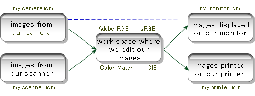
Software that is fully "ICC
aware" will have ways of dealing with the profiles
in each box of the above diagram. Setting up color
management in the application of your choice usually
entails finding the proper menus or windows to enter the
above information. High end photo editors such as PhotoShop and high
quality photo printing tools such as Qimage are
fully ICC aware, but the color management setup is a bit
different in each. You should refer to the software
documentation/help regarding color management for
specifics on how to "hook up" the proper ICC
profiles. Below is a short synopsis of two popular color
managed applications, PhotoShop and Qimage:
PhotoShop:
Camera or scanner profile:
When you open an image from your camera or
scanner, if that image is not tagged with the
profile actually embedded in the image file, you
may be asked to select the profile when the image
is opened. If not, use "Image", "Mode",
"Assign Profile" to identify the
profile for the image.
Work space: Click "Edit",
"Color Settings", and select the RGB
work space: Adobe RGB is usually best. Don't
worry about the CMYK, Gray, and Spot selections
for now.
Monitor profile: PhotoShop
will use the monitor profile identified on your
Windows "Display" properties "Color
Management" tab. You can get to your display
settings by right clicking on your desktop
background and selecting "Properties".
To change your monitor profile in PhotoShop, you
must exit PhotoShop, change your display
settings, and then restart PhotoShop.
Printer profile: Click
"File", "Print with Preview"
and select your printer profile under "Print
Space". Use "perceptual" rendering
intent unless you have trouble with certain
colors, in which case you can try "relative
colorimetric". Leave "Black Point
Compensation" checked. When you click the
"Print" button, be sure to click "Properties"
for your printer and make sure to set all print
driver settings as required for the profile!
PhotoShop will not remember your print driver
settings from one session to the next so remember
this important step each time you enter PhotoShop.
Note: PhotoShop will only
"see" and list profiles stored in the
system color folder, normally \windows\system32\spool\drivers\color
of \windows\system\color. It may also have
trouble if you have two different profiles (with
different file names) that have the same internal
description. If you don't see the profile you are
looking for, make sure the profile is in the
proper folder and that it has a unique
description, and then restart PhotoShop.
Qimage:
Camera or scanner profile:
Like PhotoShop, Qimage will automatically
recognize the proper profile if the profile is
embedded in the image file. Unfortunately, for
files downloaded straight from a camera or
scanner, this will usually not be the case.
Qimage allows you to specify profiles to
associate with certain types of images. Check out
examples 18, 19, and 28 in the Qimage help under
"Learn by Example" to see how to
associate a particular profile with your camera/scanner.
Work space: Qimage does
not have a separate work space as PhotoShop does.
Qimage allows you to edit your images in their
original color space, eliminating the need for a
separate work space. Simply open or edit your
original images and Qimage will follow the blue/dashed
lines in the above diagram when displaying/printing.
Monitor profile: Right
click on the text next to "Mntr ICC" on
the bottom right of the main window to select
your monitor profile. Note that even if you
profiled your monitor with a monitor profiling
tool, you should still enter the monitor profile
under "Mntr ICC". The Windows system
does not load your monitor profile at
the system level, so specifying the monitor
profile here is not double profiling. The change
that you see when Windows starts up is an initial
"calibration" stage that is needed in
addition to the profile; it is not the profile
itself being loaded.
Printer profile: Right
click on the text next to "Prtr ICC" on
the bottom right of the main window to select
your printer profile. Use "perceptual"
intent unless you have trouble with certain
colors, at which point you can try "relative
colorimetric" intent. Leave "Black
Point Compensation" checked. Click "File",
"Printer Setup" and click "Properties",
making sure to set all print driver settings as
required for the profile! Qimage remembers all
print driver settings from one session to the
next but if you regularly use more than one
profile, you can click "File", "Save
Printer Setup" to save all printer related
settings including the driver settings, printer
profile, etc. so that loading them in the future
will ensure the proper settings for the profile
without worrying if you've set everything the
same.
Other options for color
management:
After reading this article, you
may still question whether you really need color
management via ICC profiles. Keep in mind that there are
a lot of people who simply print what comes out of their
scanner or camera without ever understanding color
management or using ICC profiles, and they are satisfied
with the results. I'm a firm believer in "if it
ain't broke, don't fix it" but in this case, it is
often difficult to know what you are missing without
seeing the results of a color managed system and
comparing that with what you are used to. There are a lot
of different combinations of cameras, scanners, monitors,
and printers out there and some work well together
without any color management. It is rare, however, to get
a really good and accurate color match among all
devices without some form of color management.
What about EXIF Print, Epson's
PIM, and PIM II? These options can
help resolve overall "complaints" about prints
being too dark or bright, oversaturation or
undersaturation, etc. but they are not considered full
color management because they are generally options that
only handle color from certain (supported) cameras to
certain (supported) printers. They do not help with
monitor color or scanners, nor do they ensure any known
level of color accuracy like ICC profiles. In addition,
these options tend to be poorly supported in most
applications, requiring specialized software or "plugins"
to use. If you have the required software (which may have
even been supplied free with your printer) and your
camera supports either EXIF Print or Epson's PIM, it
might be worth trying if you do not want to take the leap
into full color management using ICC profiles.
Final Thoughts:
At this point, you've read through
a lot of material. I've tried to give you the basics of
what you need to know to get your feet wet in color
management. Refer to the diagram and try to grasp the
concept of having a profile for each box in the diagram.
Also remember that your ICC aware software is responsible
for getting you from one box to the next, so you don't
have to worry about the process; only that each device in
the process needs its own profile and that you have
software that can handle converting color from one device
to the next.
Color management and use of ICC
profiles is relatively simple in concept but often very
difficult to describe. I hope that this article has given
you the basics and will allow you to move forward in the
area of color management as you see fit. Color management
via use of ICC profiles is the professional's choice for
ensuring accurate color and can provide substantial
benefits in increased color accuracy when set up properly.
Mike Chaney
|
|
|
|
|
4132
|
Technical Discussions / Articles / August 2004: Over the Gamut and Through the Woods
|
on: May 26, 2009, 10:09:27 PM
|
Over the
gamut and through the woods.
So you want to manage
color?
It seems that the longer you stick
with a particular hobby or profession, the more
complicated things get. In digital photography, once you
get past that initial thrill of being able to view, edit,
and print your own photos, you start to become aware of
subtleties like the fact that certain colors on your
monitor don't match what is printed. You do some research
and it seems that there is something called "color
management" or "ICC profiles" that can fix
your problem, but the whole concept seems almost like
snake oil, or worse... some foreign language only spoken
by rocket scientists. Before long, you find yourself
trying a bunch of downloaded files (profiles), messing
with rendering intents, turning on/off something called
"black point compensation", and instead of a
good color match between your monitor, scanner, printer,
and other devices, you become lost in a forest, screaming
for help just hoping someone will hear you. Is it really
possible to understand this "color management"
concept to the point where you can at least determine if
you need it and if you do, exactly what you need to make
it work? Well, we're going to try. We'll try to deal with
concepts instead of underlying math where possible so
that we don't get caught up in the "rocket science"
of it.
Red, green, blue, yellow,
magenta, and cyan
Before digging into color
management, let's take a look at how different devices
represent the colors you see in a photograph. Devices
that emit their own light (like monitors and projectors)
or collect light using sensors (like cameras and scanners)
normally use intensities of red, green, and blue to
produce different colors. Devices such as printers that
produce output that relies on reflected light normally
use a combination of yellow, magenta, and cyan to filter
light hitting the paper so that the light reflected off
the paper is the correct color.
For the majority of colors, it is
possible to reproduce the same color using either RGB (red,
green, blue) or CMY (cyan, magenta, yellow) primary
colors. While printers ultimately place some combination
of CMY inks, dyes, or toner on the paper, the print
driver normally accepts data in RGB and the driver uses
the RGB data to "convert" to CMY for the final
print. The fact that almost all device drivers operate
under the RGB scheme allows us to simplify things and
work with a single set of primaries. In a typical setup
then, your camera, scanner, monitor, and printer all work
with RGB values. The RGB values are passed to the monitor
for display and RGB values are sent to the printer for a
print. There is no need to worry about the fact that your
printer doesn't use RGB inks: the driver takes care of
that and the print driver still wants the data in RGB
form.
In a digital image, we can specify
intensities of red, green, and blue for each pixel to
identify the color of the pixel. Red and green make
yellow. Red and blue make magenta (purple). Red and half
intensity green make orange. Etc. Line up all the
millions of pixels containing RGB values in rows and
columns and you get your final image (the photo).
All colors are not created
equal
Since our camera, scanner,
monitor, and print driver work and allow us to think in
terms of RGB, we are tempted to think that sending the
same RGB values between devices will result in the same
color. As a result of cameras, scanners, monitors, and
printers all using different technology to reproduce
colors, however, they each use a slightly different shade
of red, green, and blue as their primaries. The devices
may also have slightly different "tone curves"
so that a particular change in RGB value won't
produce the same change in visible light from both
devices. These issues mean that mixing the RGB values at
the same brightness level on each device will produce a similar
color, but not an identical color since we are
starting with RGB primaries that don't exactly match and
may also have non linear response with respect to
brightness. The reason for the "mismatch" in
RGB primaries can get complicated, but we need not
understand why the differences exist, only that they do.
ICC Profiles: the language
of color
At this point, it is becoming
clear that we need a way to convert the color from one
device to another, i.e. one set of RGB values to another.
Our camera recorded red, green, and blue intensities of
200, 200, 45. What intensities do we need for our monitor
to reproduce the same color? We know it most likely isn't
going to be 200, 200, 45 like the camera. Is it 202, 189,
56? Is it 192, 205, 38?
We could probably get the
conversion pretty close with many hours of trial and
error testing just eyeballing results and we could write
software that carried out our observations to do the
conversion. The problem is, our software would only be
good for that one specific camera model and that one
specific monitor because each camera and monitor will
work differently. What we need is a language that
describes the primary colors themselves and a color
management "engine" that can look at the
language spoken by the two devices and translate from one
to the other. We could then specify the "color space"
for a device which is determined by the primary colors
used by the device, and ask our color management engine
to translate between the camera's color and the monitor's
color for example.
ICC profiles are specifications
that describe the language of color spoken by a
particular device. An ICC profile for your camera
describes the subtleties of how your camera speaks RGB.
Similarly, an ICC profile for your monitor describes the
subtleties of how your monitor reproduces RGB colors on
the screen. Once you know the language of the camera and
the language of the monitor, the color management engine
can translate from the camera's language to the monitor's
language to get accurate color on the monitor. If you
know the subtleties of the language spoken by the
printer, you can do a similar conversion from the
camera's RGB language to the printer's RGB language to
reproduce accurate color on the printer as well. The
color management engine acts as the "universal
translator", translating the color of one device to
the next. All you need are ICC profiles that describes
the "dialect" of the RGB language spoken by
each device; a profile for your camera (either a generic
profile or one for a particular light source), a separate
profile for your monitor, one for the printer, etc. The
profiles themselves describe the color of the device in a
"universal dialect" called the Profile
Connection Space (PCS) which the color management engine
can use to translate color from one profile to another,
but with that, we're getting a little more technical than
we need.
The above chart shows our input
devices (camera and scanner) on the left, our photo
editing tools where we modify our images in the middle,
and our output devices (monitor and printer) on the right.
We need a profile that describes the color space for each
of the five areas above. In the context of this article,
we can use "color space", "ICC profile",
and "profile" synonymously. The path is usually
from left to right, starting with the original image,
converting to some common work space to modify the image,
and then converting to the monitor or printer color space
when we are ready for output.
When going from one area to the
next, our color managed software simply converts from the
color space in the box where we came from to the one
where we are going. As long as our color managed software
knows the color space (profile) for each box, it can get
you from one box to the next with consistent color. Note
that the actual RGB values for the image in each box are
slightly different, but the image looks the same
because the proper mapping has been done from one set of
RGB values to the next. Also note that if we choose not
to edit our images and simply want to display or print
the originals, we can follow the dashed blue lines where
our color managed software can convert directly from the
camera or scanner profile to the monitor or printer
profile. Having a common work space (Adobe RGB being the
most popular) in the center box is not a requirement as
it is possible to edit images in their "native"
color space on the left, but Adobe RGB (or sRGB) is often
used for consistency. The emphasis here is that we need a
profile for all boxes in the above diagram. If
we have a profile for every box except the printer, we
cannot produce color managed output for the printer
because while we may know the color language spoken in
all the other boxes, not knowing how the printer speaks
RGB means that there is no way to convert to the
printer's language.
ICC Profiles: a visual
representation
We have learned that in addition
to devices having unique RGB primaries, there are
standardized "work spaces" that have their own
(carefully picked) RGB primaries as well. These work
spaces are basically ICC profiles designed to allow
editing of images in a known "color space". A
color space is the area mapped out by drawing a triangle
between the red, green, and blue primaries as shown below.

The above is an abstract
representation of two of the most popular work spaces:
sRGB and Adobe RGB. The entire/outer colored area is an
approximation of the colors visible to the human eye,
called the "gamut" of the human eye. The
triangles map out the color spaces or the gamut of colors
spanned by the sRGB and Adobe RGB color spaces. As you
can see, using different red, green, and blue primaries
allows you to cover a larger or smaller portion of the
visible gamut. Why not just pick primaries that allow you
to cover the entire gamut? Again, the answer can get
complicated, but it is partially due to the fact that it
simply isn't possible given the technical capabilities of
certain devices (like monitors, printers, cameras, and
scanners) and it isn't always practical in a mathematical
sense either.
It is obvious by looking at the
above that sRGB covers a smaller gamut than Adobe RGB.
sRGB covers a gamut similar (but not identical) to your
monitor so it is well suited for display of images. Adobe
RGB on the other hand, covers a larger gamut and is
better suited for images being reproduced on a number of
different devices that might be capable of producing
colors beyond the sRGB gamut (many printers can produce
cyan and yellow colors beyond the sRGB gamut for example).
Most consumer level point-and-shoot cameras record images
in a color space close to sRGB above, even if that is not
specified in the manual or documentation for the camera.
If you have a selection for color space on your digital
camera or raw conversion software and you choose Adobe
RGB color space, your camera will be able to record
colors beyond those in the typical sRGB gamut,
particularly in the area of saturated cyan and green.
Being able to select color spaces
like sRGB or Adobe RGB in your camera gives you an added
benefit: you'll automatically have a profile for your
camera (the profile for sRGB or Adobe RGB is included
with most color managed software). If you are using a
point-and-shoot camera and no mention is made of a
profile or color space, you'll have to assume sRGB unless
you decide to get or create a profile of your own (see
below).
Now that we know what a
profile is, where do we get them?
We know that a profile can
describe the subtle color response of a device, and that
we need a profile for each device to be able to manage
color between devices (in order to render the same or
visually-same colors on each device). Now all we need is
a profile for our monitor, one for the scanner, one for
the camera, and one for our printer/paper/ink combination.
Profiles are just files that go in your Windows color
folder which is usually \windows\system32\spool\drivers\color
or \windows\system\color. The files you are looking for
will have either an ICM or ICC extension such as
my_printer_profile.icm or my_monitor_profile.icm. Sounds
easy but this can often be the stumbling block in a color
managed workflow. Let's take a look at the options:
Options for your camera
Most of the latest dSLR cameras (the
high end pro and prosumer models) come with a user
selectable color space. Remember that "Color space"
in this context is synonymous with "ICC profile".
Most have sRGB and Adobe RGB to choose from and if you
are working with software that can handle profiles, Adobe
RGB is generally the best choice to select in the camera
setup menu. Setting the camera to Adobe RGB will ensure
that images from the camera conform to the Adobe RGB
profile. If you usually just download pictures from the
camera and put them on the web or send them in emails
without modifying them, sRGB may be the better choice
because the sRGB color space (profile) is closer to your
monitor's profile than Adobe RGB. One common mistake is
to select Adobe RGB in the camera (or raw conversion
software) and then send the image to someone via email.
When the recipient views the email, he/she will see the
wrong colors because Adobe RGB is not well suited for
viewing on a monitor (the color space "triangles"
don't closely match). The solution is to convert those
Adobe RGB images to sRGB using your color managed "ICC
aware" software before sending them in an email.
In contrast to high end cameras
that allow you to specify a color space, if you have a
consumer "point and shoot" camera, there may be
no selection for color space and generally no indication
of what should be used for a profile. In this case, it is
usually best to just use sRGB as the "assumed"
camera profile. There are some camera profiles available
online such as those on the Popular
Photography site, but in general, it is very
difficult to create profiles for JPEG and TIFF images
from a camera because cameras often respond differently
under different lighting and it can be difficult to
recreate the exact settings used/needed on the camera for
the profile to be accurate. If you shoot in raw mode and
develop your photos with a raw conversion tool, it is the
responsibility of the raw conversion tool to convert your
raw images to JPEG's or TIFF's under a user specified
color space. In other words, you should not need to look
for a profile if you convert raw files with a raw
conversion tool because the raw conversion tool should
have output options like the ability to save converted
images in either sRGB or Adobe RGB color spaces.
It is possible to create a profile
(or profiles) for your camera using a profiling tool such
as those mentioned in the scanner and printer sections
below, but developing profiles for cameras is generally
not for the novice and requires very exacting framing and
lighting.
Options for your scanner
Scanners are actually quite easy
to profile using profiling software, but you may be able
to find a generic profile online (or your scanner may
have come with some) that are accurate enough. Even the
low cost profiling tools do a good job with scanners.
Just scan an included color chart, mark the four corners
of the chart in the software, and the profiling software
will create a profile for you. Some popular low cost
scanner profiling software are: Profile Prism by my
company (Digital
Domain Inc.) at $79, WiziWYG from Praxisoft at $89,
and Monaco EZ Color from Monaco Systems at $299.
There are even some free options online such as IPhotoMinus but the
free tools are limited to scanner profiling only, do not
come with the necessary color target to scan (which
you'll have to locate and buy), and generate simpler
"matrix shaper" profiles that are not as
accurate as the tools listed above.
Options for your monitor
About the only reliable and
accurate method of obtaining a profile for your monitor
is to buy monitor profiling software that comes with a
device called a "colorimeter" that attaches to
the screen to take actual measurements and create the
profile based on measurements. You can sometimes find a
generic profile for your monitor on the monitor
manufacturer's web site but these are usually quite poor
because monitors really do change significantly with age,
requiring them to be reprofiled once a month or so for
accurate color. Two popular monitor profilers are the
Spyder by Colorvision and
MonacoOPTIX by Monaco
Systems. Expect to pay in the $200 to $300
range but with significant improvement in color accuracy
on screen.
The visual "calibration"
tools such as Adobe Gamma that comes with PhotoShop and
other similar tools can help with certain aspects of on
screen color, but don't expect a reliable or accurate
match using these devices because they are designed for
general calibration, not profiling.
|
|
|
|
|
4133
|
Technical Discussions / Articles / July 2004: The Megapixel Race
|
on: May 26, 2009, 09:57:03 PM
|
The
megapixel race. Where did it start? Where will it end?
The race
is on
In 1996, I bought
my first digital camera, a Kodak DC40. At the time, it was one of
the only consumer cameras available and at 768 x 504 resolution,
it offered only a little more than one third of a megapixel. It
didn't even offer a way to view your pictures on the camera, but
it sure was cool. A year and a half later, I shelled out even
more cash for one of the next generation: an Olympus D600L with a
whopping megapixel of resolution. With that purchase, I became
aware that the megapixel race had begun and that I'd be spending
a lot of money on this new technology.
The good,
the bad, and the ugly
A lot has happened
since 1996. Manufacturers have added roughly a megapixel per year
to keep us drooling and upgrading as the balance of power begins
to show a strong shift from film to digital. As with many
advances in technology, it is good to step back from time to time
to take a look at where we've been and where we are going. How
many megapixels do you really need? Is anything lost along the
way or are the latest 8 MP cameras really 8 times better than the
1 MP versions from years ago?
To answer these
questions, we first need a little background. Since digital
cameras became widely available in the late 1990's, the "consumer"
camera, the small point-and-shoot style cameras marketed at the
masses, have all had image sensors ranging in size from about 6
to 9 millimeters across, roughly 1/4 the size of a postage stamp.
While the size of the sensor has not changed, manufacturers keep
finding ways to cram more pixels into the same 1/4 postage stamp
space.
This may sound
great at first, but as with most good things, there is a price to
be paid, and that price is image noise (grain). An image sensor
contains millions of photo sites, each of which is capable of
collecting a charge as light hits the cell. Unfortunately, there
is "overhead" involved since you must have some
circuitry to store, amplify, and shift the charge over to digital
data (the final image). As you decrease the ratio between the
size of the light detecting part of the cell and the size or
complexity of the electronics, noise increases. This noise can
often be seen as grain in images and will look a bit like multi-colored
"snow" from an old TV or even larger blotches of color
depending on the filtering used.
Megapixels,
taming the herd
An image sensor is
a bit like a radio antenna. The bigger the sensor, the more light
it can collect and therefore the less noise it will have. In
contrast to consumer cameras, most digital SLR's have sensors 8
times larger (or more), allowing them to capture more accurate
detail and also allowing them to operate effectively at higher
speeds (ISO equivalents). Digital SLR's are also designed with
much larger sensors in mind and they use larger, higher quality
lenses so it is fair to say that the SLR camera in general is
more "ready to accept" digital technology. On the other
hand, consumer cameras can be more of a challenge when trying to
increase resolution while holding the size of the sensor constant.
Most consumer cameras were designed around the 6-9 millimeter
sensor so increasing the size of the sensor is not cost effective
because it will require that the camera bodies (and possibly the
lenses) be redesigned. By increasing pixel count and keeping the
sensor size constant, manufacturers can use last year's camera
body, maybe add a feature or two, round off a few edges, change a
few buttons, add a pin stripe, and sell the same thing they sold
last year, but with more pixels.
Most consumer
cameras in the last few years have used what manufacturers like
to call a "1/1.8 inch" sensor which amounts to a sensor
about 7.2 x 5.3 millimeters. Obviously the advertised "1/1.8"
nomenclature is no indication of the actual sensor size. The 1/1.8
architecture was generally used for consumer cameras in the 2-4
megapixel range. Once manufacturers hit 4 MP, noise was on the
increase and compromises were being made. At 5 MP, some
manufacturers began switching to what they call a "2/3 inch"
sensor (8.8 x 6.6 millimeters), while the rest made the jump to
the larger sensor when they went from the 5 to 8 MP mark. Looking
at the sensor size alone, the increase may not look like a lot,
but the slightly larger sensor amounts to a 1.5 times increase in
overall size, giving manufacturers some breathing room to keep
moving forward in the megapixel race and alleviating many
complaints about noise.
Putting it
all into perspective
So what does all
this mean to people who are shopping for a digital camera? It
simply means that you need to consider more than the pixel count
when shopping for a camera that meets your needs. Don't buy into
the "8 is better than 5" marketing strategy without
considering other aspects of image quality:
Your
needs: What you need to do with the camera is
usually more important than the latest jump in resolution.
Do you need a point and shoot camera that is simple and
will fit into your pocket? Do you need an SLR with manual
controls? How much telephoto work do you plan to do and
might you need interchangeable lenses? Does the camera
offer features that you would find beneficial such as a
direct print option or a camera dock to print quick shots
on site? How fast is the camera from shot to shot? Most
of these questions can be answered with a little
reflection on your part and by reading through online camera reviews. When you've narrowed the
search to a few cameras that meet your needs, review some
online samples at the end of the reviews from your
various potential camera selections and compare similar
shots to see which you like best.
Print
size: How big do you need to print? If you plan
to print 4x6 or smaller prints most of the time with an
occasional 8x10, your camera choices will be much broader
because it doesn't take as much resolution to print small
sizes. Many people argue that 300 DPI (dots per inch) are
needed for true photo quality and you may have seen a
reference to 300 DPI, but there really is no overall
magic number. Prints will generally still look like
photos and won't suffer from noticeable pixelization (jaggies)
down to about 150 DPI if you print with high quality
printing software. Below about 150 DPI, prints start to
show jaggies (stair steps in diagonal lines that should
be smooth) or they will start to lose some sharpness. Use
the following as a rough guideline to how many megapixels
you really need:
| For a
300 DPI print (super sharp photo intended for viewing
up close) |
| Print Size |
Resolution needed
for 300 DPI print |
| 4x6 |
about 2 MP |
| 5x7 |
about 3 MP |
| 8x10 |
about 6 MP |
| 11x14 |
about 14 MP |
| 13x20 |
about 23 MP |
| For a
150 DPI print (photo quality when viewed at "arms
length") |
| Print Size |
Resolution needed
for 150 DPI print |
| 4x6 |
about 0.5 MP |
| 5x7 |
about 1 MP |
| 8x10 |
about 2 MP |
| 11x14 |
about 3.4 MP |
| 13x20 |
about 6 MP |
When using the tables above, note
that it is important to realize that most larger prints are
not scrutinized up close or with a magnifying glass and are
meant to be viewed from a distance. You can often "get
away with" much lower resolution when printing larger
sizes simply because people will not usually notice that a
150 DPI print is slightly softer than a 300 DPI print unless
they study it very closely. Also note that the idea that you
can get away with resolutions as low as 150 DPI depends on
the printing tool that you use and assumes that the tool (or
you) upsample (interpolate) the print to avoid noticeable
jaggies.
- Cropping: How
often do you find the need to crop a section of the photo
for printing? Does your technique or workflow often
require that you crop the photo to get rid of unwanted
portions of the image? If so, you need to take that into
consideration when using the tables above since cropping
an image reduces the resolution of the final print.
Framing your photos better when you take the shot can
reduce the resolution needed for the job because it means
you won't have to waste pixels on things you don't need
in the photo.
- Artifacts: What
are you (or your intended "audience") sensitive
to? Do you like super sharp photos? Do you notice noise (grain)
in backgrounds like blue skies or shadows? Some of the
latest 8 MP cameras have issues with chromatic
aberrations (purple fringing around sharp edges or edges
of high contrast). Do you notice this or see it as a
problem when reviewing online samples? Does the camera
render color that looks good to you? A lot of the buzz on
the web regarding "my camera is better than yours"
is subjective and the arguments for/against certain
cameras will never be settled because different people
look for different things in photos. Some focus on detail
or resolution while others focus on accurate color, other
artifacts in the images, and (lest we forget) some people
actually focus on the photograph itself, the content, the
framing, etc.
- User opinions: Be
sure to check online forums and other online resources to see what
people are saying about certain cameras. You may look
through samples and decide you like photos from a certain
camera better than others only to find out later that you
are not able to achieve the same quality as the reviewer
who shot the samples. A quick check in a few forums might
show a lot of complaints from people really having to
"tweak" photos to get good (usually color)
quality, so make sure that the quality you see is
attainable with your experience and time.
- Photography: This
probably shouldn't be the last topic because it is so
important. The quality of your pictures ultimately
depends on your ability as a photographer and your
ability to utilize your tools. I've seen amazing photos
from 1.5 to 2 MP cameras that beat photos from 6 MP
cameras just because the photographer took the time to
learn the tools of his/her trade (the camera itself and
any after-the-fact editing tools) and was simply able to
take good photos. Let us not forget that the "8 MP"
logo on your camera can't make you a better photographer,
nor can it make the camera any easier for you to use.
Learning techniques and tools from listening to others
can be the best way to improve your photographs. A lot of
people spend a lot of money each year just to have the
latest technology. That can be a disappointing and not
very rewarding process if you are lured into thinking
that a newer camera will make you take better photographs.
The latest technology can help, but often it is more a
question of whether you know how to use it and/or whether
or not the camera suits your needs.
- Mike Chaney
|
|
|
|
|
4134
|
Forum Rules, Status, and Info / Welcome + Rules / Welcome to Tech Corner
|
on: May 26, 2009, 08:04:10 PM
|
Welcome to Mike Chaney's Tech Corner! The forums here are dedicated to technical discussions related to digital photography. The articles on this site are copyright Mike Chaney and may not be duplicated in part or whole, but you are free to link to this site or the articles here. What is discussed here? Things like: - Issues or technical feedback on cameras, camera accessories, printers, and other hardware
- Issues, questions, or help with digital photography related software
- Talk about the latest technology related announcements by various manufacturers
- General technical talk about photography such as depth of field, sensor size, megapixel counts, and so on
Enjoy reading the articles and we'll see you in the forums. Mike |
|
|
|
|
4135
|
Forum Rules, Status, and Info / Welcome + Rules / Posting Rules
|
on: May 26, 2009, 08:00:46 PM
|
Rules for posting messages on this forum are similar to other forums on the web. Let's keep a family atmosphere, so watch your language and be respectful. Spam, Flaming, insults, or bad language are sure to get you banned. If you'd like to speak with us about advertising, please contact mchaney@ddisoftware.com. Commercial posts/ads that are intended to sell or promote products are not allowed in forum posts. Posting of usernames, passwords, or unlock keys/serial numbers of any kind (including software not specifically covered by this forum) will result in immediate ban. Feel free to link to this site from your own web page, however, duplication of any information on this site is prohibited. We appreciate your support! |
|
|
|
|

