|
4111
|
Technical Discussions / Articles / February 2006: Wide Load: Tips for Printing Large
|
on: May 27, 2009, 01:19:45 PM
|
Wide Load: Tips for
Printing LARGE
Background
Wide format printers are
getting cheaper and more economical, making large prints like 13x20,
20x30, and larger possible even for the advanced amateur. Logic
dictates that a wide format inkjet printer is nothing more than a big
printer and that printing to a wide format printer should be no
different than printing to your typical desktop inkjet except that it
allows you to work with larger page sizes. Unfortunately there are
a lot of snags that you may encounter when printing (very) large prints.
Most involve printer/driver setup and are easily corrected while others
may require a rethink on how you have your equipment connected, what
type of equipment you are using to print, whether or not your current
hard drive has the capacity for wide format printing, whether or not you
need more RAM, etc. Let's take a look at printing large and we'll
try to cover all the common missteps in the minefield. We'll keep
both
Qimage
and
PhotoShop
in mind for this article as those are popular PC/Windows printing
applications and are the applications that I deal with
most in wide format printing.
Page Size
Wide format printers often handle paper/page size differently than your
average inkjet, particularly with respect to borderless or "no margins"
printing. First, it is important to realize that there are two
methods that drivers use to perform borderless printing: expand page and
expand prints. In the expand page mode, the driver simply increases the
size of the page so that it is larger than the physical paper size. In
this borderless printing mode, the driver will actually show a printable area
larger than the physical paper size. For example, a 16 inch wide roll may
show as 16.23 inches across in your printing software. What is actually happening is that the
driver is printing approximately .12 inches off the left and right edges of the roll.
With this method, it is important to print your large prints in the
center of the page. For example, use "centered" or
"optimal/spaced" in Qimage.
This will ensure that the "overspray" that extends off the edges of the
paper is minimized and you won't lose the edges of the print because
they are printing up against one edge or the other. If you use something like
"compact" or "optimal", Qimage will place the print at the left edge of
the paper and .12 inches of the print will be off the page, cropping the
print slightly. Epson calls this expand page mode "Retain Size" in their
latest wide format drivers. In the older (7600/9600) drivers, this was
the only option available so no options were visible. What you
need to keep in mind with the expand page mode is that the driver
expands the page size so that it extends slightly beyond the edges of
the paper. In doing so, it is possible to print off the edge of
the paper and lose some of your prints. Try to avoid this
"clipping" by not printing anything all the way against the left/right
edges of the paper when aligning your prints on the page preview on
screen.
The other method of borderless printing (one that is used on most
standard inkjet printers) is the expand prints mode. In this mode, the
printable area remains the size of the paper (16.0 inches across for
example), but prints are expanded in size. With this mode, you can
specify 16 inches as the width and the driver will "artificially" expand
the print to 16.23 inches so that the print is large enough for some
overspray to the left/right: the overspray eliminates tiny slivers of
unprinted paper at the edges due to slight misalignment of the paper. This mode is more common but often more
confusing because every print you send will be slightly larger than what
you specified. Even if you print 4x6 prints on a 16x20 page, the 4x6
prints will be just slightly larger than 4x6 and this may confuse people
or prompt them to blame the printing software for the size problem when
in fact it is the driver that took the 4x6 print and expanded it after
the fact. If
the expand prints mode (called "Auto Expand" by Epson in their latest
wide format drivers) is being used, Qimage does have an option that can defeat the
size expansion so that you can obtain prints of the specified size
without the driver expanding them. See "Page Formatting", "Borderless Overspray/Expansion"
in Qimage. Some drivers even allow you to turn this expansion off
(or at least reduce it) by dragging the "amount of extension" slider all
the way to the left in the driver. Keep in mind that doing this
produces less overspray so any "sloppiness" in the paper loading
mechanism may show up as unprinted slivers on the edges of the print.
Understanding software differences WRT sizing
All software including PhotoShop and Qimage must work within the
limitations of the printer which are defined by the driver. If you
specify an impossible task, like printing a 16x20 print on 16x20 paper
without using borderless printing, different software may handle the
request differently. For example, if you don't specify borderless
printing, the maximum size print allowable on 16x20 paper using the
Epson 4800 is 15.766 x 19.333 inches. If you try to print a 16x20 using
PhotoShop, you will be told that the print size is larger than allowed
but you will be given a "Proceed" option. If you proceed, PhotoShop will print
at 16x20 but will clip the edges of the print and you'll end up with a
15.766 x 19.333 inch print that has the edges missing. In Qimage, you
will be told that the print size is larger than one page and will be asked
if you want a poster. If you say no, you'll end up with a 15.766 x
19.333 inch print (same size as PhotoShop) but without the edges cropped off. These are just two
different ways of handling the same problem and in both cases you end up
with (no more than) a 15.766 x 19.333 inch print: a printer/driver
limitation. It is important to recognize how different
programs handle sizing tasks and in particular, what happens when you
try to print sizes that do not fit on the paper. Whatever printing
software you use, be familiar with how it handles sizing discrepancies.
Spooling options
Qimage will almost always send more (potentially much more) data to the
driver than PhotoShop or other printing programs due to Qimage's
interpolation process. As such, you must make sure that the printer is
set up properly for large format printing. Not having the
printer/spooler set up properly may result in partial prints, no print
at all, or crashes due to the system not being able to handle the
[large] amount of data being handed to the driver. First and foremost, go to
control panel, select "printers and faxes", and right click on your
printer. Select "Properties" from the right click menu and then click
the "Advanced" tab. If "Enable Advanced Printing Features" is checked at
the bottom, UNcheck this option. This is the cause for 98% of printing
troubles when printing large prints as this feature can only handle a
small amount of data and isn't meant for photographic printing so the
option should remain UNchecked. The other
options on that tab usually make little difference but I recommend
checking "Spool print documents so program finishes printing faster" and
also "Start printing immediately". Those options will ensure the best
use of resources on the machine. Finally, click the "Print Processor"
button and make sure that the right side is set to "RAW". If any other data type is selected, it is likely
your photographic printing will not work properly. Click "OK" to save
the changes.
Maximum print sizes
Some online sources report that the maximum print
length in PhotoShop CS2 is about 90 inches. I have not confirmed this,
but I can tell you that when set up properly, Qimage has no length limit. PhotoShop
and most other applications that print photos try to send the image
all-at-once to the driver: they basically hand off the entire original
image at once and simply specify a print size for that image. Depending
on the initial image size and specified print size, this all-at-once
printing method can overwhelm the driver/spooler and
lockups/crashes may ensue. Qimage has a "smart" handoff to the driver that
passes the data in smaller chunks that don't overwhelm the system and
can allow for much larger prints. With Qimage, you are only bound by the
amount of RAM, virtual memory, and hard drive space available and by how
well your print driver handles the printing task when dealing with the
large amount of data normally used for big prints. Most of the big print
failures that I've seen fall into three categories:
(1) Printer is connected through a
network. I have not yet seen a reliable setup when printing through a
network and working with large prints. My advice here is just don't do
it! In fact, if your wide format printer is connected via an Ethernet
cable, switch to USB and print directly to the printer via a local
machine connected directly to the printer. There are dozens of
complications that arise when trying to send large amounts of print data
across a network so if at all possible, print from a machine that is
directly connected to the wide format printer as a local printer. You
will avoid a lot of hassles this way! It may be possible,
depending on many factors, to have a reliable network printing setup to
a wide format printer, but the complications are so diverse and varied
that I don't dare get into that here. When dealing with "wide
loads", it is best to avoid network connections altogether!
(2) Don't upsample originals. I've seen people scan 8x10 photographs at
2400 PPI ending up with a 1.4 GB file thinking they want the most
resolution possible for printing large. In this case, the original photo
only holds maybe 300 PPI of real information so scanning the photo at
600 PPI and then letting Qimage handle the interpolation makes more
sense (and often produces better results). Your system and the driver
will have enough to do processing your 10 foot long print, so don't hand
it a 1-2 GB file unless you truly have enough resolution in the original
to support it. If you have enough pixels in the original to
support the resolution of the final image (like a montage or panorama
using a dozen photos from a dSLR), your original images have reason to
be big, but don't "oversample" lower resolution photos or "overscan"
media at ridiculous PPI as this may do nothing but hurt you in the long
run! Taking a 30MB original, for example, and resampling it to
400MB might make sense if you plan to print from PhotoShop, but if you
are printing with Qimage, do not upsample that 30MB image
because Qimage will do all the upsampling at print time very efficiently
and with much less resources (RAM and hard drive space) if you simply
print the original 30MB image!
(3) When using a photo editor or other software to prepare a final image
for print, use a less proprietary and more internationally accepted
standard like the TIFF format or even the JPEG format for the final
image to be printed. Other formats such as Adobe's PSD format
often have more overhead and put more stress on your system, not to
mention that the public spec for such formats is often far behind what
is used in the latest version of the software that creates those files.
You may often be dealing with very large images when printing large
prints. To decrease the overall resource requirements for the job
and make the whole process go smoother, use a standard format like an 8
bit/channel TIFF file with no alpha channels and no
layers! All print drivers are 8 bits/channel so there is rarely any need
to carry 16 bit/channel through to the final print-ready image as it is
just going to end up getting converted back to 8 bits/channel anyway for
the print driver. Using PSD or layered TIFF's can put more strain
on memory resources and may cause longer print times or even an
occasional crash as the system tries to read a 400 MB image and print
the 3.7 GB of data needed for a 720 PPI 40x60 inch print. For
printing large, I recommend 2 GB of RAM with both the minimum and
maximum virtual memory set to 4 GB. This should avoid most disk
swapping unless your originals are extremely large.
(4) You can never have too much free
hard drive space when printing large prints! Printing a 44 inch
wide print that is several feet long can take 5 GB (yes, gigabytes) of
hard drive space or more. As a general/safe rule of thumb, try to
keep 10 GB free on the drive where your print driver spools data.
If you print with Qimage, Qimage will not need much hard drive space to
process the job but it is passing a lot of data to the
driver and the driver will in turn cache that data to disk while it is
spooling. Due to Qimage's high quality interpolation, it will
almost always send more data to the driver than your average printing
program, so don't assume that you have enough drive space just because
you were able to print a print through some other software. Qimage
rarely has a problem processing the job and will finish its printing
task, but after the printing task is over (sometimes before), I've seen
the print driver itself crash even when several gigabytes of free space
remain on the drive so don't be fooled into thinking it isn't a drive
space problem just because you have a few gigabytes free on the drive!
(5) I have assisted professionals
with the above tips and have printed prints as large as 44 inches wide
by as much as 10 feet long (44 x 120 inches) with no problem using
Qimage. When printing super large prints like this with Qimage,
however, I would recommend setting Qimage to interpolate no higher than
360 PPI for the final print. That means that if the page
resolution (current driver base resolution) shown above the preview page
on Qimage's main window shows 720 x 720 PPI or 600 x 600 PPI, set your
interpolation levels to "High". If the resolution shown above the
preview page is 360 x 360 or 300 x 300, set your interpolation level to
"Max". When printing huge banners, you rarely need the maximum 600
x 600 or 720 x 720 offered by the driver, so setting Qimage's
interpolation level to "High" instead of "Max" will cause it to
interpolate to 1/2 the listed PPI.
| When printing prints larger than
about 20x30 inches: |
| Qimage's preview page shows |
Set interpolation levels to |
| MORE than 720 x 720 |
Med |
| 600 x 600 up to 720 x 720 |
High |
| Below 600 x 600 |
Max |
Use the above table as a good rule of
thumb for printing prints larger than 20x30 inches to avoid system
overload. Under 20x30 inches: just keep the interpolation levels
set to "Max". While there should be no problem printing at "Max"
interpolation level in Qimage well beyond this arbitrary 20x30 size on a
capable machine, it will take longer to process and will increase the
strain on the entire system (particularly with respect to hard drive
space).
Summary
Hopefully the above tips will help clear up
some of the confusion and questions being tossed around from people
printing in wide format, particularly when using the latest Epson wide
format printers which have some new options. I print wide format
myself and have helped others like local camera store employees who
printed 44 inch wide prints 10+ feet long from Qimage to display on the
front of their store using the above tips. Most of the issues with
printing large involve just setting up the equipment, system, and driver
properly. I occasionally run into something out of the ordinary,
but most of the time the information on this page is all you need to
resolve any wide format printing problems even when they occur in
software other than my own Qimage.
Mike Chaney
|
|
|
|
|
4112
|
Technical Discussions / Articles / January 2006: Interpolation: Magical or Mythical
|
on: May 27, 2009, 01:16:37 PM
|
Interpolation: Magical
or Mythical?
Background
Years ago, when most of us
were taking photos using cameras with 1-3 MP (megapixel) resolution,
interpolation or "upsampling" was a hot topic. To get decent
photos at larger sizes of 8x10 and beyond, the ability to upsample
photos seemed more of a necessity than an option. Don't do it and
you might end up with jagged edges. Do it and it would smooth over
the jaggies to make the photo a bit softer but without the pixelization
artifacts that made the photo look more like a bad video capture than a
good photo. Fast forward to present time. With cameras
approaching and soon surpassing the 8-10 MP mark, is there really much
call for interpolation? How important is it and what does the best
job? It seems that specialized interpolation software and plugins
have lost little steam and people are still spending $200 on packages
that claim to do the best job adding pixels. Do you really need
these expensive solutions? How much better do they do than your
average photo editor? Let's take a look.
The problem
Interpolation attempts to
hide a problem that can be described simply as not having enough pixels
for the amount of space where they are displayed. The effect is
similar to walking too close to your TV. Get too close and you
start to be able to see the individual pixels and these are distracting
when you are trying to see the overall picture. The same occurs
when you take a limited number of pixels and try to "stretch them out"
over a large area.
Let's look at a crop from a
larger picture:
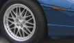
This tiny crop looks pretty
good. We can tell that it is the wheel of a car and we don't
notice anything strange about it. Take the exact same image,
however, and display it larger (4x) and we get:

Now we can see that we
simply don't have enough pixels for this larger size: the spokes on the
wheel look more like saws than straight lines and the outline of the
chrome part of the wheel looks jagged and not smooth.
The solution
To get rid of the visually
distracting pixelization in the above larger image, we can use
interpolation methods to add pixels to the image. The pixels in
the original (smaller photo) describe the data that we have to work
with, so interpolation cannot add any true data to the image, but it can
smooth over some of the rough edges and can add "apparent detail" by
predicting what should appear between pixels in the original image.
Look at interpolation like making a prediction. If I showed you
the sequence A C E G, you could make a logical assumption and fill in
the missing letters to get ABCDEFG. Are B, D, and F really the
missing letters though? You were thinking of the alphabet, when
the missing letters could have really been from a person's name: A
CHENG. This just goes to show that you can only "guess" so much
information when you are missing a significant portion of that
information.
What does interpolation do
to the above large/pixelated image?
| Without interpolation |
|
|
| PhotoShop "bicubic smoother"
interpolation |
 |
| Qimage "pyramid sharper"
interpolation |
 |
The top image shows what
the photo would look like at the 4x expanded size without interpolation.
By using interpolation, we are able to smooth out the distracting jagged
look (center and bottom photo) and improve the overall appearance of the
photo. Note that in doing so, we've reduced or eliminated the
coarse look of the image but the image now looks a bit soft (blurry).
This is a necessary tradeoff, since there is simply not enough data from
the original to determine which edges should be sharp and which edges
might be slightly out of focus due to depth of field, lens distortions,
etc. Older methods such as the bicubic methods used in
PhotoShop
tend to do a good job while more advanced methods like fractal
resampling, edge directed resampling, or the pyramid resampling method
available in
Qimage
(bottom image above) tend to do even better by further reducing jagged
edges to produce an even smoother result.
Understanding the tradeoffs
The above is a 4x upsample
which is considered fairly "radical". The truth is that if you
have a recent model digital camera, you will probably never need to
resample to the degree shown above. When you print your photos, a
slight upsample or downsample may be needed, but you'll rarely ever need
a drastic change in resolution to get a good print unless you do extreme
crops or billboard size printing. The most important thing is to
use a good interpolation algorithm to interpolate to the PPI (pixels per
inch) used by your printer, or an integer multiple thereof. Some
print drivers don't do such a great job of interpolation so if you send
them an "oddball" size by just printing the original, you may end up
with prints that have jagged edges. This can be true even if you
send the printer too many pixels, as some drivers don't
even handle downsampling well! One example showing
the problem can be seen in
Imaging
Resource's review of the Olympus P400 dye sub printer.
Notice near the end of the page how the 400 PPI image looks much worse
(more jagged) than the image that was downsampled to 314 PPI (the PPI of
the printer) first. This illustrates the importance of being able
to resample to the PPI used by the printer prior to sending images to
the print driver.
We can see some of the
benefits and tradeoffs of upsampling in the above samples, but
downsampling is just as important. When we take an image
consisting of concentric circles of increasing frequency and downsample
that image with an appropriate amount of antialiasing, we get the
following result showing a single set of rings emanating from the
center:
| Qimage default downsampling
(includes antialiasing step) |
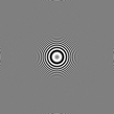 |
If we take the same image
and downsample using a standard downsampling routine without first
performing the antialiasing step, we get:
| PhotoShop bicubic sharper
downsampling (does not include antialiasing) |
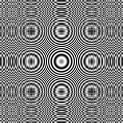 |
As can be seen in this
second example, lack of antialiasing has caused extra patterns to appear
that were not in the original image. While at first it may look
like the second example has more "detail", in fact the extra detail is
nothing more than artifacts caused by the resampling algorithm trying to
consider data beyond the frequency limit.
A balanced approach
A well balanced
interpolator will be able to downsample without aliasing artifacts while
also being able to upsample without jaggies or over-softening the image.
Old tried and true methods such as bicubic or lanczos are usually good
enough for most upsampling needs. More advanced methods can
increase visual quality for very large prints or special jobs, but be
aware that there is only so much detail you can "add" to an image.
Some of the newer interpolation methods try to make all edges as sharp
as possible and while these methods can make upsampled results appear
sharper, they often tend to break the correlation between sharpness and
depth of field and can make results look a bit like fingerpaintings.
Methods that produce smooth (jaggy free) images but don't try to
sharpen, on the other hand, can appear a bit too blurry. As with
many things, there are tradeoffs to each method.
The key to the best results
with any interpolation method is often to pick the appropriate amount of
sharpening. Interpolation methods that produce softer results can
often handle much more sharpening before showing any artifacts, so a
touch of extra sharpening can correct that soft look. Similarly, a
slight edge blur can remove that "painterly" feel of some of the sharper
interpolation methods if needed. Generally the more you stretch an
image (the more interpolation you use), the more sharpening will be
needed to compensate. "Smart printing" tools like Qimage and some
PhotoShop print sharpening plugins take all this into account and can
automatically apply the proper amount of final sharpening based on the
resolution of the original, the size of the final print, the resolution
of your printer, and other factors to allow the print to be the most
visually consistent at any size.
Probably the most important
thing to realize in this entire article is that there is only so much
you can do to "invent" data that is not there and when displaying or
printing photos, you have to go to extremes in most cases to be able to
see the difference between interpolation methods. If you are
captivated by some software or plugin that claims to do a much better
job at interpolation, my suggestion would be to download a trial or do a
search for reviews of the product before you buy. I've seen some
ridiculous samples posted on interpolation software websites showing a
vast difference between their method and others, only to download the
software and find out that it really does no better than the old bicubic
method. When you consider what the image "should" look like versus
what we get out of various interpolators on the market, there really is
very little difference between the better ones. If you find
yourself about to plunk down $200 for an interpolation program or plugin,
you might want to think twice. There are interpolation programs
out there that offer a wide variety of methods for less than $50 that do
as good or better than the high priced software.
Just for a sense of
"calibration", one of the better methods available produced this result
for the car wheel:
Some interpolation
algorithms may render this image a little sharper, with a little
more/less jagged edges, but the result will always be pretty similar to
the above as far as the overall amount of detail that can be seen.
Now consider what this image would look like if we had taken it with
enough resolution to begin with and didn't need to
interpolate:

This final image clearly
shows the limitations of interpolation. Interpolation can reduce
the appearance of artifacts like jagged edges but it simply cannot
retrieve detail that is not there. The 4x reduced image simply has
only 1/16th the amount of data which means that 94% of the data in the
interpolated result had to be "guessed" in the above samples.
Visually, the interpolated result is miserable in comparison to this
last sample above regardless of the method used, but technically the
result isn't too bad considering the fact that you started with only
about 6% of the data you needed and you guessed at the other 94%!
Bottom line
The bottom line here is that interpolation can
and does help improve the visual quality of images. That said,
don't expect magical results and beware of some of the mythical claims
out there. If you work for a magazine that normally starts with
extreme crops and blows them up to 8x10 photos for print, you might be
in the market for specialized interpolation software that allows you to
pick the best method for each image/situation. Just be aware that
many of the "miraculous" results displayed on the web sites for some of
these interpolation programs and plugins are quite exaggerated.
Better to try them first if they have a trial than to spend a
significant amount of money and find out later that they really don't do
much better than what you already have. Finally, keep in mind that
if you have a 5+ megapixel camera and you normally don't do much
cropping nor printing above 8x10 size, interpolation method may never be
a concern for you. More important will be to find software that
gives you the most benefit as far as the time it saves you and the
quality of the final result.
Mike Chaney
|
|
|
|
|
4113
|
Technical Discussions / Articles / December 2005: Lighting, Viewing, and Metamerism
|
on: May 27, 2009, 01:12:19 PM
|
Lighting, Viewing, and
Metamerism
Background
Metamerism. It might
sound like a word that can only be understood by techno geeks, but it
affects nearly everything you print. Have you ever noticed that
the colors in your printed photos look good under daylight from a window
but those colors change under fluorescent or incandescent lighting?
Blue skies may turn purple under certain lighting, skin tones may look
more yellow/orange, and grays may take on a color cast. B/W prints
often suffer from metamerism more than color prints and they can look
neutral under some lighting only to take on a red or green color cast as
you move the prints around your office or home. Metamerism is
often an issue when buying carpet, trying to match clothing color,
drapes, and other items. Colors may appear to match nicely in the
store but when you get home, the colors look completely different in the
lighting in your house. This is metamerism in action. In
this article we'll take a look at metamerism, what causes it, and look
at our options for controlling it.
Understanding how we perceive colors
The first thing we need to
understand is how people perceive color. Our eyes, like most
photographic equipment, see color by using three primary color
receptors: red, green, and blue. By "sampling" the amount of red,
green, and blue light present, our eyes can determine the color of an
object. Equal amounts of red and green let us perceive the color
yellow. Equal amounts of red and blue allow us to perceive
magenta. By varying the amounts of red, green, and blue light, we
can see any color in the visible spectrum. Image capture devices
(cameras, scanners) record RGB intensities similar to the way our eyes
record them and we use output devices (monitors, printers) to put these
primaries back together so that our eyes see the same RGB intensities
that were present in the original scene. While printers use
different primaries (a form of cyan, magenta, and yellow) the end result
is the same: the devices try to put the data back together so that the
red, green, and blue sensors in our eyes see the same intensities (or
very close) as those in the original image. Doing this "record and
playback" successfully gives you an accurate representation of color in
a printed (or displayed) photograph.
Primaries versus the color spectrum
It all sounds simple so
far. Unfortunately, while any color can be "simulated" by using
primaries like red, green, and blue, spectral distribution is also
important. Think about a rainbow. In every rainbow, we can
see all the visible colors from red, orange, yellow, green, blue,
indigo, and violet and all colors in between. As the wavelength of
the light changes from red to violet through the range of colors in the
rainbow, the wavelength of light changes from say 700 nm (red) to 400 nm
(violet). If we had a light bulb that could reproduce any
wavelength we desire by just turning a knob, we could turn the knob to
about 580 nm and we would see yellow. If we look at the spectral
distribution of color for this light, we'd see a single spike of color
at the 580 mark on the rainbow-colored graph. The graph would show
the rainbow of colors from violet to red across the bottom with a single
vertical spike in the yellow location.
Now instead of a single
yellow bulb, consider two bulbs: a red bulb and a green bulb. The
red and green bulbs will produce two spikes on the spectral distribution
graph: a spike at red and a spike at green. The graphs look
completely different, but if we set the intensities just right and mix
the red/blue light together, our eyes will perceive the two colors as
the same because both "excite" the red and green cones in our eyes to
the same degree. So we can arrive at the same perceived color with
very different lighting. At this point, you might be tempted to
say "who cares", but this is the first step to understanding metamerism.
How lighting affects prints
We all know that different lighting can affect
the way you perceive color. People are starting to buy bulbs that
are advertised as more "natural" to improve the appearance of people (or
other objects) in the home. What makes different bulbs and
different lighting technology more desirable? First we have to
consider the light spectrum from above. Lets start with the sun.
Sunlight or "daylight" is considered full spectrum. Full spectrum
simply means that you have a relatively even distribution of every color
in the spectrum from violet through red. If you look at the
spectral distribution of sunlight, you'd see a relatively straight line
across the graph indicating that every color from violet, blue, cyan,
green, yellow, orange, red are all present at nearly the same intensity.
This is the very definition of "white": the presence of all colors at
once.
In contrast to daylight,
most man-made lighting such as fluorescent and incandescent lighting has
a very "spiky" distribution of wavelengths. Our eyes may be able
to adjust to any of these light sources, but each color in the spectrum
may not be represented equally.
Here
is a page showing the spectral distribution of different light sources.
As you can see, fluorescent lighting has a large green component but is
deficient in red. This can make fluorescent lighting look a bit
green. Conversely, incandescent lighting has a larger red
component and is deficient in green and blue, making objects (or the
light itself) look orange.
When we print photos, our
printers distribute ink/dye with the assumption that we have full
spectrum lighting as our viewing source. We really have to assume
full spectrum lighting because there is so much variation in lighting of
even the same type (incandescent, fluorescent) that to do otherwise
would only make the problem worse. Because our printers reproduce
color using primaries like cyan, magenta, and yellow, uneven
distribution of light from a non full spectrum light source can shift
colors due to the way the "spikes" created by our printer's cyan,
magenta, and yellow inks happen to align with the spikes in our light
source. If our light source has a "valley" in the spectrum in the
blue area and a "peak" in the red area, this might have the affect of
enhancing the yellow ink while subduing the cyan ink. Move to a
different light source, and the opposite may be true, forcing the
perceived color to change. It's sort of like watching a runner who
is pacing at a steady rate. As long as the runner keeps pace, it
doesn't matter whether the ground between his steps is
solid or he is running on the tops of well placed poles because he
doesn't use the ground that he isn't stepping on. Place poles
where he is stepping and he'll do fine. As soon as he changes his
pace, however, and his stride no longer matches the placement of the
poles, he falls. Same idea with matching your lighting with the
color distribution of your inks.
So how do we deal with metamerism?
We have to consider the
spectral distribution of light plus the spectral distribution of our
inks to understand and control metamerism. Sound complicated?
You bet! So complicated in fact that there really is no simple
answer. Even if you use ICC profiles to get the best color for
your printed photos, almost all ICC profiles are designed to produce
accurate color under full spectrum lighting (D50). View your
prints under most indoor lighting, and your results may vary. Some
printers have inks that are more or less prone to metamerism, and some
individual inks can cause more of a problem than others. For
example, the yellow ink in some printers has been found to be a major
contributor to metamerism, so some specialized (mostly B/W related)
software is designed to try to use less yellow ink so that your prints
don't shift color as much from room to room. It really is a
complicated issue, but there are things that you can do to take control
of metamerism.
The best (and relatively
inexpensive) way to deal with metamerism in a controlled environment is
to buy better lighting. While
Solux
bulbs probably produce the best metamerism-free lighting, there are
other options available that do a relatively good job. For
example, most home and garden centers now carry "daylight" or "natural"
fluorescent bulbs for your home or office. They are more expensive
than regular office fluorescents but you can still probably replace all
of the 48 inch fluorescent bulbs in a small office for less than the
cost of a few packs of photo paper! Most of these bulbs are
labeled with a CRI (Color Rendering Index). The closer the number
to 100 (perfect daylight), the better. A CRI of 90 would be
considered good, 95-98 very good, and anything above 98 exceptional.
Not only will these bulbs help prevent color surprises in your prints,
they also brighten the room and often give more of a revived feeling to
the surroundings.
If you are printing B/W
photos, you may want to invest in specialized software that produces B/W
prints that are less prone to metamerism. Most inkjet printers do
not just use black ink to produce B/W prints: they still use a mix of
black plus some of the color inks. To understand why printers
still need to place color ink on the paper when printing B/W photos is
another article in itself, but most print drivers don't offer a "black
ink only" option. To make matters worse, most black inks aren't
truly neutral anyway! Our eyes can be more sensitive to color
casts in B/W prints because we are very sensitive to slight color casts
when we know the entire photo should be neutral. If you find that
your B/W prints shift color when moving to different lighting, you might
want to consider a RIP (Raster Image Processor) designed for your
printer such as
QuadTone RIP.
In most cases though, an accurate ICC profile for your printer will do a
decent job.
Also be aware that
different printing technologies suffer from metamerism to different
degrees. Pigment based printers usually suffer from metamerism
more than dye based printers, however, the latest pigment based printers
have far fewer problems than the earlier models such as the Epson 2000P
and 2200 which are known to produce prints more prone to metamerism.
Summary
Most people will probably
go through life unaware of the issue of metamerism and to be honest, the
problem is rarely so severe that people complain about it. For
those who are concerned with color accuracy and producing the best
photos, however, there may be some situations where colors are difficult
to match and knowing that metamerism can be an issue can at least allow
you to deal with the problem. As a general rule of thumb,
metamerism is most evident in printed photos, so if you are having
trouble with color matching in your printed photos, always take the
photo to a window or take it outside to see if the problem persists
under full spectrum lighting. You might just be dealing with a
particular color that is affected by metamerism. It can be a
tedious and losing battle to try to tweak colors under difficult
lighting, so it's always a good idea to try daylight when dealing with
color issues in printed photos just to identify where the problem is
coming from. This might not make the fix any easier if you
must deal with difficult lighting or your photos must be
displayed under that lighting, but at least if we can see and identify
our enemy, we have more options in how to deal with it.
Mike Chaney
|
|
|
|
|
4114
|
Technical Discussions / Articles / November 2005: Shopping for a New Monitor
|
on: May 27, 2009, 01:09:41 PM
|
Shopping for a New
Monitor
Background
Is your old monitor getting
hard on your eyes? Aging CRT monitors can be a real headache as
they get older, lose contrast, and their ability to resolve crisp detail
fades. You've decided that the time has come to get a new monitor
but your friend is telling you to get an LCD monitor while some
coworkers swear by CRT monitors. Who's right? What are the
pros and cons and what do you look for when shopping for a new monitor?
Let's see if we can give you the basics to allow you to decide for
yourself.
CRT Monitors
Cathode Ray Tube (CRT)
monitors have been around for a long time, have been refined over the
years, and have a large following. All this refinement means that
there are some incredible CRT monitors on the market from your low end
15 inch "el cheapo" CRT all the way up to larger gamut 22 inch high end
graphics station CRT monitors costing almost $5,000. Still, the
average digital photography enthusiast will likely notice that the
selection of CRT monitors available at your local computer or
electronics store is dwindling and stepping aside to make way for the
LCD market. At one popular computer warehouse store I found 18 CRT
monitors compared to 89 LCD monitors. At another, 7 CRTs to 51 LCD
monitors.
Seeing this swing from CRT
to LCD, if you do decide on a CRT, are you going to be looking at an 80
pound paperweight in just a year or two? Probably not, but it's
worth looking into the reasons behind the apparent near demise of the
CRT monitor to see what is driving these trends. We'll get to that
after we take a quick look at LCD monitors.
LCD Monitors
When LCD monitors finally
started taking hold just a couple of years ago, selections were minimal
and quality was questionable. Anyone who had used a laptop two
years ago would probably grimace at the thought of putting a "laptop
screen" on their desk. They had limited resolution, poor contrast,
and color changed drastically when you moved your head from side to side
and looked at the display at an angle. LCD monitors have actually
come a long way in just the past year or two. They now offer much
wider viewing angles (although there is always some fluctuation in color
when viewing from an angle), their contrast or "dynamic range" now
bests almost any CRT, and they are faster than they used to be and don't
have any significant "smearing effect" seen on some old laptop LCD
displays. In addition, the latest LCD displays offer crispness and
clarity that even the high end CRTs can't match, especially when dealing
with static non-moving images and text. Let's take a look at some
of the pros and cons of both CRT and LCD monitors in the next section.
CRT versus LCD
You guessed it: life is full of tradeoffs.
While LCD monitors seem to be the up and coming trend, CRTs still offer
some advantages that may be important to some.
LCD Pros:
-
"Pixel perfect" clarity:
CRTs may look blurry in comparison once you've seen an LCD.
-
Lightweight and easy to move around.
-
Thin panel can often be scooted farther back on
the desk without bumping into the wall.
-
LCD monitors consume much
less power than a CRT, reducing demands on other devices such as
uninterruptible power supplies.
-
High contrast: bright
whites and dark blacks.
-
Flicker free: LCD monitors
don't "scan" the same way that CRT monitors do so you will never see any
flicker on an LCD monitor.
-
LCD monitors can't be
magnetized like a CRT and are therefore less susceptible to distortions
caused by speakers and other nearby devices.
-
LCD monitors don't create
static like a CRT and therefore collect less dust.
LCD Cons:
-
Unlike CRT monitors which
can be run at any resolution up to the max listed resolution, LCD
monitors really only operate "properly" at their native resolution,
limiting you to just one option for resolution.
-
Color (especially of
photos) can change slightly at an angle. On larger (19 inch plus)
LCD monitors, slight differences in color can even be visible on the
same color displayed in the middle of the screen versus the edges due to
the differing angle of view.
-
A slight smearing effect
can sometimes occur when watching video especially when the video shows
fast moving objects. Such objects can sometimes leave a trail.
-
LCD monitors are prone to
having dead pixels that appear as tiny bright/dark dots.
-
LCD monitors can be more
difficult to profile than a CRT and require a special LCD profiling
device that may cost more than a CRT profiling device.
CRT Pros:
-
CRT monitors are generally
much cheaper than the same size LCD monitor.
-
CRT monitors can run at any
desired resolution up to the max listed resolution.
-
CRT monitors can display
high speed video without smearing.
-
CRT monitors usually show
no or minimal color change when viewed from an angle.
CRT Cons:
-
CRT monitors can be bulky
and difficult to move around.
-
CRTs consume much more
power than an LCD.
-
CRTs are generally not as
crisp and sometimes appear blurry or soft compared to a good LCD monitor
(for still pictures or text).
-
CRTs create static that
attracts dust.
-
CRTs often deliver less
contrast (duller picture).
-
The picture on a CRT
generally degrades faster over time than an LCD.
Some things to look for
I could ramble on about dot pitch, dynamic range,
viewing angles, and other tech jargon, but the best advice I can give is
to go to your favorite computer/electronics store (preferably one with a
large selection of monitors), and see for yourself. Look at still
photos, motion video, and text on each monitor and see which you like
best and which model is easiest on your eyes for the work you do.
Keep in mind that a lot of electronics superstores may not have the
staff or the knowledge to adjust each monitor so that it is working
properly. For example, they may be running a 1280 x 1024 LCD
display at 1024 x 768 resolution which will make the display look
horrible. Ask the help at the store to be sure that the LCD
displays are all running at their "native" resolution because if they
are not, you really can't effectively compare LCD monitors.
Here's a quick checklist
for shopping for a monitor:
-
If you have an idea about the type of monitor you
want beforehand, do a search using your favorite search engine and look
up some of the models listed for sale where you plan to shop. Read
user reviews and/or print them for the models you might be interested in
and bring them to the store. Some online retail outlets have user
reviews that can be very helpful.
-
It is actually easier to shop for a CRT because
you can just evaluate video, still photographs, and text on screen and
make a judgment.
-
When dealing with LCD monitors, know what
resolution you prefer beforehand. Most LCD monitors up to about 19
inches are going to be 1280 x 1024 and you'll have to run them at that
resolution to get the most out of them. The next step up are 1600
x 1200 resolution LCD monitors and that jump usually means a pretty
significant jump in price too. If you think you'd like to run your
monitor at 1600 x 1200 resolution, you'll likely have to spend more than
a thousand dollars on an LCD. If that's out of your budget but you
still need the higher resolution, you may be stuck with a limited
selection of CRTs.
-
When looking at LCD
monitors, assuming they are being run by Windows and that you have
access to the desktop, right click on the desktop background and select
"Properties". Then click the "Settings" tab at the top and look at
what is listed in "Screen resolution". For an LCD monitor, the
number listed there should match the resolution listed on the little tag
on the shelf in front of the display (hopefully there is one). If
there is a mismatch, the LCD display is being driven at the wrong
resolution and any visual comparison is fruitless.
-
Know your workflow.
Do you work with video more than stills? If so, be aware of the
LCD smearing effect. Display video on both LCD and CRT monitors to
see if you can see any smearing or "trails" when video is being
displayed on the LCD. Some LCDs are better than others in this
area. Smearing or trails on some of the better LCD models is
negligible.
-
When looking at the LCD
monitors, move your head from side to side with a colorful photo
displayed on the screen. Do the colors change or dull when you
move your head from side to side? Is the effect enough to bother
you? Will you sometimes be viewing from an angle or need to have
more than one person view the monitor at a time, say for presentation or
evaluation purposes? Generally the more expensive LCD models will
have this under control as they have a wider "viewing angle". Some
of the cheaper ones may cause more noticeable changes when viewed from
an angle.
-
If you spend a lot of time
in a word processor, spreadsheet program, or other application that
requires text, open up WordPad or something that shows text and see how
easy the different models are on your eyes. You don't want to go
to a store and buy a monitor that displays an awesome red rose only to
come home and start your normal work on a legal paper to find out that
text rendering is terrible on that monitor!
-
Finally, take into account
the size and shape of the display itself. Is it going to fit on
your desk at an appropriate height and distance from your eyes?
Whatever you do, don't buy a big CRT monitor only to bring it home and
find out that it is so deep that it hits the wall and forces you to view
it too close. There's a lot of discretion here as far as size,
distance, and exactly what you are using the monitor for. Common
sense and a measuring tape is probably all you need here.
Summary
With LCD monitors becoming
more popular, my incentive for writing this short article was to give
potential buyers enough information to make the right decision when
purchasing a new monitor. I often get asked what to look for when
shopping for an LCD monitor or whether LCD is really better than CRT, so
this article may at least give you the basics of what to look for so you
can decide for yourself. Hopefully I've covered the major points
and have identified some potential stumbling blocks in the process of
buying a new monitor so that these stumbling blocks and potholes can be
avoided. If you are thinking about replacing your aging monitor
with the latest technology, it always helps to know what to look for
since the way you shop for an LCD monitor can be different from how you
shopped for your last CRT. In the end, buy whatever fits both your
needs and your eyes best. After all, it is you who will be looking
at it most of the time.
Mike Chaney
|
|
|
|
|
4115
|
Technical Discussions / Articles / October 2005: Understanding Embedded Image Info
|
on: May 27, 2009, 01:06:36 PM
|
Understanding Embedded
Image Info
Background
Ask someone to define
"digital photo" and they'll probably tell you some things about taking
photos on a digital camera, viewing them on a monitor, and printing them
on a printer. Let's face it, that's what most of us do: point,
shoot, view, and print. The "casual" digital photographer may
never realize that there is more to their images than the picture that
gets displayed or printed. There is a host of information stored
in most images taken straight from the camera. Of course the picture itself takes up 99% or more
of the data in the image, but do you know what else is embedded in your
photos? Let's take a look at some common embedded information to
see if it can help us in any way.
The image header
The file that contains your
image also has a header that contains information such as the file
format (JPEG, TIFF, etc.), the resolution of the image (3000 x 2000 for
a 6 megapixel image for example), how the image is encoded (RGB for
example), and some other useful tidbits that help software to decode the
photo inside the image file. In addition to this basic
information, "extended" information about the photo may also be included
such as whether the flash was on or off during the shot, the distance
from the camera to the subject, the shutter speed, aperture, and even
GPS information on some cameras. The information (both basic and
extended) is usually stored at the beginning of the file, hence the term
"file header". The actual photo is normally stored immediately
after the header in the file. Let's take a look at some common
types of "extended" information that can be embedded in digital photos.
Embedded EXIF information
By far the most common and
most standardized embedded image information is EXIF, short for
Exchangeable Image File format. Today nearly all digital cameras
embed EXIF information in each image. This information usually
includes dozens of parameters that describe the shot such as the shutter
speed (1/250 for example), the aperture (f/2.8 for example), date/time
of the shot, flash on/off, ISO equivalent film speed, and many more.
In addition to shot-specific information, there are also many fields
that get repeated from shot to shot such as the camera manufacturer,
camera model, lens type, firmware version, etc. Information such
as shutter speed and aperture can help in diagnosing problems such as
motion blur, depth of field issues, etc. If you are not familiar
with these terms and you tend to point-and-shoot most of the time, these
fields may be less useful to you. Some information, however, such
as the date and time of the shot can be useful to everyone since
file dates get changed and almost never indicate the date and
time that the actual picture was taken.
Some image formats such as
the Windows bitmap format (BMP) do not support embedding of extended
header information, so you'll find EXIF information in file types such
as JPEG, TIFF, or raw but if you save your images in an older format
such as BMP, TGA, etc. the header information may be "stripped" from the
file since the file format doesn't support it. Be aware of this should you resave an image in a
different format and find that the embedded information has been lost in
the copy. As with any type of file [header] format, EXIF has its
limitations. The EXIF data stored in photos from your digital
camera is mostly technical in nature and doesn't allow for much (if any)
end-user editing so you cannot really use EXIF to store user data or comments.
To view EXIF information stored in your photos, you can use a tool like
Qimage. Simply roll your mouse cursor over
thumbnails in the thumbnail grid in Qimage for example, and some of the
more important/common EXIF data will be displayed on the status bar on
the bottom of the window. To view some of the less common fields
from the extensive EXIF information in your images, try a dedicated EXIF
viewing tool like
Exifer.
Embedded ICC profiles
While the EXIF header in your images does have a
field called "color space", use of this data is very limited because the
only two values allowed in the EXIF color space field are (1) sRGB and
(2) unspecified. This basically means that there is no way to tell
what color space (ICC profile) to use if the color space is not sRGB (a
standard color space for the PC/Windows platform).
For this reason, an ICC profile describing the specific color space of
the image may be embedded in the file as well. When an ICC profile
is embedded in the image, most ICC aware (color managed) software
applications will automatically recognize the embedded profile by
reading it from the image header. If you are using a color managed
workflow, embedded profiles become quite useful because they take the
guesswork out of how to interpret the color in photos and how to
translate that color to your monitor and printer.
Embedded IPTC information
One popular data format called IPTC, short for
International Press Telecommunications Council, allows users to enter
their own data and have it stored in the embedded image header.
Developed initially for the journalism community, the data field names
can be a bit cryptic. As a result, some programs give the fields
more readable names that don't necessarily follow the standard.
IPTC allows the user to enter information such as keywords, description,
location the picture was taken, photographer's name, priority, etc. Many photo editing
tools allow you to view and edit the IPTC information in images.
One good thing about putting your own information into the original
image is that the image can be passed along to others with the image
itself unchanged. The ability to write comments and other
information into an image can give the photo itself more meaning to
those who may view it out of context.
Other embedded data formats
We round out our look at embedded information
with a few embedded data formats that were developed to help printers
reproduce more faithful color. First up is Epson's PIM (Print
Image Matching) and PIM II. Knowing that full color management
using ICC profiles can be more complicated than some users would like
due to availability of profiles (or lack thereof) for various devices,
Epson introduced PIM as an answer for matching the color from your
digital camera to the print. Once PIM was introduced, many
manufacturers started making their (newest) digital cameras PIM
compatible by embedding the necessary PIM info in the header of each
image captured by the camera. While not as robust and arguably not
as accurate as full color management using (accurate) ICC profiles, PIM
and PIM II do offer a way to transfer information like contrast,
saturation, lighting, etc. from the camera to the printer to allow the
printer to adjust to different image capture conditions.
About a year after the
release of the initial PIM from Epson, EXIF released their EXIF 2.2
format also known as "EXIF Print" at the time. A more
industry-wide and more standard format, EXIF 2.2 endeavored to encompass
much of what Epson's PIM was doing in a format that was already being
used by all manufacturers, i.e. a format considered by most as less
"proprietary". EXIF 2.2 offered capabilities similar to PIM with
respect to recording the image capture conditions to produce a better
print, but proved to be a bit less "automatic" than PIM because the
latter had a more defined workflow. PIM was seen by many as a more
defined solution whereas EXIF 2.2 or "EXIF Print" was seen as "here's
some data about the image: use it however you like".
So far, solutions like PIM,
PIM II, and EXIF 2.2 have yet to take off and solidify themselves as
the standard for managing printed color. In my own
opinion, the reasons for these solutions not taking root in the industry
as the be all/end all solution for printer color management are twofold:
(1) color management via ICC profiles is already the established and
accepted international professional standard for color management of
any device and (2) PIM and EXIF 2.2 solutions tend to be a
bit less robust and less "scientifically accurate" than using ICC
profiles. Both of these points are reasons that many third party
photo and printing applications do not support the special "plugins"
needed to decipher and make use of PIM and EXIF 2.2 printing.
A very robust and accurate international standard for color management
already exists through the ICC (International Color Consortium) in the
form of ICC profiles and third party add-ons for supporting ICC profiles
have been readily available for years.
Summary
Hopefully this article has
given you a taste for some of the information that can be embedded in
images from your digital camera. If any of the above information
appeals to you or you think that any of the mentioned data would be of
benefit to you, simply plug in terms like EXIF, PIM, IPTC, and ICC into
your favorite search engine and you can spend hours looking at
additional information and downloading tools to allow you to view and
manipulate the data. There's a whole hidden world of information
in your images that maybe you didn't even know existed. Sometimes
you don't know how useful the information can be until you have it in
front of you. :-)
Mike Chaney
|
|
|
|
|
4116
|
Technical Discussions / Articles / September 2005: Soft Proofing Basics
|
on: May 27, 2009, 04:30:33 AM
|
Soft Proofing Basics
Background
We've touched on many
aspect of color management in previous articles, but have not dealt with
soft proofing until now. If you've read some of my prior articles
on color management and you have started using a color managed workflow
with accurate image, monitor, and printer profiles, you may have heard
about or noticed a feature called "soft proofing". In this
article, we describe what soft proofing can do for you and how it should
be used in a color managed workflow.
What is soft proofing?
Soft proofing, available in some ICC aware
software such as my own Qimage photo printing software and other high end photo
editors, allows you to see how your printer will render the colors in an
image by displaying a "simulation" of the print on screen. Seeing
what the print will look like by viewing a simulation of the print on
your monitor can be helpful as it may allow you to evaluate different
printer profiles and rendering intents without wasting paper/ink.
Anything that can improve our ability to make the right choice with
respect to printer profile and rendering intent can save you time and
resources. Keep in mind that soft proofing simulates how your
printer will reproduce colors in an image, so we use soft
proofing to compare color rendition not other aspects such as sharpness
or fine detail. If you are viewing what a print should look like
on your screen, how accurate can this simulation be? Read on to
find out what factors are involved in getting an accurate soft proof.
Under the hood
Soft proofing of a print by viewing a simulation
of the print on a monitor requires three things: an image profile, an
accurate monitor profile, and an accurate printer profile.
When you soft proof an image on screen, the ICC engine in the software
you are using will follow these two steps to produce the soft proof:
-
First the image will be
color converted from the image profile (the profile tagged on the image)
to the printer profile.
-
Once colors have been
converted to the printer profile, a second color conversion is performed
that converts color from the printer profile to your monitor profile.
By converting to color used
by the printer and then converting the printed color to the color used
by the monitor, we can simulate the color of the print on the monitor.
At this point, it should become clear that both the monitor and printer
profile must be 100% accurate for soft proofing to be truly accurate.
Since the printer profile is used twice in these color conversions, both
the "forward" and "reverse" look up tables in the printer profile must
be accurate and the monitor profile must be accurate as well. Any
inaccuracies in either the monitor or printer profile will cause color
errors in the soft proof and will cause the on screen "simulation" to
differ from the actual print. Add in some metamerism (the fact
that printed color might look different under different lighting) and
the fact that your monitor cannot display all the colors that your
printer can display (and vice versa), and you end up with some serious
limitations in what soft proofing can accomplish.
Soft proofing in practice
Given that inaccuracies and gamut differences can
add up to discrepancies between a soft proof and the actual print, what
is the best way to utilize the information provided by a soft proof?
Fortunately, if you have an accurate custom monitor profile created via
a monitor colorimeter (device that attaches to the monitor to measure
color and create a profile) and an accurate printer profile based on the
specific printer, paper, and ink you are using, the soft proof
simulation on screen will most likely look very much like the print with
respect to color. There may be some differences brought about by
certain lighting conditions or differences in color gamut such as the
fact that your printer can produce yellows and cyan colors beyond the
reach of your monitor, but overall, the soft proof should generally
match the print. The unfortunate side of the equation is that few
of us have both monitor and printer profiles that are so accurate that
soft proofing results in an exact match.
The proof is in the printing
If you are having trouble
getting your prints to match your screen, soft proofing is not going to
work well for you by definition. A no-match condition between the
print and your screen indicates that either the monitor profile, the
printer profile, or both have inaccuracies that cause errors in color
rendition. These inaccuracies will manifest themselves in a
mismatch between the soft proof and the actual print. Since few of
us really know how accurate our profiles are until we gain some
experience with them, the best advice I can give is to run some test
prints! I cannot stress this point enough, in that the true
proof is in the printing. I can't count how many times I have
gotten email from people who have been stopped in their tracks and
refuse to print because their soft proof "doesn't look good" only to run
a test print and find out that the actual print looks fine and the error
was in the soft proofing, the monitor profile, or some other part of the
process. Soft proofing is also unable to account for errors such
as using the wrong paper, printing on the wrong side of the paper,
switching to a different ink, clogged nozzles, or even having one
obscure setting not set properly in the print driver. Because
there are so many factors involved, always run a test print to be sure
your soft proof isn't telling you the wrong story. Once you've run
a few test prints and have compared those to the equivalent soft proofs
on screen, you'll be able to get an idea about how well soft proofing is
working for you.
So by all means, use soft
proofing if you like, but never use it as a substitute for printing.
Soft proofing should be used only when you know you have accurate
monitor and printer profiles and even then, only to judge overall "look
and feel" of the color. Soft proofing can be helpful if you are
working with a special image and you are wondering whether "perceptual"
or "relative colorimetric" rendering intent would be better for that
image. It is not a good tool, however, to determine which of four
different printer profiles works best with the paper you are using:
you'll need to produce test prints using each of the four profiles to
make the best decision and to see the true subtleties that only the
printer can print. Soft proofing is a useful tool for evaluating
overall color but if you are working on specific aspects of color such
as trying to get just the right shade for your friends yellow sweater,
be sure to print a small test print to be sure you aren't being fooled
by differences between the soft proofed image and the actual print.
Mike Chaney
|
|
|
|
|
4117
|
Technical Discussions / Articles / August 2005: Whatever Happened to JPEG2000?
|
on: May 27, 2009, 04:16:26 AM
|
Whatever Happened to
JPEG2000?
Background
In 2001, the official
release of the JPEG2000 spec sent ripples through the digital imaging
industry. Camera and software manufacturers had already started
planning a quick path that would lead us all to hardware and software
upgrades that would make our web browsers, imaging software, and cameras
even better by allowing use of this new "wavelet" based image
compression scheme which provides higher quality images using even less
storage space than the old JPEG standard. Back in 2001, it was
thought that the changeover from JPEG to JPEG2000 would be well on its
way by 2003 and by 2004 it was expected to be the new standard for file
storage in digital cameras. So what happened? It's now 2005
and there are still no digital cameras that support JPEG2000 and
support for this new standard really only made it into "mainstream"
digital imaging software within the last year or two. Did JPEG2000 fall on its face? Did it not live up to the hype? Read
on and I'll give you my own insights into the subject.
JPEG2000: All show and no go?
The obvious guess as to why JPEG2000 acceptance
has been slow might be that it was all hype. Nothing could
be further from the truth, however, as JPEG2000 certainly outperforms
the old JPEG standard. JPEG2000 images can retain much more
detail than a JPEG image compressed to the same size. In addition,
the JPEG2000 standard allows for lossless compression, greater than 8
bit/channel support, and other features not in the JPEG spec. Take
a look at the image below.
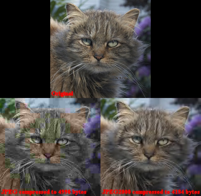
The original image at the top has been highly
compressed (about 60:1) to produce the two images on the bottom. You can easily see how much better
JPEG2000 does (right above) at this level of compression. We must look elsewhere to
discover why JPEG2000 has gained acceptance slower than expected, as it
clearly does perform.
Backward Compatibility
One issue with the new format is that JPEG2000
is not backward compatible. That is, it isn't just a rewrite of
the JPEG standard and JPEG2000 code cannot be used to read JPEG files.
For this reason, completely new code has to be written to address
JPEG2000 images and if you also want to support the older JPEG standard, you
must rely on having the old code present at the same time.
JPEG2000 images are really quite different from JPEG images so backward
compatibility with the JPEG standard doesn't make much sense.
Nevertheless, it is a completely new image format and not just an
upgrade of an existing one, which can ultimately limit the speed with
which it is accepted into the market.
Complexity
The wavelet technology used to create and decode
JPEG2000 images is much more complex than the code used for JPEG
images. With increased complexity comes an increase in code size,
increase in memory requirements,
and a decrease in performance. What this means is that reading and
writing of JPEG2000 images will take longer and will require more
complex software that needs more memory to run. Speed and greater
memory usage are often tradeoffs for quality in digital imaging.
The fact is, some of the initial code released for the JPEG2000
standard was very slow (up to 10 times slower than JPEG). Many saw
this as unacceptable for the perceived difference in quality when using
only moderate to low compression (the above example is one of
extreme compression that you wouldn't normally see in practical
terms). It took a year or two for the
algorithms to be tweaked to the point that good JPEG2000 code today
runs "only" about 2-3 times slower than code for JPEG images, depending
on compression level.
The Waiting Game
Let's face it. JPEG
images are already quite good. An 18 megabyte image from a 6
megapixel dSLR camera can be compressed into a 2 megabyte image with almost no
visible degradation in image quality. You really have to zoom in
and look hard to see any difference between the 18 megabyte (TIFF)
original and a 2 megabyte JPEG. The fact that camera memory keeps
getting larger and cheaper doesn't help JPEG2000 either. Most
people will not care that their 1 GB memory card that cost them maybe 85
bucks will "only" hold 500 JPEG
images and it could probably hold 1500 JPEG2000 images at similar
quality. The fact that your camera will take 2-3 times longer to
store JPEG2000 images on the camera card, potentially affecting
shooting/buffering speeds, might also make it a tough sell for people
using high end (read fast) cameras and those who have the need for speed.
I believe that due to the
tradeoffs involving compatibility, speed, and code complexity,
hardware and software manufacturers are in a sort of stalemate. It appears
that software manufacturers who develop mainstream tools like photo
editors, image management, and web
browsers are waiting for camera manufacturers to start supporting
JPEG2000 as a native format in cameras and other devices. In turn, the
camera manufacturers are waiting for global acceptance of the format in
tools like web browsers, image management tools, photo editors, and
other software. Nobody seems to be jumping at the opportunity to
do it themselves because for most companies, it is all about
cost/benefit. Do you spend the resources required to update the
processing chips in your cameras when millions are already on the market
with the old JPEG format and memory cards are so high in capacity and cheap?
Do the software companies spend the resources to include JPEG2000
support when none of the hardware can save JPEG2000 "JP2" files?
This "wait and see" attitude along with advances in areas like storage
capacity make JPEG2000 look a little less "juicy" than it did five years
ago.
The Current State of JPEG2000
Whether or not JPEG2000
becomes the defacto standard for compressed images remains to be seen.
It's actually a shame that people seem to care less and less about
storage space and that a technologically advanced standard like JPEG2000 just sits waiting for someone to jump on it and lead it down the
road to success. Right now, with all cameras still using the old
JPEG format, JPEG2000 AKA "J2K" or "JP2" has become an image format for
the "elite" who have specialized needs such as storing a high volume of
images in limited space. Instead of becoming the new standard for
compressed images, it has become more of a "toolbox" feature that allows
people to re-encode images into a smaller size for special [storage]
needs. It seems like the web would be the first logical place for
JPEG2000 to take off as web space and download times could outweigh most
performance issues related to decoding and displaying the images.
Hopefully the makers of software such as web browsers will take note and
start to support JPEG2000 on the web. I believe JPEG2000 still has a chance to make it into
mainstream hardware like digital cameras, phones, PDA's, and especially
the web. Some applications may never overcome the tradeoff of
performance and code complexity, but in my heart of hearts, I still have
to believe that JPEG2000 is just slow in acceptance... not dead!
Mike Chaney
|
|
|
|
|
4118
|
Technical Discussions / Articles / July 2005: Understanding Rendering Intents
|
on: May 27, 2009, 04:03:12 AM
|
Understanding Rendering
Intents
Background
Let's take a break from print driver settings
this month and talk about rendering intents. Rendering intents are
an often misunderstood concept of color management that can affect how
you use your ICC profiles. As usual, I'll try to keep things as
simple as possible in order to assist in the understanding of how
rendering intents affect results when you select perceptual, relative
colorimetric, saturation, and absolute colorimetric intents when using
ICC profiles. That said, it is impossible to discuss this subject
accurately without getting into some technical detail so if you feel
like you are getting lost, stick with it and we'll summarize it in the
end to hopefully put some meaning into the tech talk. If you've
read information on other sites regarding rendering intents and you
think you know all there is to know about them, please read on as there
is an abundance of inaccurate information on the web regarding rendering
intents and how they actually work.
Why are rendering intents needed in the
first place?
Color management (the use of ICC profiles) is a
game of give and take and involves many compromises. The main
reason that we make compromises in color management is because the gamut
(range of colors available) on one device is often very different from
another. A bright saturated blue color displayed on your monitor
for example may not be reproducible on your printer because your printer
simply cannot make that color. In this case, we would say that the
example blue color is in the monitor's color gamut but outside the
printer's color gamut. Trying to reproduce a reasonable visual
representation for colors that are out of range on a device is what
rendering intents are all about. For example, we may use tricks
like reducing the saturation of the entire print so that a color that is
out of range still appears a bit more vibrant than ones that are in
range. Rendering intents simply use different methods to
"trick" the eye into believing that the print can reproduce
irreproducible colors.
Visual representation of color gamuts
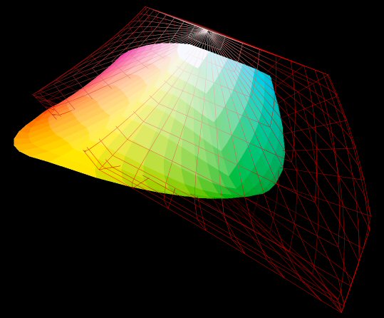
The above represents the gamut of colors
available in the Adobe RGB color space (red wire frame) and the gamut of
the Canon i9900 printer using Canon Photo Paper Pro (solid color
gradient). The hue and saturation of the color (red, green, blue,
orange, etc.) is represented in the 2 dimensional X/Y axes while the
luminance (brightness) is on the Z axis. The red wire frame shows
the range of all possible colors available in your image if your image
is stored in Adobe RGB color space. The solid gradient indicates
the range of all possible colors reproducible by your printer. As
you can see, most of the printer's color gamut is contained within the
Adobe RGB wire frame but small sections like the bright yellow peak that
protrudes through the Adobe RGB gamut (middle-left) indicate that there
are some colors that the printer can reproduce that cannot be captured
in the image. There are also large sections of the Adobe RGB color
space like the empty space in the wire frame on the bottom-right that
indicate colors that might be present in your original image that cannot
be reproduced by your printer. It is the handling of these "out of
range" colors that we'll refer to in discussing the rendering intents
below.
Relative Colorimetric Intent
If we look at the 3D gamut representation above,
we can see that our Adobe RGB images might have colors (lower right of
the red wire frame) that cannot be reproduced by our printer and that
same image might also have colors that are inside both the solid
gradient and the wire frame, indicating that those colors are in our
image and they are reproducible on the printer. One way to handle
the mismatch of gamuts is to: (a) render all colors that are present in
the image and are directly reproducible by the printer to
the proper color and (b) render all colors that are outside
the printer gamut to the nearest color on the edge of its gamut (called
the "gamut hull"). The gamut hull, visible in the above graphic,
simply represents the extremes of what the color space or device can
reproduce and usually represents colors that are bright and saturated.
Other colors inside the hull (not on the surface) are simply colors that
are less vibrant so that they are not as close to the extremes of what
the color space or device can reproduce.
Looking at the gamuts above, all colors that are
inside both the solid gradient and also the red wire frame are not a
problem: we can render those directly from the image color to the same
color on the print. Colors that lie inside the wire frame but are
outside the solid gradient are colors that are in your image but are not
reproducible on the printer. For those, we look at the gamut hull
(solid gradient above) and we pick the point on its surface that is
closest in distance to the color we are trying to make in the wire
frame. This method obviously has some drawbacks. Since there
are many colors inside the image gamut that can map to the same point on
the printer gamut hull, it means that we may see banding in our prints
as a particular gradient (like blue sky for example) might all map to
the same spot on the hull of the printer's gamut. On the positive
side, at least all of the colors that are reproducible by the printer
are reproduced accurately.
Note that the small section
of yellow that protrudes through the wire frame indicates colors that
the printer can reproduce but cannot be contained within
our original image. Since the image cannot contain those colors,
we need not worry about trying to reproduce them in the context of
rendering intents because they cannot be present in the image.
Perceptual Intent
As mentioned above,
relative colorimetric intent has the benefit of being able to reproduce
all colors that are reproducible. That is, if the printer can
reproduce the color, it will... accurately. The down side to
relative colorimetric intent is that we often have images that exceed
the printer's gamut and when this happens, we may see banding (sometimes
called posterization) of color in the prints.
Perceptual intent is a
rendering method that tries to get around the fact that out-of-range
colors might result in banding. With perceptual intent, we
compress or "squash" the gamut of the image down a bit so that not as
much of the wire frame sticks out beyond the solid gradient of our
printer's gamut. If we squash the gamut of the image so that the
wire frame is smaller, there won't be as many colors in the image that
can't be reproduced on the printer. This will eliminate or at
least reduce the amount of banding in the prints because more colors (in
our image) are now in range of the printer.
When we artificially squash the image gamut down
to try to fit more of it inside the printer's smaller gamut, we
generally end up with a print that has reduced saturation. If we
reduce saturation by only a little, our eyes may not notice the
difference on the print other than the colors not being quite as vibrant
as those under the non-squashed relative colorimetric intent. All
things being relative, the print can look better because although it is
a bit less vibrant in color, the banding present in the relative
colorimetric rendering is gone or at least reduced substantially.
Other than reduced color
vibrancy, there is another down side to perceptual intent. The
current ICC CMM (color management model) is not a "smart" model meaning
that it cannot and does not examine the gamut of the actual image
before trying to compress it to fit in the printer's gamut. While
the gamut available to your original image (the red wire frame) is
large, your actual image may only contain a few dull colors like some
green foliage and people wearing light pastel clothing. All colors
in your image in this case may be reproducible by the printer. A
"smart CMM" might be able to look at the original image and determine
that it doesn't need any squashing to be printed.
Unfortunately, the CMM does not have any knowledge about the image being
rendered and must perform a sort of "blind rendering" that assumes that
all possible colors must be taken into account whether or not they
actually exist in your image!
Some misinformation on the
web would lead you to believe that because the CMM cannot account for
image gamut, that it simply compresses the entire gamut of
the color space used by the image so that it fits inside the printer's
gamut. This is, however, also not true. Squashing the entire
color space where the image resides into the printer's color space would
amount to taking the entire wire frame above and shrinking it in size so
that no corners protrude through the printer's solid gamut in the
diagram. As you may be able to see by the graphic, that would be
an extreme amount of compression that would result in noticeable color
desaturation. In addition, it would mean that the same image
encoded in two different color spaces of different sizes (say sRGB and
Adobe RGB) would result in two different prints with different amounts
of desaturation even though the original images should appear the same
as they both have all the same colors: they are just encoded
differently.
What all this amounts to is
the fact that perceptual intent basically uses an arbitrary amount of
gamut compression (squashing) in order to reduce the banding effects
that might be present in relative colorimetric intent. The amount
of compression, which will show up in the printer's ICC profile, is
really up to the creator of the printer profile. What is normally
done is that when creating a printer profile, the available gamut of the
printer is taken into account and a level of compression is chosen so
that most colors that are likely to be seen in a photograph will be
"pulled back" into the printer's gamut. If it sounds "wishy
washy", that's because it is! Many web sites point out the
original concept of rendering intents and point out that relative
colorimetric intent clips the gamut while perceptual compresses it, but
these "ideal" concepts are not what is ultimately going on behind the
scenes in the CMM.
What does
all this mean?
By now you are probably either kicking yourself
for even reading this article because it seemed so simple before, or
you're getting close to deciding to just use perceptual intent and not
worry about the whole subject of rendering intents. :-) My
purpose, however, is not to confuse but to inform. I want people
to understand the limitations of color management as it exists today and
to understand what is really going on not just the high level concepts.
If I were to try to put all of the above as simply as possible, I'd say:
Perceptual Intent:
Use this method for most of your work especially if you intend to just
set it and leave it alone. Perceptual intent will produce prints
with accurate hue and while overall saturation levels may be a bit less,
you are unlikely no notice this by just examining the print by itself.
In addition, this method reduces artifacts like banding in blue skies.
Relative Colorimetric
Intent: Use this rendering method in certain cases where reproducing
accurate colors is paramount. This rendering intent is often used
when your original image contains only a narrow range of colors.
As an example, if you are reproducing an image of the Grand Canyon and
there are only rust colored Earth tones in the scene, perceptual intent
may take some of the clarity out of the photo because of the compressed
color gamut and because there aren't a variety of other colors present
for our brains to get a relative "lock" on the entire scene. Using
relative colorimetric intent in this case should make the texture of the
rock look more realistic and more defined because all of the colors in
the photo are likely to be within the gamut of the printer due to the
fact that they are not bright, saturated colors.
What about the other intents?
We have two intents left, but I won't spend much
time on those since they are of little/no value when reproducing
photographs.
Absolute Colorimetric
Intent: Absolute colorimetric tries to reproduce the exact colors
recorded in the original scene. Sounds even better than relative
colorimetric until you realize that absolute colorimetric intent
reproduces these colors with no regard (no adaption) for the illuminant
or light source. Simply put, using absolute colorimetric intent
will usually result in awful color shifts because our eyes will try to
adapt to the illuminant (white of the paper, color temperature of the
monitor, etc.) and the same color may look different under different
lighting. As such, absolute colorimetric is used mainly for
reproduction of specific colors like reproductions of fabric or logo
colors.
Saturation Intent: With
perceptual rendering intent, we may sometimes notice that colors have
been a bit desaturated to fit bigger gamuts into smaller ones. To
overcome this sense of desaturation, the saturation rendering intent
tries to keep accurate saturation while shifting other factors like the
hue of the color. This intent can be useful for things like screen
captures, bar graphs, and other images where the hue of the color is
less important than the overall "pop" of the image. Simply put, in
photographs, people are more likely to notice that a stop sign looks too
magenta than the stop sign not being vibrant enough. The converse
is true when displaying a pie chart where people are much less likely to
care that the red in the pie chart looks a little shifted toward magenta
but the presentation may have less "impact" if the entire pie chart
looks dull!
Summary
These are the games we play when trying to fool
our eyes into believing that a print or an image on the monitor looks
the same as it did when it was recorded/captured and what is really
going on behind the scenes when we make the decision about which
rendering intent to use. Hopefully the information in this article
has given you a bit more solid a foundation to stand on when dropping
down that often misunderstood selection called "rendering intent".
Mike Chaney
|
|
|
|
|
4119
|
Technical Discussions / Articles / June 2005: Using ICC Profiles with Canon Printers
|
on: May 27, 2009, 03:56:30 AM
|
Using
ICC Profiles with Canon Printers
Background
Last month we discussed how to properly utilize
ICC profiles with Epson printers. This month we focus on the use
of profiles with Canon printers. Many of the latest Canon printers
come with ICC profiles. Unfortunately, they have cryptic file
names such as CNB5CCA0.ICM and descriptions that aren't much more help
than the file name such as "Canon i960 PR1". Do you know how to
make use of these profiles or even what paper they are for? If
not, read on and we'll try to make using these profiles as simple as
possible. As we
did last month, we will assume for the purpose of this article
that you have ICC (color managed) software such as
Qimage or
PhotoShop
that you
will be using to print photos.
What is a profile?
An ICC profile is a file that
describes how to achieve accurate color on your printer
with a certain type of paper. You need to have a profile
for the specific paper (and ink) you are using. For more
information on what profiles are and how they work, read
my
August 2004 article
entitled "Over the gamut and through the woods"
.
Finding the right profile
If you have a newer model Canon
printer, it may have come with ICC profiles that
installed automatically from the software CD that comes with the
printer. The following profiles install with the Canon i960 driver for
example:
| File name |
Description |
Paper Type |
Quality Setting |
| CNB5CCA0.ICM |
Canon i960 PR1 |
Photo Paper Pro |
1 |
| CNB5CCB0.ICM |
Canon i960 PR2 |
Photo Paper Pro |
2 |
| CNB5CDA0.ICM |
Canon i960 MP1 |
Matte Photo Paper |
1 |
| CNB5CEA0.ICM |
Canon i960 SP1 |
Photo Paper Plus Glossy |
1 |
In addition to the above profiles, you may find
another more generic profile called CNBJPRN2.ICM with the description "BJ
Color Printer Profile 2000". This CNBJPRN2 profile is too generic
to be of much use and isn't a "real" printer profile, but is more of a
color matrix shaper. As such, use of this generic profile should
be avoided and profiles for specific paper/quality types should be used
like the ones above. Your Canon printer may have profiles with
slightly different names, but just remember that the description
includes the printer model followed by the paper type (PR = Photo Paper
Pro, MP = Matte Photo Paper, and SP = Photo Paper Plus Glossy), and
finally the quality setting at the end (1, 2, 3, etc.). Using the
profile description (visible in your photo editor or printing software
in the profile selection dialog), you should be able to choose the right
profile for your printer and Canon paper.
If you are unable to locate any profiles for your
printer or the paper you are using, you could try downloading and installing the latest driver for
your printer. It is possible that profiles will be installed with
the driver. To obtain the latest driver for your Canon printer, go
here and use the dropdown menus to locate your
printer. You can then download and install the driver.
If you are just not able to find
any ICC profiles on the Canon web site for your printer (or
paper that you are using), you could always create an ICC
profile yourself using a tool like
Profile
Prism, but the intent of this article
is to illustrate how to use readily available profiles
for Canon paper.
Finding the WRONG profile!
Please remember that printer
profiles are designed for a specific printer, a specific
paper type, and specific print driver settings. Don't try
to use a profile designed for Canon Photo Paper Pro with a different brand paper for example. The paper
may look the same and people may think it behaves the
same way in your printer, but you will likely be wasting
your time and ink since profiles only work with one type
of paper. Similarly, profiles for a previous (older)
model printer will likely not work properly either since
the printer hardware is probably slightly different and
the driver may be slightly different as well.
General overview of using
printer profiles
Let's assume you have located the
profile for your printer and paper. There are two steps
in using the profile and if both steps are not performed
correctly, you can end up with horrible color in your
prints (most often either green/yellow color cast or dull/dark/muddy
prints).
Let's look at the two steps to properly utilizing a
profile below.
Step 1: Print driver setup
First we have to set all print
driver settings to those required by the profile. Print
driver setup is usually accessed via "File",
"Printer Setup" or by clicking "File",
"Print" and selecting "Properties"
for your printer. A profile will only work with one
specific set of driver parameters. If you choose any
parameter incorrectly such as selecting the wrong paper
type, wrong quality setting, selecting "Vivid Photo" from the
"Effects" tab,
etc. the profile will not work properly. If the profile
you are using came with a "readme" file, be
sure to view the contents of that file and set the driver
settings accordingly. If there is no readme file that
outlines driver settings (there rarely is), you may have to rely on the
file name. You need to know the printer model, the type
of paper, and the printing mode (quality setting) as a
minimum.
Let's use the Canon i960 and Photo Paper Pro as an example. The
i960 driver CD
installs several profiles, one of which is "Canon i960 PR1". By the
description, we can tell that
this is the profile for the i960 printer with Photo Paper Pro and is designed to be used with the
driver set to quality level 1.
The following driver settings are appropriate for use with this profile:
Once the "Custom" and "Manual" radio buttons have
been checked above and the "Grayscale Printing" checkbox UNchecked, click the
first "Set" button on the right of the window under "Print Quality".
The following window will appear:
Slide the Quality slider to the right so that it
rests under the "1" for quality. Click the "Diffusion" button next
to Halftoning and click "OK" to accept. Now back on the main
driver window (first window above) click the second "Set" button under
"Color Adjustment". The following window will appear:
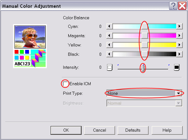
Make sure that the "Intensity" slider and all
four color sliders are set to zero (center position), UNcheck the
"Enable ICM" check box and set "Print Type" to "None". Click "OK"
to accept. Now back on the main driver window, click the "Effects"
tab at the top. The following window will appear:
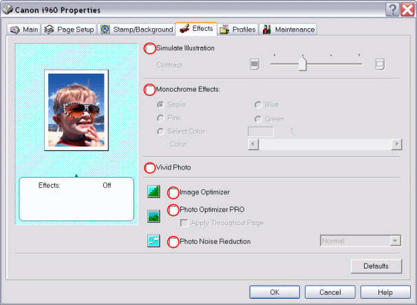
On the "Effects" window, be sure to UNcheck all
check boxes so that no effects are selected. Click "OK" to accept
these settings, return to the main driver window, and click "OK" to
accept all the settings on all of the above windows.
Your
Canon driver screens may look a bit different than the
above i960 driver screens, but most Canon drivers are very similar.
Step 2: Select the profile
in your printing software
Now that we have opened our print
driver setup window and have selected all the proper
parameters in the driver itself, we must make the proper
selections in our printing software to tell that software
which profile to use. Step 1 of the process (above)
simply prepares the driver to accept profiled data. It is
in step 2 that our printing software must apply the
profile. To do this, we need only tell our printing
software which profile to use by giving it the file name.
Refer to the steps below to see how to perform steps 1
and 2 in Qimage and PhotoShop.
Workflow for Qimage and
PhotoShop
Qimage:
Step 1 (from above):
In Qimage,
click "File", "Printer Setup"
from the main menu.
Select your
printer and click "Properties" for
that printer.
Follow the
screens from step 1 above to set the print
driver settings.
Step 2 (from above):
Click "Settings"
from the main menu and then "Color
Management".
Click the
"Enabled" box under "Printer"
toward the middle of the window.
Click the
browse "..." button in the "Printer"
group.
Click the
"All Windows Profiles" on the lower
right of the window.
Scroll
through the list and double click on the
proper profile (for example "Canon i960 PR1").
Leave
rendering intent set to "Perceptual"
with "Black Point Compensation"
checked.
Click "OK".
Add photos to
the queue and print.
PhotoShop:
Step 1 (from above):
In PhotoShop
CS, click "File", "Print with
Preview" from the main menu. In prior
versions of PhotoShop, click "File",
"Print Options".
Click "Page
Setup".
Click "Printer"
at the bottom of the window.
Select your
printer and click "Properties" for
that printer.
Follow the
screens from step 1 above to set the print
driver settings and click "OK" to
return to the "Print with Preview"
window.
Step 2 (from above):
Back on the
"Print with Preview" window, check
"Show More Options".
Drop down and
select "Color Management".
Under "Print
Space" at the bottom, drop down "Profile"
and select the proper profile (for example
"Canon i960 PR1").
Set "Intent"
to "Perceptual" and check "Use
black point compensation".
Click the
"Print" button and print your photo.
Once step 1 and 2 have been
performed you can print any photos you like and they will
all be profiled using the printer profile you selected in
step 2. Note that Qimage remembers all software and print
driver settings even if you exit Qimage and come back
later, so step 1 and 2 will only have to be performed
once and will only need to be redone if you change print
driver settings for some other purpose/profile. PhotoShop
will not remember your settings so you'll need to redo
both steps above each time you print or save your
settings from the print driver window if your driver has
that option.
Most problems with using profiles
are caused by an error in one of the two steps above:
Failure to set print
driver settings appropriately such as paper type, print
quality, and print type "none".
Forgetting to turn on the
profile in your printing software.
As long as you always insure that
the print driver settings are set properly per the readme
file that comes with the profile (or per the instructions
in step 1 if no readme is provided) and that you have
told your printing software which profile to use, you'll
get accurate color for all your photos.
Mike Chaney
|
|
|
|
|
4120
|
Technical Discussions / Articles / May 2005: Using ICC Profiles with Epson Printers
|
on: May 27, 2009, 03:47:53 AM
|
Using
ICC Profiles with Epson Printers
Background
Most new Epson printers like the R1800
come with ICC profiles for various papers and even if you
have an older printer, Epson may have added some ICC
profiles for your printer to their printer software
download pages. Increased availability of profiles means
that there are a lot of people out there asking how to
use them. While I applaud Epson for taking the lead in
providing more and more ICC profiles for their printers
and papers, documentation for how to use these pre-made
profiles is scarce. Do you know where to find these
profiles, what they are, and how to properly utilize them?
If not, read on and we'll try to make using these
profiles as simple as possible. Since driver settings are
handled a bit differently for different model printers,
we'll focus on using profiles with Epson printers in this
article. We will assume for the purpose of this article
that you have ICC (color managed) software such as
Qimage
or
PhotoShop
that you
will be using to print photos.
What is a profile?
An ICC profile is a file that
describes how to achieve accurate color on your printer
with a certain type of paper. You need to have a profile
for the specific paper (and ink) you are using. For more
information on what profiles are and how they work, read
my
August 2004 article
entitled "Over the gamut and through the woods"
.
Finding the right profile
If you have a newer model Epson
printer, it may have come with ICC profiles that can be
installed from the software CD that comes with the
printer. For example, the R1800 has an installation
option for installing the ICC profiles. If your
installation CD does not have an option for installing
profiles, you may want to explore the CD anyway to search
for files ending with *.icm or *.icc to see if there are
some "hidden" profiles on the CD. If you find
any, you can right click and select "Install
Profiles". If you find any profiles on your software
installation CD that came with the printer, they will
likely be for the most popular Epson papers such as Epson
Premium Glossy, Premium Luster, etc. Remember that one
profile is needed for each paper type.
If your software installation CD
does not contain any ICC profiles, there may be some
available on the
Epson printer support web
page. Simply scroll through the list,
find your printer, and click on it. On the next page,
click "Drivers & Downloads". If any
profiles are available for your printer, there will be a
link for "ICC Profiles". Sometimes some ICC
profiles are included with the "PIM" plugin, so
you might check the PIM download as well if all else
fails. If no link is visible that references ICC profiles,
most likely Epson has not gotten around to creating any
for your printer yet.
If you are just not able to find
any ICC profiles on the Epson web site for your printer (or
paper that you are using), you could always create an ICC
profile yourself using a tool like
Profile
Prism, but the intent of this article
is to illustrate how to use readily available profiles
for Epson paper.
Finding the WRONG profile!
Please remember that printer
profiles are designed for a specific printer, a specific
paper type, and specific print driver settings. Don't try
to use a profile designed for Epson Premium Glossy Photo
Paper with a different brand paper for example. The paper
may look the same and people may think it behaves the
same way in your printer, but you will likely be wasting
your time and ink since profiles only work with one type
of paper. Similarly, profiles for a previous (older)
model printer will likely not work properly either since
the printer hardware is probably slightly different and
the driver may be slightly different as well.
Also be aware that the old Epson
profiles that you may find on your hard drive (these are
usually files that start with EE_ followed by a number)
should be avoided because they are not designed to be
used outside the print driver itself and are generally
quite inaccurate. Newer profiles are normally files that
start with SP (for Stylus Photo) followed by your printer
model number and paper type: for example SPR1800 PrmGlsy
BstPhoto.icc.
General overview of using
printer profiles
Let's assume you have located the
profile for your printer and paper. There are two steps
in using the profile and if both steps are not performed
correctly, you can end up with horrible color in your
prints (most often either green or magenta color casts).
Let's look at the two steps to properly utilizing a
profile below.
Step 1: Print driver setup
First we have to set all print
driver settings to those required by the profile. Print
driver setup is usually accessed via "File",
"Printer Setup" or by clicking "File",
"Print" and selecting "Properties"
for your printer. A profile will only work with one
specific set of driver parameters. If you choose any
parameter incorrectly such as selecting the wrong paper
type, wrong resolution, selecting "PhotoEnhance",
etc. the profile will not work properly. If the profile
you are using came with a "readme" file, be
sure to view the contents of that file and set the driver
settings accordingly. If there is no readme file that
outlines driver settings, you may have to rely on the
file name. You need to know the printer model, the type
of paper, and the printing mode (quality setting) as a
minimum.
Let's use the R1800 and Premium
Glossy Photo Paper as an example. The R1800 software CD
installs several profiles, one of which is SPR1800
PrmGlsy BstPhoto.icc. By the file name, we can tell that
this is the profile for the R1800 printer with Premium
Glossy Photo Paper and is designed to be used with the
driver set to the "Best Photo" quality setting.
Unless otherwise specified (in a readme file), use the
following print driver settings:
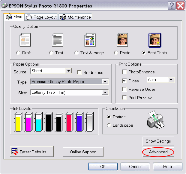
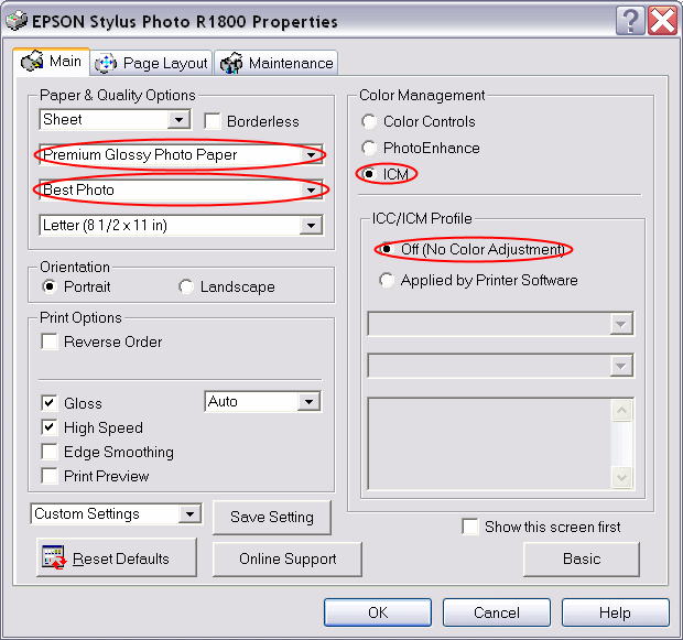
Note that the important settings
are circled in red. Options that are not circled such as
"High Speed" or "Edge Smoothing" can
be set to on or off as you like since they won't affect
color enough to cause problems with the profile. Your
Epson driver screens may look a bit different than the
above R1800 driver screens, but the most important thing
is to be sure to select the paper type, quality, and
select the "no color adjustment" mode. Other
printers may list the quality setting as a DPI number
such as 1440 or 2880 instead of "Best Photo",
but the idea is the same. If the file name or an
associated readme file doesn't give you any information
at all about how to set the print driver settings, there
is no point using the profile. A profile is basically of
no use unless you can at least identify the paper it is
for and the print quality used in the driver.
Step 2: Select the profile
in your printing software
Now that we have opened our print
driver setup window and have selected all the proper
parameters in the driver itself, we must make the proper
selections in our printing software to tell that software
which profile to use. Step 1 of the process (above)
simply prepares the driver to accept profiled data. It is
in step 2 that our printing software must apply the
profile. To do this, we need only tell our printing
software which profile to use by giving it the file name.
Refer to the steps below to see how to perform steps 1
and 2 in Qimage and PhotoShop.
Workflow for Qimage and
PhotoShop
Qimage:
Step 1 (from above):
In Qimage,
click "File", "Printer Setup"
from the main menu.
Select your
printer and click "Properties" for
that printer.
Follow the
screens from step 1 above to set the print
driver settings.
Step 2 (from above):
Click "Settings"
from the main menu and then "Color
Management".
Click the
"Enabled" box under "Printer"
toward the middle of the window.
Click the
browse "..." button in the "Printer"
group.
Click the
"All Windows Profiles" on the lower
right of the window.
Scroll
through the list and double click on the
proper profile (for example "SPR1800
PrmGlsy BstPhoto.icc").
Leave
rendering intent set to "Perceptual"
with "Black Point Compensation"
checked.
Click "OK".
Add photos to
the queue and print.
PhotoShop:
Step 1 (from above):
In PhotoShop
CS, click "File", "Print with
Preview" from the main menu. In prior
versions of PhotoShop, click "File",
"Print Options".
Click "Page
Setup".
Click "Printer"
at the bottom of the window.
Select your
printer and click "Properties" for
that printer.
Follow the
screens from step 1 above to set the print
driver settings and click "OK" to
return to the "Print with Preview"
window.
Step 2 (from above):
Back on the
"Print with Preview" window, check
"Show More Options".
Drop down and
select "Color Management".
Under "Print
Space" at the bottom, drop down "Profile"
and select the proper profile (for example
"SPR1800 PrmGlsy BstPhoto.icc").
Set "Intent"
to "Perceptual" and check "Use
black point compensation".
Click the
"Print" button and print your photo.
Once step 1 and 2 have been
performed you can print any photos you like and they will
all be profiled using the printer profile you selected in
step 2. Note that Qimage remembers all software and print
driver settings even if you exit Qimage and come back
later, so step 1 and 2 will only have to be performed
once and will only need to be redone if you change print
driver settings for some other purpose/profile. PhotoShop
will not remember your settings so you'll need to redo
both steps above each time you print or save your
settings from the print driver window if your driver has
that option.
Most problems with using profiles
are caused by an error in one of the two steps above:
Failure to set print
driver settings appropriately: paper type, print
quality, and color management mode such as "no
color adjustment".
Forgetting to turn on the
profile in your printing software.
As long as you always insure that
the print driver settings are set properly per the readme
file that comes with the profile (or per the instructions
in step 1 if no readme is provided) and that you have
told your printing software which profile to use, you'll
get accurate color for all your photos.
Mike Chaney
|
|
|
|
|
4121
|
Technical Discussions / Articles / April 2005: Can't take Just One Byte? 48 bit Images
|
on: May 27, 2009, 03:41:42 AM
|
Can't
take just one byte? 48 bit images.
Background
In this month's article, we dabble
in the world of 16 bit per channel (48 bit) images. Your
camera or scanner might support these higher bit depth
images but what are they? What do they do? When do you
use them? And most important, are they worth it being
that they are double the size of a normal 24 bit image?
Bits, nibbles, bytes, and
words
Most people are aware that
anything digital (computers, cameras, scanners) operate
using lots of ones and zeros where 1=on and 0=off. The
most basic unit of measure in a computer is known as the
bit: a bit can only be on or off.
Next in the line of common
measures is the nibble. A nibble contains 4 bits, each of
which can be turned on or off independently and it turns
out that there are 16 different combinations you can get
by turning 4 bits on/off in different patterns, allowing
us to count from 0 to 15 with 4 bits.
The most well known measure is the
byte. A byte contains 8 bits and allows you to count from
0 to 255 because there are 256 different ways you can
arrange 8 bits by turning each one on/off individually.
Most images that you see on the web such as JPEG images
are stored by assigning RGB values to each pixel (dot) in
the image (brightness/intensity values for red, green,
and blue) and most images use 8 bits for each color
channel. 8 bits for red, 8 bits for green, and 8 bits for
blue give you 24 bits and allow you values of 0-255 for
each primary color. Starting with 0,0,0 (black) and
moving through all possible combinations up to 255,255,255
(white) gives us 16,777,216 possible colors in a 24 bit
image.
A little less known measure is the
word. A word contains 16 bits and allows you to count
from 0 to 65535. While a byte only allows values ranging
from 0 to 255, two bytes together that form 16 bits allow
you to have much greater precision. Allowing values from
0 to 65535 for each of the red, green, and blue primary
colors for each pixel means that you can address a total
of over 281 trillion colors! A 48 bit image still covers
the exact same color range as a 24 bit image: 0,0,0 black
to 65535,65535,65535 white and everything in between. The
difference is that you can define the range with many
more steps to make much finer gradients. It is similar to
having a ruler that only has measurements down to 1/8
inch and then putting marks down to 1/32 inch for finer
measurement. You haven't changed the fact that an inch is
an inch, but you can better define your position within
that inch with finer gradations.
281 trillion colors? Do we
really need that?
It has been argued that the human
eye can discern about 10 million different colors, so is
281 trillion really necessary? The notion sounds
ludicrous until you consider the variety of conditions
that we try to "sample" with our images and how
we sometimes post process them before they are ready for
display. Your monitor and printer are 8 bit per channel (24
bit) devices that can "only" display 16.8
million colors so 24 bit images is all they understand or
need. Your camera or scanner however, may not have
captured the image in a ready-to-display condition so
manipulation can actually reduce that 16.8 million color
range significantly. Let's take a look at why.
Consider an example where your
most well composed wedding photo was underexposed due to
improper metering. Instead of capturing brightness values
from 0-255 for each primary color, your camera may have
only used the lower half of that range (0-128). For those
familiar with histograms, this histogram would appear
weighted to the left with nothing in the highlights and
the image itself would look very dark. Of course, you'll
try to fix this by increasing the exposure (brightness)
of the image so that 0-128 gets "stretched" to
(let's say) 0-255 and now there are things in the photo
from true black to true white. The problem in stretching
0-128 to 0-255 to brighten the image is that you are now
using only half the available values in the 0-255 range:
0,2,4,6,8,10, etc. You have effectively taken yourself
from a system that can display 16.8 million colors down
to one that tries to cover the same color range with only
about 2 million steps, and you have probably also
increased noise (grain) in the process! At 2 million
colors, you risk being able to see the steps between each
color in some smooth areas like blue skies and other
gradients and the result may look like banding or
posterization in the image. Similar effects can occur
even in a properly exposed image if you have to make
significant changes in color such as might be needed to
correct improper white balance, a "blown out"
red sweater, or other color issues.
48 bit images from your
camera/scanner
The biggest benefit of capturing
raw images with your camera or scanner, that is, images
with a high bit depth such as 48 bits, is that they allow
for more latitude when making corrections. In the above
example of underexposure, a 48 bit image would be reduced
from 0-65535 values down to 0-32767. Even if you "rescale"
that range to brighten up the image, you still have
plenty of steps in the scale to create a properly exposed
final 24 bit image to feed your monitor/printer without
risking banding because the 24 bit image only needs 256
steps for each color and you still have 32768 to work
with. Keep in mind that when a 48 bit image is converted
to 24 bits, the range 0-65535 is simply scaled down to 0-255.
Scanners have their own light
source so they are typically not prone to the same
environmental factors that cause things like under/over
exposure in cameras, so the 48 bit scanning modes are a
bit less useful than raw capture mode on cameras.
Basically the closer you can guarantee that your
image will be to the proper exposure and color, the less
need there will be for higher bit depth images like 48
bit TIFFs. There are some exceptions such as using super
wide color spaces, but that's beyond the scope of this
article and is usually not an issue for the vast majority
of work. For scanners, I typically never use the 48 bit
capture mode just because the conditions rarely warrant
it, the "scene" is usually very reproducible,
and scanner sensor noise levels often exceed the
threshold that would give any real benefit with 48 bit
images anyway.
Cameras are another story. I tend
to always try to shoot in raw mode and process with a
professional level raw conversion tool because
photographs capture moments in time that are usually
impossible to recreate. Set your camera to JPEG mode and
underexpose that one important shot and you stand a good
chance of not being able to salvage it. If you are
shooting in raw capture mode, the extra precision offered
by the higher bit depths captured in raw files often
allows you enough leeway to get acceptable shots of even
the worst cases of underexposure and (to a lesser extent)
overexposure.
Real world advice on 48
bit images
To be honest, if your scanner
typically returns scans that need very little
manipulation and are generally properly exposed right out
of the box, I see no need to use 48 bit capture mode on a
scanner for most work.
If your camera, however,
supports a raw capture mode and you are willing and have
the time to do the post processing work to develop those
"digital negatives", it can really save you
from time to time and can often lead to better image
quality just because you are allowing a more powerful
computer process the raw data rather than letting the
camera do it before it makes a JPEG for you. Even if you
never make any mistakes, raw images often show greater
resolution and sharpness and higher color accuracy than
the camera can deliver in JPEG mode.
Once you have your 48 bit images
in hand, make whatever exposure or color corrections you
need and feel free to save the final version as a normal
24 bit TIFF or even JPEG when you feel it is ready for
display/print. Remember that nothing is lost in having
the final/edited version saved as a 24 bit file to make
it available to other software such as photo editors,
printing software, and email programs: it saves space and
your monitor/printer will want a 24 bit image anyway as
they don't understand 48 bit data.
Mike Chaney
|
|
|
|
|
4122
|
Technical Discussions / Articles / March 2005: Size Matters: Paper Size vs Print Size
|
on: May 27, 2009, 03:37:26 AM
|
Size
Matters: Paper Size vs. Print Size
Background
This month we deal with another
topic that seems simple on the surface but can get rather
complex when you actually start dealing with it. In this
article we uncover some differences in how paper is
handled by printers and we'll learn how to avoid some
common problems that can leave you rather surprised at
the difference between the size you chose to
print and the size that actually comes out of
the printer.
How your printer sees your
paper
Loading a sheet of 8.5 x 11 paper
into your printer seems like such a simple thing. You
might be tempted to think that your printer sees the same
8.5 x 11 paper that you see and that it should be able to
print any size print up to 8.5 x 11 on that paper.
Unfortunately it is rarely that simple. Most printers
default to a mode that can only print on a portion of
that 8.5 x 11 paper. Your printer for example, may only
be able to "address" an 8.0 x 10.7 inch portion
of the paper. To make matters worse, the 8.0 x 10.7
rectangle that is available for printing on the 8.5 x 11
paper is usually off-center meaning that you could print
something as large as 8.0 x 10.7 but if you do, it will
not appear centered on the page.
So you've fed a sheet of 8.5 x 11
photo paper into your printer only to discover that the
printer can only use an 8.0 x 10.7 inch area on that
paper, leaving uneven borders around the edge that the
printer sees as inaccessible. The reason that your
printer cannot print in these edge/border areas is due to
physical limitations of the printer itself. The print
head must have enough time to accelerate for example and
get up to a constant speed before spraying ink and must
decelerate at the opposite side of the page, creating the
left/right borders. The paper itself must be able to load
and be moved accurately by the rollers, which creates the
top/bottom borders. These limitations mean that there is
a "printable area" on the page that is smaller
than the paper itself, and that this printable area is a
an area inside which the printer can operate optimally to
produce the highest quality prints. There are often
driver options that can affect these limitations, so read
on.
Understanding print driver
jargon
We already mentioned some
limitations which may not allow you to use an entire
sheet of paper from edge to edge and top to bottom. These
limitations cannot be overcome by printing software
because the limitations are part of the printer's
physical design. If you are willing to live with some
compromises, however, they can sometimes be overcome or
changed by selecting certain options in the print driver.
Let's take a look at some common print driver options
that allow you to change the printable area on a given
page.
Note that not all
options are available in all drivers
No options checked:
If none of the options below are checked, it is
likely that your printer will only be able to
print to a portion of the page as described above.
If you do not specifically select any options
most printers will have a border along all 4
edges ranging from about .1 inches up to possibly
.6 inches. This leaves you with a maximum print
size that is smaller than your paper size of 8.5
x 11. Note that some drivers call this default
printable area "maximum" in contrast to
"centered" below.
Centered:
Some drivers have a "centered" option.
This option simply adds more margin to the
default margins so that the printable area is
centered. If the default margins for top and
bottom are .3 on top and .5 on the bottom for
example, the "centered" option will
simply add .2 inches to the top margin so that
both the top and bottom margins are .5 inches.
Obviously this option has an undesirable side
effect in that it will always reduce the size of
the printable area. In our example, unchecked you
might have been able to print 10.7 inches tall
and now with "centered" checked, you
can only print 10.5 inches tall.
Borderless or
"no margins": Many newer
printers offer a "borderless" mode
activated by checking the "borderless"
checkbox in the driver, usually under the "Page
Setup" tab in the driver. Checking this box
actually activates quite a number of features
along with some compromises. Note that borderless
mode may not be available (selectable) for all
paper sizes and all types of paper, so you may
find the option disabled when you are printing on
8.5 x 11 paper while it is available for 4x6, 5x7,
and 8x10 paper. All printer models are different
in which paper sizes and paper types support
borderless printing. Borderless mode, if it is
available for the paper size you are using, will
allow you to print on the entire paper surface,
but doing so will create a number of issues to be
aware of (see "The borderless conundrum"
below). Note that "no margins" is
similar to borderless except that "no
margins" generally only removes the left/right
margins: top/bottom margins remain.
The borderless conundrum
We've discussed how most printers
and print drivers behave in their default configuration
and that you will likely not be able to produce a print
as large as the full paper size you are using. Many newer
drivers, however, offer an option called borderless
printing. Borderless printing basically allows you to put
ink on the entire page without having any white space or
"borders" on the left, right, top, or bottom.
Activating borderless printing by checking "borderless"
or "no margins" in the print driver, however,
does more than just allow your printer to access the
entire page, and creates a new set of issues to deal with.
Quality:
Most of the time, print quality will decline near
the edges of the paper. You may be warned about
this when you select borderless in the driver.
Honestly, I've never seen any noticeable decline
in print quality except some slight banding on
older printers. The difference in print quality
in the middle of the page versus the edges is
subject to many factors including printer model
and the type of paper being used.
Overspray:
First we have to realize that paper loading
mechanisms are not perfect. There is some "slop"
when your printer loads the paper and it can be
off by as much as 1mm left-to-right when loading
and the paper rarely aligns perfectly parallel
with the guides. This slop in the mechanism means
that if you were to print a 4x6 print on 4x6
paper, you would end up with tiny slivers of
white on one side and a tiny sliver of the print
missing off the other edge. The bigger the print
size, the harder it is to keep the paper aligned
through the entire printing process. To overcome
this problem, most drivers create some overspray
which actually prints part of your photo off the
edge of the paper onto a sponge. That way, if the
paper slips a bit one way or the other, something
is still being printed all the way up to (and
beyond) the edge of the paper, thus eliminating
white slivers at the edges of the paper.
Expansion:
If you print a photo at 4x6 inches on 4x6 paper,
for overspray to be able to account for slack in
paper loading, there obviously must be some
expansion (enlargement) of the image. In reality,
your 4x6 photo has to be expanded to something
like 4.2 x 6.2 inches so that about .1 inch of
the photo prints off the edge of the paper. This
is where most of the confusion begins with
borderless printing. Due to the fact that your
print driver expanded your 4x6 print and is
printing part of the photo off the edge of the
paper, there will be some cropping of the image
at the edges. Some print drivers allow you to
adjust the "amount of extension" but be
aware that most drivers will not allow you to
turn expansion (AKA extension) off completely
because doing so usually results in small slivers
of white on one or more edges.
Print size
surprises: Due to the way print drivers
enlarge images when borderless mode is selected,
your prints will always be a little larger than
the size chosen. This is usually not a big
problem if you are printing one photo that covers
the entire page such as a 4x6 on 4x6 paper
because the fact that the photo is slightly
enlarged to 4.2 x 6.2 and a small sliver of the
photo is missing at the edges will go unnoticed
unless important parts of the photo are very
close to the edges. If you decide to print four 3x2
prints on borderless 4x6 paper, however, you will
notice that your 3x2 prints are a little larger
than expected due to borderless size expansion.
You may also notice that a small piece of your 3x2
prints is missing along each edge of the paper
because the side adjacent to the edge of the
paper will have some "overspray" that
printed beyond the edge of the paper. These
issues can be confusing when exact cropping and
sizing are needed. It can be very difficult to
obtain exact cropping and sizing when using a
print driver in borderless mode.
Printer
maintenance surprises: If you are
someone who prints almost everything in
borderless mode, you may eventually be surprised
with a printer maintenance message after printing
thousands of borderless prints. Most printers
keep track of how much ink is being sprayed onto
the overspray sponges or overspray tanks and you
may get a message that the printer needs
maintenance to clean/empty the sponge/tank that
holds the ink overspray. You may not even be able
to continue printing until the maintenance is
performed. The counter that tells the printer
when the overspray sponge/tank might be full is
only incremented when borderless mode is being
used so be aware that excessive borderless
printing may actually result in extra printer
maintenance. Please don't email me and ask how
many borderless prints you should expect before
this happens because I have no idea and I do not
believe that information is readily available.
:-) I only know from experience that I've seen it
happen on inkjet printers from more than one
manufacturer.
Some borderless printing
tips
Borderless printing is
usually fine if you are printing a single photo
per sheet such as one 4x6 on 4x6 borderless paper,
one 5x7 on 5x7 borderless paper, etc. The fact
that the driver slightly enlarges the photo so
that some of it prints beyond the edge of the
paper is of little consequence for most snapshots.
You should probably try to
avoid borderless printing if being able to get an
exact crop (an exact portion of the image) or
being able to print at a specific size is
paramount. When important details in the image
lie near the edges or there is a frame that is
being printed around the image, remember that
your print is being "stretched" a bit
so it won't be exactly the size that you
specified and also remember that your frame or
other important details near the edge of the
photo may be cut off slightly. Borderless mode is
also not recommended when printing posters that
span multiple pages because it is likely that the
edges of your poster will not align properly.
Many Canon print drivers
offer a selection called "amount of
extension". If you slide the "amount of
extension" slider all the way to the left,
you can actually disable the driver expansion but
be aware that doing so may cause small slivers of
white border to appear on your paper because the
paper cannot align exactly every time. Most other
non-Canon drivers do not allow you to completely
disable the print size expansion but some allow
you to select less/more overspray which equates
to less/more expansion.
Qimage
has an option that allows you to disable
borderless print expansion even if the driver
does not allow it to be disabled. You can click
"Page", "Borderless Overspray/Expansion"
and then choose "disable" and Qimage
will reverse the effects of the print driver
enlarging your photos. While disabling overspray/expansion
will ensure that your prints print at exactly the
size chosen, you will be subject to the slop in
the printer's paper loading mechanism and you may
see some small slivers of white along one or more
edges. If your printer's paper loading mechanism
is consistent in that it always loads the paper a
little too far left creating a tiny white sliver
on the left of the page, you can compensate
using margins in
Qimage. With a little
experimentation, this method of borderless
printing will allow you to get exact sizes
without the driver's artificial enlargement and
will also allow you to eliminate all but the
thinnest sliver of unprinted white border.
Whether your driver allows
you to disable expansion completely in the driver
or you do it with software such as Qimage, be
aware that with expansion disabled, you will now
be printing exactly the size that you specified.
Printing exactly a 4x6 on paper that is exactly 4x6
inches means that any slop in the paper loading
mechanism is going to show up on your prints as a
white sliver on one side and a sliver of the
image missing off the opposite side. Loading more
sheets of paper or even a different brand paper
may cause paper to load differently which can
cause the slop in the loading mechanism to change.
In general, you can usually remove all but a tiny
hairline margin that may or may not be bothersome
depending on the type of work you are doing. Just
be aware that disabling borderless expansion has
its tradeoffs.
Summary
Your printer has some inherent
physical limitations that will likely not allow it to
print over the entire surface of the paper you are using
regardless of paper size. These limitations are recorded
as unprintable margins which are reported to printing
software. Printing software will honor these limitations/margins.
Unprintable margins can be eliminated by using borderless
printing mode, if available in the print driver, but
borderless printing opens up a new set of potential
problems such as unwanted print (size) enlargement and
cropping due to overspray and expansion by the driver.
Being aware of the limitations of each printing mode as
they relate to what you can actually print on your paper
will help you avoid surprises when printing.
Mike Chaney
|
|
|
|
|
4123
|
Technical Discussions / Articles / February 2005: Color Management in a Nutshell
|
on: May 27, 2009, 03:34:51 AM
|
Color
Management in a Nutshell
Background
In my Over the
Gamut and Through the Woods column
from August 2004, I made an attempt to explain how to use
color management and ICC profiles. In this article, we
take a step back in order to discover whether or not we
really need color management and we'll discuss some
alternatives. As you can see by the August 2004 article,
moving into a color managed workflow requires the use of
ICC profiles which you may not be familiar with initially.
In addition, acquiring these profiles is not always free
and may require at least some minor investment.
Ultimately, your investment of some time and money can
pay off in the form of more accurate color on screen and
in print, but is it worth it?
The naked eye
Assessing color by eye is a simple
process that involves some very complex issues. We may
look at a printed photo and discover that it looks very
dull with washed out colors. This is a simple assessment
but it can be caused by a multitude of problems. Simply
cranking up the saturation on the image and reprinting
may solve the problem to your satisfaction, or it may
create other problems like loss of detail in bright
colors like blue sky. You might even look at a printed
photo in your office under fluorescent lights and notice
that a blue flower looks too purple, only to take the
same print to a window and the flower appears the proper
shade of blue under outdoor lighting.
Assessing our needs
Rather than try to understand all
these interactions, why they happen, and the possible
fixes, let's ask ourselves some simple questions to help
us determine whether or not we really need to step into
the world of color management and ICC profiles.
Are you happy with color
in your photos? This is ultimately the driving
force behind color management for most people. If
you take photos with your camera, print them,
give them to friends and family, and everyone
thinks they look great, you probably don't need
color management. The only problem here is that
many people who used to think their prints looked
perfect say they didn't know what they were
missing after they tried a true color managed
workflow. It is very difficult to "imagine"
how your photos could look better on screen or in
print without seeing the difference. If you
strive to get the best reproduction of your
photos and you are open to the possibility that
they can be improved, read on.
Do your photos look very
close to the same (color-wise) on screen compared
to your prints? A common problem with non color
managed workflows is that there are often
differences in color when you compare a print to
what gets displayed on your monitor. Everything
might look reasonable until you run across that
one purple sweater that just doesn't look right
in print but looks fine on screen, or the orange
beach ball that looks fine in print but looks too
yellow on screen. If you are generally happy with
the way your photos appear on screen and in print
but you find a few of these scattered nagging
issues, color management and the use of ICC
profiles is the most straightforward way of
correcting "oddball" problems with
color. Trying to correct them using other (manual)
image editing methods often corrects the problem
at hand, but creates a new one somewhere else.
If you've decided to try a
color managed workflow, are you willing to make
the investment in time/money? It takes some time
to learn how to use ICC profiles, learn where to
activate them in your software, and learn how to
use different options that relate to the use of
ICC profiles. My Over
the Gamut and Through the Woods
column from August 2004 goes a long way toward
that understanding. It may take a few hours of
reading and using your ICC aware software to get
up to speed, but we're normally not talking weeks/months
of experience or anything really overly
complicated once you understand the basics. As
far as monetary investment, see below for a
breakdown.
The color management
investment
Time and money are the major costs
of a color management workflow. It will take a little
reading to understand how to use ICC profiles in a color
managed workflow and may actually complicate your
workflow a bit if, for example, you change from one type
of photo paper to another and now find that you need to
acquire a new ICC profile for the new paper. In a non
color managed workflow, you would just print on the new
paper and experiment a bit. If you see something you don't
like, you can change some print driver options or tweak
the image and reprint. In a color managed workflow, use
of the new paper is less of a manual effort and more of a
scientific measurement process. While it may take some
extra time up front to print test targets and create an
ICC profile for the new paper, it does at least guarantee
some level of color accuracy and in the long run may save
a lot of time by eliminating reprints, manual tweaks, and
fiddling with image edits.
So let's say you'd like to give it
a try, but what about the monetary investment? If you use
your monitor as a "draft" view, are mainly
concerned about color accuracy in prints, and don't do a
lot of image editing with respect to color, you might be
able to get by with just profiling your printer to create
an ICC profile for the printer. A low cost printer
profiling tool such as my own Profile
Prism is a good investment for getting
color accurate prints by allowing the profiling of any
printer/ink/paper combination. Such a tool will cost
about $79. But what if you don't have a scanner? A good
flatbed scanner is required to be able to profile a
printer because a scanner is used to "read" the
printed target along with a reference target to make the
adjustments in the profile. If you have an old scanner or
your current scanning software is inadequate, the scanner
may not be good enough to create accurate printer
profiles. If that's the case, add about $100 to $120 for
a good scanner like the Canon LiDE 80 that is capable of
creating excellent printer profiles when combined with
scanner based printer profiling software.
Starting from scratch, we can now
create our own printer profiles for any inket or dye sub
printer, paper, and ink combination for a monetary
investment of about $200. Considering the price of ink,
photo paper, and time, that's not bad, but what about the
monitor? If you do decide to do some edits and work on
color in your images, your monitor may also need a
profile because the edits you do on screen might not look
the same when you print. Although your printer is
printing accurate color via a printer ICC profile, your
monitor may have some issues with accuracy. You can do a
visual "calibration" of your monitor using a
monitor calibration tool like Adobe Gamma or the monitor
calibration tool that comes with Profile
Prism, but realize that this is not as
accurate as profiling. To create a truly accurate profile
for your monitor and "close the loop" on color
management, you will need to buy a colorimeter that
attaches to your monitor. The colorimeter takes actual
readings and creates an accurate profile. You can get a
good monitor colorimeter with software for $250 to $300
at places like ColorVision or Monaco Systems.
When we add these up, we're at $500
to take total control of color. The input device (camera)
needs a profile too, but it is beyond the scope of what
most people will be able to do to create camera profiles.
The better/professional cameras usually come with a
"color space" setting which is the same thing
as a profile. For example, set your camera to sRGB color
space, and all images from the camera will be in the sRGB
color space profile. Set it to Adobe RGB, and all images
will use the Adobe RGB profile. If not specified or
selectable in your camera, sRGB is the only real choice.
Just remember that a full color managed workflow requires
an accurate ICC profile for both the input device (camera/scanner)
and the output device (monitor/printer). If you are
missing an ICC profile on either side of the input/output
equation, accuracy may be questionable.
Go or no?
Ultimately your decision on
whether or not to adopt a color managed workflow will
depend on your wants and needs. If you are a professional
or a semi-pro who occasionally sells prints or does work
for publications, you will probably want to use color
management because the benefits will show in your work
and your time/money invested will come back to you. Color
management via ICC profiles is currently the only method
of dealing with color that can actually ensure some level
of scientific accuracy in the results. If you are a
"casual shooter" who prints a few photos from
time to time and you don't consider digital photography a
hobby, you may be hard pressed to justify the time and
money investment required in a color managed workflow.
This certainly doesn't mean you
need to be a pro to justify color management. You might
simply be someone who takes pride in their photography
and you want that to show in your photos. Different
combinations of equipment (cameras, scanners, monitors,
and printers) work better together and you might be using
a combo that produces very adequate results without
fooling with color management. On the other hand, you may
be someone who has been plagued with inaccuracy in
certain colors in your prints and you want a better way
to solve the problem than the endless moving of sliders
in your image editor. Some problems are very difficult to
solve by manual tweaking but are easily solved using
color management. Here is just one
example of how different equipment can
render different results and how color management can
bring them together in a scientific, measurable way with
no (or very little) manual tweaking.
Mike Chaney
|
|
|
|
|
4124
|
Technical Discussions / Articles / January 2005: Coming to Terms with DPI, PPI, and Size
|
on: May 27, 2009, 03:29:54 AM
|
Coming
to Terms with DPI, PPI and Size
Background
I get a lot of questions about DPI,
PPI and image size, enough to indicate that a lot of
people are having trouble grasping some of these concepts
when applied to their images. In this article, we'll try
to make the terms and concepts of DPI, PPI, and physical
size a little less of a mystery while at the same time
offering some simpler methods of dealing with image/file
size and resolution.
Understanding the terms
DPI or "dots per inch"
is a term that normally describes the resolution of a
printer since printers produce colors by placing colored
dots on a piece of paper. A printer that has a resolution
or DPI rating of 2400 can place 2400 individual dots of
color within a one inch span on the page. If the printer
is listed as a 2400 x 1200 printer, the printer can place
2400 dots in an inch across the page and 1200 dots in an
inch down the page. A 2400 x 1200 printer can therefore
place about 3 million dots in a 1 inch x 1 inch square on
the paper. Resolutions of 2400 x 1200 DPI, 5760 x 1440
DPI, etc. are typical for inkjet printers.
Dye sub printers are usually
between 300 and 500 DPI. Why the difference? Dye sub
printers can produce continuous tone color, meaning that
every dot on the page can be an arbitrary color of up to
16.7 million possibilities. With an inkjet printer, the
printer can only "spit" a few different colors
(up to maybe 32 in some cases) for each dot, so much
smaller dots are used in combination to simulate
continuous color. A dye sub printer might place a single
dot of gray on the page for example, while an inkjet
printer might lay down 32 intermingled dots (16 black and
16 empty/white) in the same area in an 8x4 pattern to
"simulate" gray by using half black dots and
half white dots. Let's not get too caught up in printer
technology, however, and just remember that DPI refers to
a printer's capability to place individual dots on the
page.
PPI or "pixels per inch"
is a term that most often indicates the resolution of an
image file (a JPEG, TIFF, etc.) when that image file is
displayed/printed at a certain size. For example, if you
take a photo with your 6 megapixel camera that produces a
3000 x 2000 pixel image, that 3000 x 2000 pixel image
will be 300 PPI only if displayed/printed at a
size of 10 x 6.67 inches, 150 PPI if displayed/printed at
a size of 20 x 13.33 inches, and so forth. The bigger you
display/print that 3000 x 2000 image, the less PPI you
have to work with because the same number of pixels (6
million) is being spread over a larger area. As you can
see, PPI (resolution) and image size are directly related.
With respect to resolution (PPI) and image size,
increasing one will always decrease the other, and vice
versa because there are always 6 million pixels in your
3000 x 2000 images from your camera and the number of
captured pixels does not change.
One Size Fits All
When you look at an image that was
captured using your 6 megapixel (MP) camera, it will most
likely be stamped with an arbitrary resolution such as
300 PPI. A 3000 x 2000 pixel image from a Canon 10D
camera for example has 300 PPI recorded in the image file
as its "resolution". With 3000 x 2000 pixels in
the image, 300 PPI only equates to one size: 10 x 6.67
inches. When you open this image in your photo editor, it
will tell you that the image is 3000 x 2000 pixels, 300
PPI, and its size is 10 x 6.67 inches. Does that mean
that you should print all images from that camera at 10 x
6.67 inches? Does it mean that 10 x 6.67 is the maximum
size you can print?
Of course, stamping an image file
that came from a camera with a physical size is
completely arbitrary and an almost "backward"
way of thinking because the scene that you photographed
with the camera most likely wasn't 10 x 6.67 inches nor
is it likely that you will always print all your photos
at 10 x 6.67 inches. So why put information in the image
file that gives it a physical size of 10 x 6.67 inches?
The answer is that 300 PPI is just a general guideline
often used in the industry for "minimum resolution
for true photo quality". In reality, it is possible
to print excellent quality photos far above and below the
300 PPI "photo quality" threshold, so the
resolution/size that you see in an image when you open
that image in a photo editor is rather arbitrary and
should not be considered a magic number.
For most workflows involving
editing and printing images, an image should not have a
physical size until that image is displayed or printed on
a device and you shouldn't need to worry about size or
resolution until print time. You can't change the number
of captured pixels in the image anyway, so resolution is
determined (automatically) by size at print time.
Scanners are the exception to this way of thinking since
they scan an object with a known size at a chosen
resolution and you may wish to reproduce scanned material
at the same (scanned) size. Having to deal with image
resolution/size up front when working with photographs
from a camera, however, is a major point of confusion for
many people because typical photo editing software will
tell you that your photograph is 10 x 6.67 inches and you
begin to wonder what you have to do to print a 4x6, 5x7,
11x14, or some size other than the size indicated in the
image file. As a result, a lot of people end up
resampling (interpolating) their images to 300 PPI at the
new/desired print size as the first step, then editing
them, and finally printing. Such a workflow can and often
does cause image degradation due to applying the
interpolation at the wrong point in the process.
Interpolation to a desired print size/resolution should
be the last step in the workflow.
Instead of working backwards from
an arbitrary size of 10 x 6.67 inches and 300 PPI and
then trying to figure out what you have to do to print
the size you want, it makes more sense to simply remember
that you have 6 million captured or "original"
pixels to work with: an image that has 3000 x 2000 pixels.
Physical size (inches or cm) is not something that should
be dealt with until you determine what size you need at
display/print time. Leaving the image at its original
resolution (3000 x 2000) and resizing it only at print
time allows you to edit one copy of the image and then
create different print sizes from the same original. Just
remember that the larger you choose to display or print,
the lower the resolution (PPI) that 3000 x 2000 image
will be. If you print your 3000 x 2000 image at a size of
6x4, you'll have 500 PPI of data available in the
original image because 3000 / 6 is 500. If you print the
same image at 24 x 16 inches, your 3000 x 2000 pixels
will have to be stretched across a much larger space and
you'll only have 125 PPI from the image available at that
size.
If 300 PPI is generally considered
good enough resolution to reproduce printed photographs,
500 PPI is more resolution than you need so your 6x4 will
look fine. Does 125 PPI mean that you cannot print a 24 x
16 inch print because that is so much lower than the 300
PPI considered "photo quality"? No. Not
necessarily. What it means is that the image probably
will not be quite as sharp at 24 x 16 as it is at 6x4
when viewed closely. Resampling that 3000 x 2000 image to
a higher resolution before printing can make that 125 PPI
available in the image go a lot farther. Let's see how we
can make use of all this information in the most
effective way.
Making the most of it
The key to understanding how to
deal with resolution and size is to realize that there is
only one thing that is stable and will never change with
regard to your photograph that came out of the camera: it
has a given resolution and that resolution is static and
will not change. If you have a 6 MP camera that outputs a
3000 x 2000 pixel image file, that's the data you have to
work with: 6 million pixels. How you choose to "spread
out" those pixels on screen or in print is up to you.
Print the image at a small size like 6x4, and you'll get
a very sharp print. Print it at a larger size such as 10x8,
14x11, or more, and your print will begin to reduce in
sharpness and detail, but depending on the methods used
to print, you can often get very good photographs down to
150 PPI (20 x 13.3 with a 6 MP image) and even lower. The
key is in how you stretch your 6 million pixels
to cover a larger area.
As an example of "stretching",
you could take your 3000 x 2000 image and upsample/interpolate
the resolution to 6000 x 4000 before you print at that 20
x 13.3 size and in doing so, increase the image
resolution to 300 PPI. Interpolation is a way of "extrapolating"
data between pixels to create more pixels than were
recorded in the original. While this does not add any
real data to the image in the sense that only 6 million
pixels were recorded, a good interpolation algorithm can
predict what a higher resolution image might look like
and can reduce artifacts such as jaggies. Click on this link to view
how various interpolation methods can improve image
quality. Note that the "pixel resize" version
is what the small image on the upper right looks like
displayed at the larger size. By using different
interpolation methods, we are able to reduce or eliminate
the pixelization or "jaggies" that occur from
displaying a low resolution image at a large size. Also
note that while the images are improved by interpolation,
they are no match for the original image on the top/left
that was photographed at the higher resolution to begin
with. Needless to say, there is no substitute for real
data, but interpolation can improve things quite a bit
when printing at large sizes! As such, resampling (interpolating)
can improve print results when printing large sizes that
cause resolution to drop below 300 PPI.
Given the fact that our original
image (photograph) contains all the pixels that the
device could record and therefore the maximum amount of
data available to you, I would recommend doing all work
such as color changes, cloning out blemishes, and even
any sharpening needed because the original appears too
soft without changing the size or resolution of the image.
Remember that interpolated/resampled pixels are based on
the original/captured pixels so resampling first and then
editing only serves to increase the pixel count of the
images you are working with. It makes more sense to edit
an image that is 6 million pixels and then interpolate to
12 million pixels than to create 12 million pixels up
front and have to edit twice as many pixels.
Once any needed changes have been
made to the original image, the image can then be resized
or interpolated to the desired resolution for printing.
If you are using a photo editor, you can enter the
desired print size (say 11x14), enter a resolution (PPI),
and check "resample" so that the photo editor
will interpolate the image to the chosen size and
resolution. Size is often the easy part because you know
the size you want to print. For resolution, you want to
use a multiple of the actual/physical printer resolution.
For Canon/HP printers that would be 300 PPI for typical
photos or 600 PPI for optimal quality with the finest
details. For Epson printers, 360 PPI for photo quality or
720 PPI for photo quality with the finest details
possible. If you use a dye sub printer, always resample
to the "native" resolution of the dye sub
printer, 314 PPI, 320, 480, etc. Note that depending on
how effective your print driver is at stretching (or
shrinking) the image to fit on the paper, you may get
better results if you always resample to a multiple of
the printer resolution, even if you start with a higher
resolution than needed. For example, when printing to a
dye sub printer that runs at 314 DPI, the 6x4 print from
that 6 MP camera will likely print better if you downsample
the 500 PPI image down to 314 PPI before sending it to
the printer! In this case, sending an image to the
printer at 314 PPI actually produces better results than
sending it at the higher (but mismatched) 500 PPI!
Of course, it's always nice to
have a tool that will do all these calculations for you
so that you never have to worry about anything other than
making color, levels, and a few other adjustments on the
original, allowing the software to automatically
interpolate to the best possible quality at print time.
Qimage is such
a tool that will allow you to correct the original image
(in Qimage or using a photo editor) without ever having
to worry about DPI, PPI, or size. Simply make any changes
you like on the original without modifying the size or
resolution of the image and Qimage will handle all the
sizing and PPI calculations when you tell it the size you
would like to print, and will automatically resample to
the optimal resolution for your printer at print time
using advanced interpolation and sharpening methods.
While I did write Qimage and take the opportunity to plug
it here, it does allow you to work with images in a much
simpler and much more "forward" approach where
you edit the original pixels and let the software worry
about size, PPI, and DPI at the appropriate time: when
you are ready to print. It is probably the easiest way to
avoid the backward mentality of dealing with images that
have arbitrary size and resolution stamps that can often
prompt users to deal with resolution/size at
inappropriate times.
In Summary:
I hope this article will assist in
the understanding of PPI, DPI, and image size and will
offer an approach that is easier for most to work with.
Photographic images such as JPEG and TIFF images come
with a size/resolution stamp that can be useful when
doing things like scanning prints and reproducing them at
the same size. When scanning a given size media in a
scanner, recording the original size of the media can be
useful because it tells us how to reproduce that media at
the same size. If you want to reproduce the scanned media
at an arbitrary or different size, however, or print a
photo that came from a camera, such resolution/size
recordings in the image become arbitrary and often
confuse the issue. When you are capturing images at the
resolution limit of a device and/or you intend to
reproduce those images at an (arbitrary) size of your
choosing, it is best to just leave the images at their
native/captured resolution and only interpolate/resample
the images if necessary at print time since that is the
only time at which assigning a physical size to an image
makes sense.
Resampling images as a first (or
early) step and then editing them is a common mistake
that can cause problems when working with images that you'd
ultimately like to be able to reproduce at more than one
size. For example, resampling an image to 300 PPI at 11x14
and then editing color and other aspects of the image can
cause trouble if at a later time you would like to print
some 16x20 prints from the edited image. The edited image
has already been resampled to 300 PPI at 11x14 and
resampling it again to 300 PPI at the new 16x20 size
means that the image has gone through two resampling/interpolation
steps which can degrade the image and not give you the
best possible results.
Mike Chaney
|
|
|
|
|
4125
|
Technical Discussions / Articles / December 2004: In a Fog over Sharpening?
|
on: May 27, 2009, 12:12:14 AM
|
In a fog
over sharpening?
What is sharpening?
Simply put, sharpening is an image
editing technique that allows us to make slightly blurry
or out of focus images look in focus, clear, or "sharp".
While sharpening cannot fix obvious focus problems where
the subject in our photo is simply not focused properly,
it can allow us to add that final "punch" to
the photo to make the jump from just "in focus"
to "tack sharp". Sharpening doesn't really add
any real detail to images, however, it can accentuate
details to make them more obvious on screen or in print.
Our task with sharpening is to find that delicate balance
that makes our photos look clear and sharp without making
them look overdone.
Why do we need sharpening?
The first step in understanding
how to use sharpening is understanding why we need it in
the first place. In a perfect world, our cameras would
record every pixel in our images perfectly and those
pixels would be rendered perfectly on screen and in print.
Unfortunately, devices like cameras and printers have
their limitations and one of these limitations involves
sharpness. Due to the way cameras capture an image, for
example, there is always some smoothing which "leaks"
information from one pixel into surrounding pixels.
Imagine a single point of light in
an image such as a star in the distance in a perfectly
focused frame. Even if that point falls on only a single
pixel on the camera's sensor, the algorithms that put
together the final image will spread that point of light
into neighboring pixels making the point look less
focused (blurry). Add to this the fact that most cameras
have antialiasing filters that blur the image slightly
before it even gets to the sensor and the fact that no
lens is perfect, and we start to understand why there is
a need for sharpening to undo the appearance of some of
this blurring. Sharpening can take that point of light
that was spread into neighboring pixels and bring some of
that spread out information back closer to what should
have been recorded (a single pixel of light). The
mechanisms in the image capture process that cause
blurring are not limited to point sources of course since
edges/lines are also affected such as a sharp edge on a
car door, power lines against sky, and other fine details.
Sharpening can help reverse blurring in those areas as
well.
Where to apply sharpening
Sharpening should be viewed as a
way to compensate for deficiencies in the way devices
capture or render images. If we use sharpening to undo
the inherent blurring effects of a device, we have done
the best we can do because the result will be closer to
reality with respect to sharpness. There is often a state
of confusion with respect to where and when to apply
sharpening so here are a few recommendations.
Sharpening the original image:
The sharpness of an image that
just came out of your camera depends on many factors:
focus, lens, whether you shot in raw or JPG mode, etc.
In general, we want the image to have a realistic
level of sharpness when viewed on screen at 100% zoom
(1:1). The first sharpening step is viewing the image
you intend to display/print in your image editing
software at 100% (1:1) zoom and setting the sharpness
level so that the image on screen has the correct
amount of sharpness. If the image came from a JPG
stored on your camera, you may not need any
sharpening because the camera may have already
applied an appropriate level of sharpening. When
dealing with the original image from the camera (or
an image converted through raw conversion software),
the goal is to apply an appropriate level of
sharpening (if needed) to make the image look as
accurate as possible on screen at 100% (1:1) zoom.
Doing so will insure that we have the best rendition
of the original image possible and will insure that
we have effectively reversed the appearance of
blurring as much as possible to give us an image that
is true to the original scene.
Sharpening at print time:
There is a lot of confusion on
the web and in imaging circles in general regarding
how to sharpen images for print. There are even
numerous programs and plugins out there designed to
take the guesswork out of this step. Let's start by
looking at the print sharpening step at a high level.
The purpose of print sharpening is to make the print
appear clear and sharp at any print size. That is, we've
already set the sharpness of the original image by
sharpening the image itself and now we want to make
sure that the appropriate level of sharpness is
carried through to our prints no matter what size we
decide to print.
Sounds easy but there are
actually a lot of factors that need to be considered
when sharpening prints. The larger the print for
example, the more sharpening needs to be applied
because you are stretching the same number of pixels
(from the original image) over a larger space. You
also don't want your sharpened edges to be so tiny
that they become lost in the print, so you don't want
to upsample an image to 720 PPI for your Epson
printer and then apply an unsharp mask of radius 1
because your edges will be so fine that the
sharpening will not show up in print (more on actual
sharpening parameters in the next section below).
"Smart Sharpening"
in
Qimage
is
designed to take all these factors (and more) into
consideration to allow you to set the appropriate
level of sharpening at print time based on your own
printer and paper. Software and plugins such as
Nik Sharpener Pro
also
allow you to take control of sharpening factors in
both images and printing and are a bit more feature
rich than Qimage, but are a bit less "automatic"
and generally take more time and experience to grasp.
We understand "when"
but what about "How"?
There are actually a lot of
different techniques that allow sharpening of images.
Sharpening can be as simple as clicking "Sharpen"
in your photo editor, or as complex as converting images
to Lab color space and sharpening only the luminance
channel using unsharp mask. Let's try to keep it simple
and just focus on the most common and one of the most
flexible sharpening techniques: unsharp mask.
Unsharp mask, unlike the name
implies, is actually a method of sharpening. It is called
"unsharp mask" because it uses a blurred copy (an
unsharp copy) of the image to compare to the original in
order to sharpen. Here are the parameters associated with
unsharp mask:
Radius: the radius defines
how "thick" the sharpened edges will be
after the sharpening process. A radius of 1 will
produce very fine/thin edges while a radius of 3
will produce "fatter" edges that are
more noticeable.
Strength: strength defines
how obvious the sharpening effect will be. Higher
strength will result in more sharpening. Note
that radius and strength work together. If you
sharpen with a larger radius, you might need less
strength than if you sharpen with a small radius.
As an example, radius 1 and strength 100 will be
less noticeable than radius 2 and strength 75.
Threshold: threshold or
"clipping" defines which parts of the
image are affected by the sharpening. When the
threshold is set to zero, the entire image is
sharpened equally. When the threshold is set
higher, less prominent edges are excluded so that
things like backgrounds, sky, and other smooth
objects are not made noisy by the sharpening
algorithm.
Notes on sharpening:
Typical "starting values"
for applying moderate sharpening using unsharp mask
might be radius 1, strength 80 up to about radius 3,
strength 120. In general, when sharpening an original
from your camera, you want to use a radius of between
1 and 2 pixels with whatever strength you feel
appropriate because the in-camera blurring effects
normally don't reach beyond about a 2 pixel radius.
There are various "artifacts"
that can get you into trouble when using sharpening.
For example, picking a radius that is too large and/or
a strength that is too high can cause "sharpening
halos" which look like a ghost of the original
edge just beside/around that edge. For example,
oversharpening can cause power lines against a blue
sky to get darker and sharper, but can also cause a
light halo on the outside of the power lines that can
make them look like they are glowing. Using a
threshold that is too high can often cause strange
effects in the image because unless you sharpen the
entire image the same way, you can break the
relationship between less/more prominent edges. One
negative effect of setting threshold too high is the
image having a "charcoal painting" or
embossed look.
There is a lot of information on
the web regarding sharpening techniques, a lot of which
can be confusing and even incorrect. Some of the best
resources I have found are those at
digitalsauces.com
:
Digital Sauces
Sharpening Introduction
Using the Sharpening
Functions in Qimage
Sharpening in Adobe
PhotoShop
If you would like more information
on the Sharpening Equalizer in Qimage, see
this article
.
In Summary:
Sharpening is a technique that is
so broad that you can make it as simple or as complex as
you like. Unless you are sharpening for artistic
expression, I recommend using sharpening functions to
compensate for deficiencies that cause blurring in images.
That is, we compensate for any blurriness or softness in
the original by applying an unsharp mask to sharpen the
image back to its original/intended clarity (or
perception thereof). We also apply sharpening at print
time to insure that our prints are as sharp as the image
viewed on screen. Hopefully this article has given you a
baseline understanding of when to use sharpening and has
touched on a few of the methods of how to apply that
sharpening.
Mike Chaney
|
|
|
|
|

