Interpolation: Magical
or Mythical?
Background
Years ago, when most of us
were taking photos using cameras with 1-3 MP (megapixel) resolution,
interpolation or "upsampling" was a hot topic. To get decent
photos at larger sizes of 8x10 and beyond, the ability to upsample
photos seemed more of a necessity than an option. Don't do it and
you might end up with jagged edges. Do it and it would smooth over
the jaggies to make the photo a bit softer but without the pixelization
artifacts that made the photo look more like a bad video capture than a
good photo. Fast forward to present time. With cameras
approaching and soon surpassing the 8-10 MP mark, is there really much
call for interpolation? How important is it and what does the best
job? It seems that specialized interpolation software and plugins
have lost little steam and people are still spending $200 on packages
that claim to do the best job adding pixels. Do you really need
these expensive solutions? How much better do they do than your
average photo editor? Let's take a look.
The problem
Interpolation attempts to
hide a problem that can be described simply as not having enough pixels
for the amount of space where they are displayed. The effect is
similar to walking too close to your TV. Get too close and you
start to be able to see the individual pixels and these are distracting
when you are trying to see the overall picture. The same occurs
when you take a limited number of pixels and try to "stretch them out"
over a large area.
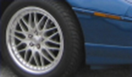
Let's look at a crop from a
larger picture:

This tiny crop looks pretty
good. We can tell that it is the wheel of a car and we don't
notice anything strange about it. Take the exact same image,
however, and display it larger (4x) and we get:

Now we can see that we
simply don't have enough pixels for this larger size: the spokes on the
wheel look more like saws than straight lines and the outline of the
chrome part of the wheel looks jagged and not smooth.
The solution
To get rid of the visually
distracting pixelization in the above larger image, we can use
interpolation methods to add pixels to the image. The pixels in
the original (smaller photo) describe the data that we have to work
with, so interpolation cannot add any true data to the image, but it can
smooth over some of the rough edges and can add "apparent detail" by
predicting what should appear between pixels in the original image.
Look at interpolation like making a prediction. If I showed you
the sequence A C E G, you could make a logical assumption and fill in
the missing letters to get ABCDEFG. Are B, D, and F really the
missing letters though? You were thinking of the alphabet, when
the missing letters could have really been from a person's name: A
CHENG. This just goes to show that you can only "guess" so much
information when you are missing a significant portion of that
information.
What does interpolation do
to the above large/pixelated image?
| Without interpolation |
 |
| PhotoShop "bicubic smoother"
interpolation |
 |
| Qimage "pyramid sharper"
interpolation |
 |
The top image shows what
the photo would look like at the 4x expanded size without interpolation.
By using interpolation, we are able to smooth out the distracting jagged
look (center and bottom photo) and improve the overall appearance of the
photo. Note that in doing so, we've reduced or eliminated the
coarse look of the image but the image now looks a bit soft (blurry).
This is a necessary tradeoff, since there is simply not enough data from
the original to determine which edges should be sharp and which edges
might be slightly out of focus due to depth of field, lens distortions,
etc. Older methods such as the bicubic methods used in
PhotoShop
tend to do a good job while more advanced methods like fractal
resampling, edge directed resampling, or the pyramid resampling method
available in
Qimage
(bottom image above) tend to do even better by further reducing jagged
edges to produce an even smoother result.
Understanding the tradeoffs
The above is a 4x upsample
which is considered fairly "radical". The truth is that if you
have a recent model digital camera, you will probably never need to
resample to the degree shown above. When you print your photos, a
slight upsample or downsample may be needed, but you'll rarely ever need
a drastic change in resolution to get a good print unless you do extreme
crops or billboard size printing. The most important thing is to
use a good interpolation algorithm to interpolate to the PPI (pixels per
inch) used by your printer, or an integer multiple thereof. Some
print drivers don't do such a great job of interpolation so if you send
them an "oddball" size by just printing the original, you may end up
with prints that have jagged edges. This can be true even if you
send the printer too many pixels, as some drivers don't
even handle downsampling well! One example showing
the problem can be seen in
Imaging
Resource's review of the Olympus P400 dye sub printer.
Notice near the end of the page how the 400 PPI image looks much worse
(more jagged) than the image that was downsampled to 314 PPI (the PPI of
the printer) first. This illustrates the importance of being able
to resample to the PPI used by the printer prior to sending images to
the print driver.
We can see some of the
benefits and tradeoffs of upsampling in the above samples, but
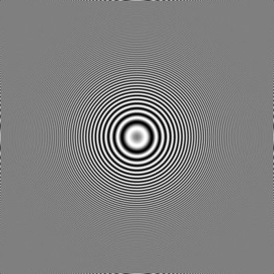
downsampling is just as important. When we take an image
consisting of concentric circles of increasing frequency and downsample
that image with an appropriate amount of antialiasing, we get the
following result showing a single set of rings emanating from the
center:
| Qimage default downsampling
(includes antialiasing step) |
 |
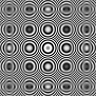
If we take the same image
and downsample using a standard downsampling routine without first
performing the antialiasing step, we get:
| PhotoShop bicubic sharper
downsampling (does not include antialiasing) |
 |
As can be seen in this
second example, lack of antialiasing has caused extra patterns to appear
that were not in the original image. While at first it may look
like the second example has more "detail", in fact the extra detail is
nothing more than artifacts caused by the resampling algorithm trying to
consider data beyond the frequency limit.
A balanced approach
A well balanced
interpolator will be able to downsample without aliasing artifacts while
also being able to upsample without jaggies or over-softening the image.
Old tried and true methods such as bicubic or lanczos are usually good
enough for most upsampling needs. More advanced methods can
increase visual quality for very large prints or special jobs, but be
aware that there is only so much detail you can "add" to an image.
Some of the newer interpolation methods try to make all edges as sharp
as possible and while these methods can make upsampled results appear
sharper, they often tend to break the correlation between sharpness and
depth of field and can make results look a bit like fingerpaintings.
Methods that produce smooth (jaggy free) images but don't try to
sharpen, on the other hand, can appear a bit too blurry. As with
many things, there are tradeoffs to each method.
The key to the best results
with any interpolation method is often to pick the appropriate amount of
sharpening. Interpolation methods that produce softer results can
often handle much more sharpening before showing any artifacts, so a
touch of extra sharpening can correct that soft look. Similarly, a
slight edge blur can remove that "painterly" feel of some of the sharper
interpolation methods if needed. Generally the more you stretch an
image (the more interpolation you use), the more sharpening will be
needed to compensate. "Smart printing" tools like Qimage and some
PhotoShop print sharpening plugins take all this into account and can
automatically apply the proper amount of final sharpening based on the
resolution of the original, the size of the final print, the resolution
of your printer, and other factors to allow the print to be the most
visually consistent at any size.
Probably the most important
thing to realize in this entire article is that there is only so much
you can do to "invent" data that is not there and when displaying or
printing photos, you have to go to extremes in most cases to be able to
see the difference between interpolation methods. If you are
captivated by some software or plugin that claims to do a much better
job at interpolation, my suggestion would be to download a trial or do a
search for reviews of the product before you buy. I've seen some
ridiculous samples posted on interpolation software websites showing a
vast difference between their method and others, only to download the
software and find out that it really does no better than the old bicubic
method. When you consider what the image "should" look like versus
what we get out of various interpolators on the market, there really is
very little difference between the better ones. If you find
yourself about to plunk down $200 for an interpolation program or plugin,
you might want to think twice. There are interpolation programs
out there that offer a wide variety of methods for less than $50 that do
as good or better than the high priced software.
Just for a sense of
"calibration", one of the better methods available produced this result
for the car wheel:

Some interpolation
algorithms may render this image a little sharper, with a little
more/less jagged edges, but the result will always be pretty similar to
the above as far as the overall amount of detail that can be seen.
Now consider what this image would look like if we had taken it with
enough resolution to begin with and didn't need to
interpolate:

This final image clearly
shows the limitations of interpolation. Interpolation can reduce
the appearance of artifacts like jagged edges but it simply cannot
retrieve detail that is not there. The 4x reduced image simply has
only 1/16th the amount of data which means that 94% of the data in the
interpolated result had to be "guessed" in the above samples.
Visually, the interpolated result is miserable in comparison to this
last sample above regardless of the method used, but technically the
result isn't too bad considering the fact that you started with only
about 6% of the data you needed and you guessed at the other 94%!
Bottom line
The bottom line here is that interpolation can
and does help improve the visual quality of images. That said,
don't expect magical results and beware of some of the mythical claims
out there. If you work for a magazine that normally starts with
extreme crops and blows them up to 8x10 photos for print, you might be
in the market for specialized interpolation software that allows you to
pick the best method for each image/situation. Just be aware that
many of the "miraculous" results displayed on the web sites for some of
these interpolation programs and plugins are quite exaggerated.
Better to try them first if they have a trial than to spend a
significant amount of money and find out later that they really don't do
much better than what you already have. Finally, keep in mind that
if you have a 5+ megapixel camera and you normally don't do much
cropping nor printing above 8x10 size, interpolation method may never be
a concern for you. More important will be to find software that
gives you the most benefit as far as the time it saves you and the
quality of the final result.
Mike Chaney


 Qimage registration expired? New lifetime licenses are only $59.99!


 Qimage registration expired? New lifetime licenses are only $59.99!